Thursday, November 14, 2019

Paper + Sewing Machine = ?

Stitched Paper Stacks of course!

I have been doing so much painting lately, I was really feeling the need to collage. Keeping in mind the Experience True Colors November color palette, I was quick to think up these adorable stacks of new and old, found and bought, black and white papers.


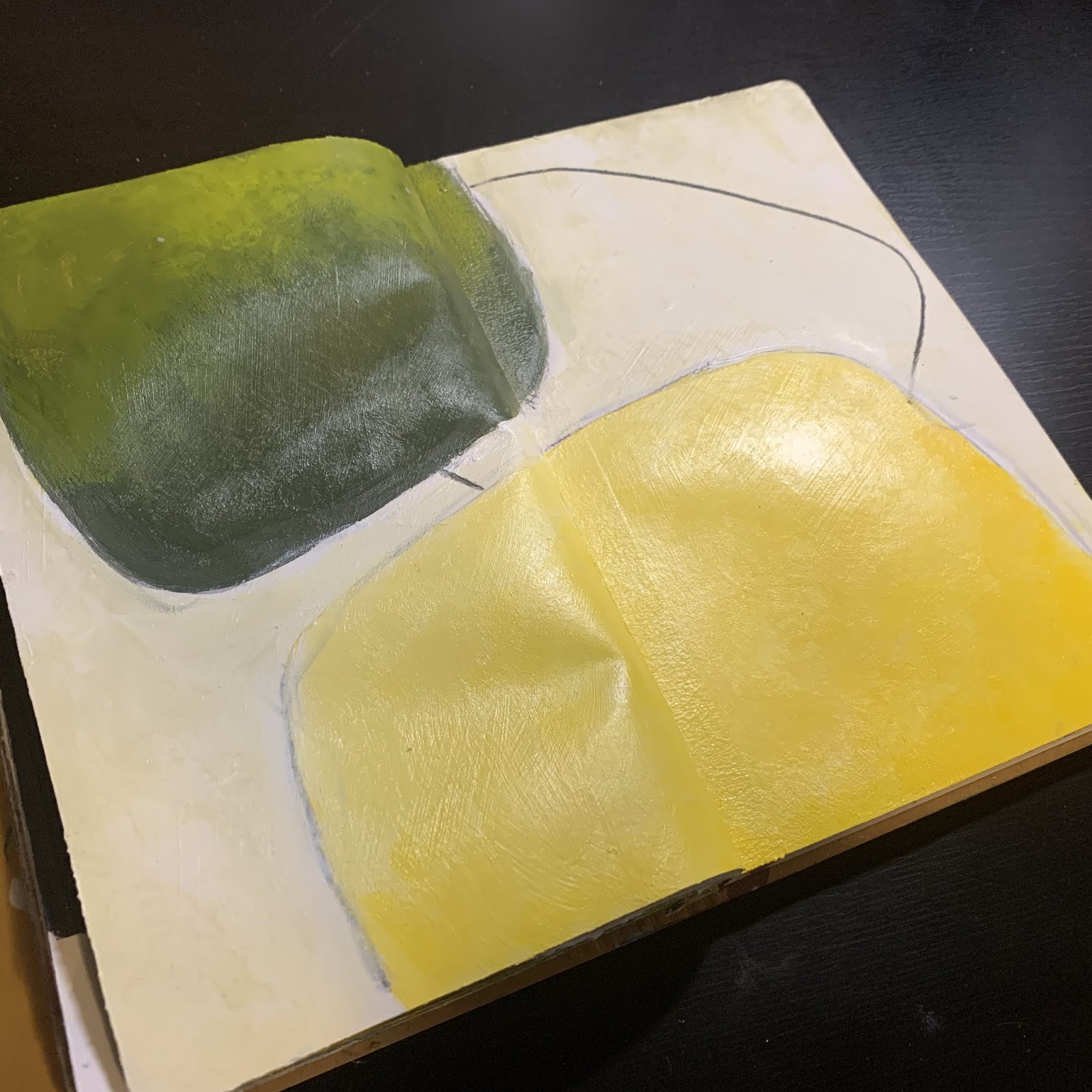
The idea came from a the previous day when I was creating a journal page of collage elements again using many of these elements, but thinking it may have need more, but just not sure. Here is that page, still unsure about it, but for now, I have turned the page!


The printed images you are seeing in the one above are from a scanned stencil (see more about that here) and the others are from images I created on an app called Paper53. I have created many unique patterns on this program and then simply print them off to use in collage.  It is not much different than reusing images of your own journal pages in other pieces. Easy peasy!!
Here is a sampling of some I have created:


Having said that, you can also create these with a paint brush and paint (india ink works awesome too) on copy papers or tissue papers. Heck you can even paint on book pages! Like I have said so many times in the past...your imagination is your only limitation.


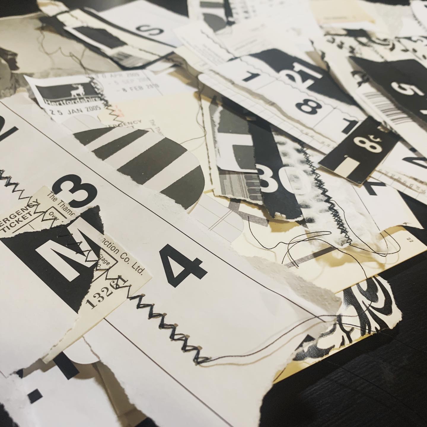
So back to the stitched paper stacks - I made quite a few, using strictly black and white papers, and using a good mix of old and new.  I just stacked them into a what I thought were visually appealing formats and then stitched together with my good old sewing machine. I varied the stitch width of the zig zag and of course always back stitched at the top and bottom. I also made sure to leave the excess thread long and visible.


The large numbers are from large poster paper (11x17") that I created on my computer and then printed off at Staples.


More found and vintages papers - Flashcards, Library return label & catalog card, floral wrap and glassine bag.


This one even has a flap from an old sewing pattern.


book pages, index card, price card...possibilities are endless as you can see.


Not papers were off limits, I even used the scraps!


This one was fun - it was a page from an old magazine that was just waiting for some embellishments.


These last two are mostly found &/or newer items. I've got transparencies, found mail, playing cards, tickets and tags.


These were a blast to create and know I will create lots more. They are perfect for quick add ins to journals, collage pages (or canvases), tags and so much more.  Thinking I may have to make some using some actual color now!


Sunday, November 10, 2019

A Quick Study on Values...

Yes, I am still studying color.  I am pretty sure this will be a long time thing and I am more than prepared for it. This past week, I started a mini study on values.  This was brought to the for front through an ongoing class I am taking through Experience True Colors.  They were focusing on values through the use of black and white.  I just went a few steps further by adding colors to my black & white.

I started my first day using strictly Carbon Black and Titanium White paint. I mixed in together to create my value scale.  When I was happy with my mixing, I used the mixed colors to create a piece in my color journal.  As you know, I am really intrigued by abstract art, so thought I would try using this format for the entire week.  In order to have some sort of unity, I decided to create a modified template/stencil.  I free hand cut them out of a 9x12" sheet of Bristol paper.


Hard to see the values in the black in the photo, but the main focus is that there are good values on the entire spread.  I added the black singular line to connect the two solid shapes using a Charcoal pencil.  Quite happy with the results.


Day two brought me mixing with three primaries (Primary Cyan/Magenta/Yellow) to get black and then of course the addition of white to get my value scale.


I made sure to take a photo of the two value scales side by side so you can see just how close I got them.


The scale on the left is using only black and white paints and the the scale on the right is using the three primaries along with white. I was really impressed on how well I did.

Not wanting to waste the mixed paint, of course I added to my color journal once again using my template again but in a different layout.


I once again used my charcoal pencil to unite the two separate images. I just wish I was talented enough to get the black to show its' variation better in photos.

Day three I decided to try using a version of primaries....individually to create a value scale. So for this version, I used Hansa Yellow Medium and created my values using the addition of carbon black and titanium white. I love the fact that when yellow and black are mixed you get green! Not sure I totally understand why yet, maybe due to color bias? Warm vs cold?  You can be rest assured I am looking into why!


Not much else to say about this one, but I really love it!  

Day four brought red into the family. Pyrrole Red.  Everything the same as the day before, just a little different presentation.


I seriously love the red and black mixed to create value.  It is quite the dance to get it balanced. I'd say it was a great success.

The final day was all about blue. Phthalo Blue (Green Shade). This again was an interesting dance with the white & black.  I worked them a bit differently this day and it was a real struggle. I struggled with my brushes so often would blend and mix with my fingers.  Needless to say, by the end of it I had some pretty Smurf like hands!


Here they are all shown together in a collage pic.  It was a fun mini study and I know I still want to delve deeper into it using warm vs cool in the magenta/cyan/yellow families.

You can learn a lot about the values in your piece my taking a photo of it with your phone.  Simply by editing the photo to b&w, you can see right away how effective your values (contrasts) are. Even without editing to b&w, you can often see where your mistakes are. It really is a powerful tool to keep close by.


Aside from learning a lot about colors and how they react to others, 
I have discovered:
* I prefer a dry brush 
* I often use 12 or more brushes in a sitting
* I like using my fingers to apply the paints
 * I like using Glazing Medium to blend
*the more I paint, the more I want to learn about color.

That Other Neutral Triptych

  That Other Neutral Triptych wrapped canvases 10x10x1.5" (x3) professional grade artist materials I worked on this smaller series at ...