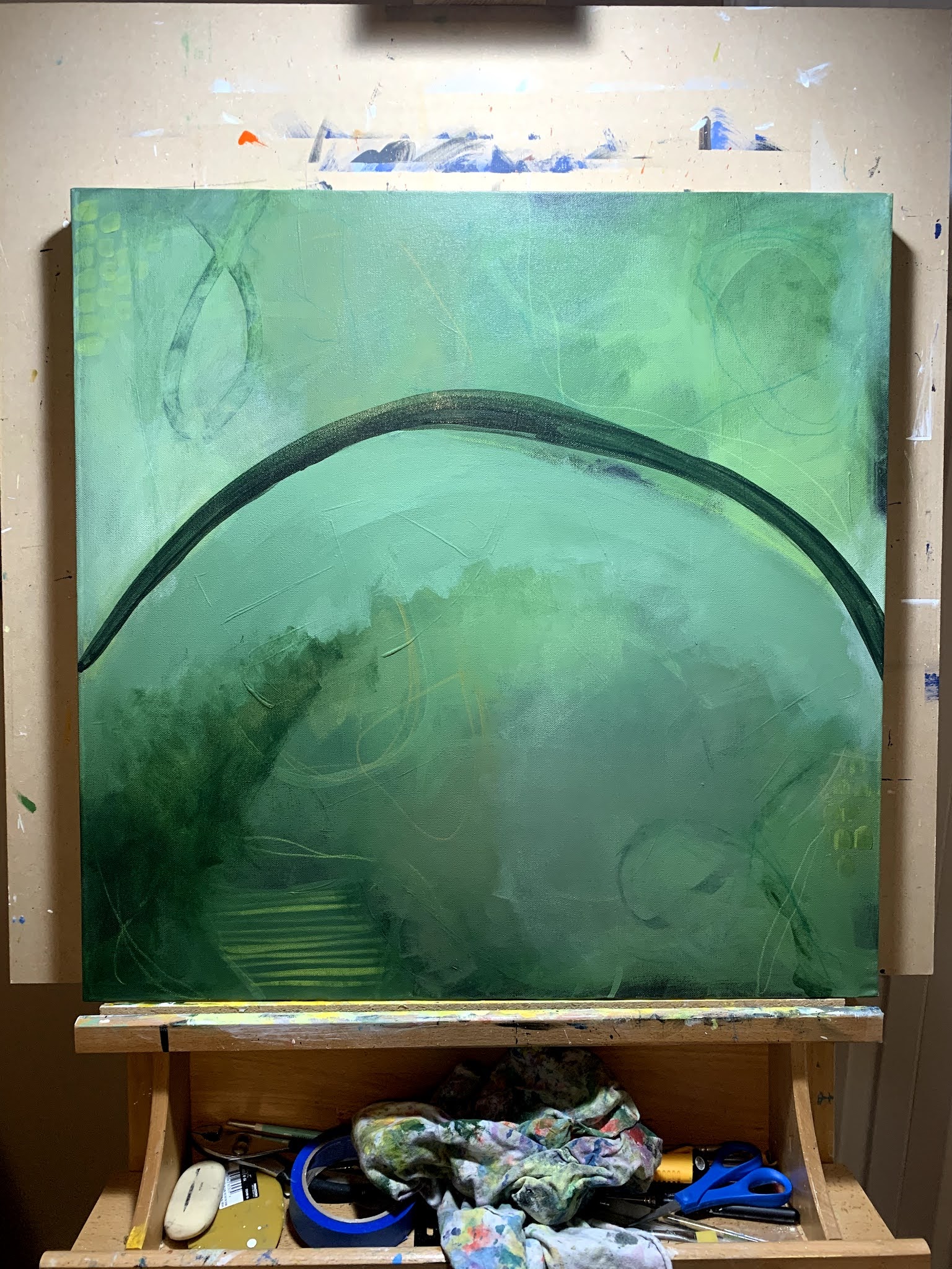
Wednesday, October 20, 2021

Swept Away


"Swept Away"

18x24x1.5" wrapped canvas
professional grade artist materials - acrylics

This is a piece from April that came together pretty quickly, which as you may have noticed doesn't always happen. I had an idea of using Turquoise Phthalo along with  Cadmuim Orange and then of course the blacks, whites and creams for creating contrast and values.  I initially went off of a rough sketch from my sketchbook journal and quickly knew it wasn't going to work as I had intended.

The biggest thing I have learned over these last few years of sketchbook/journal work is that more often than not, they simply do not translate to the canvas. Makes me wonder if it is the sketch or if it is in my color choices, or because of the way I have currently been painting. That makes me think often, am I trying two totally different processes? Probably, but that is for another day!

Back to the piece...

The initial sketch...

The first go at coverage...

Adding contrast and accent color...
This is where I knew it wasn't going to happen. Time to shift gears to what I know.

Starting with some under (painted) marks, I more or less covered the entire canvas with varying values of the turquoise phthalo and the addition of some major pops of the cadmium orange.

Once I had a good amount of marks, I started in with layers and layers of coverage using varying levels of the pigments to acrylic glazing liquids to get the limited coverage I was after.

Always taking into account what I wanted to peek through. This is often takes a few days to get to where you are seeing just the right amount of what is under the veil of continuous layers of glazing.

A finished piece is always a back forth decision for me. I tend to hang paintings in my studio near my desk where I can look at them from different angles, lighting and times of the day to decide if indeed they are done. This one has sat since April, and more times than not, I think it needs just that extra punch of orange near the bottom, but just haven't worked up the nerve to actually do it 😏. 
Maybe one day...
for now, I'll keep looking at it.


Golden Paints: Turquoise (Phthalo), Cadmium Orange, Mars Black, Titanium White, Zinc White, Titan Buff
Color Marking: Posca Pens, Molotow Pens (Empty) and filled with my color choices, NeoColorII, paint brushes with above listed paints.

Thanks for stopping by and taking a look. 

Wednesday, October 13, 2021

201


"201"

24x24x1.5" wrapped canvas 
Professional Grade Artist Materials - Acrylics

This is me again going (way) outside my comfort zone! I wanted to use a color once again I very seldom use - green! Boy, was in over my head for a while on this one.  I had to did deep and ask for a lot of input from Julie (and even her mentor Chris Cozen) to walk me off the ledge on this one. Once I got out of my own head, things really started to come together and I saw the finish line. And I will say I crossed it with a lot of satisfaction.

This piece was based on the process of another of Julie's classes - Caught Up in the Layers.  It provides a very thought provoking number of steps to get to your end game. Having a video workshop and companion printed book (and now digital version), make for a fantastic way to learn and implement your own art practices. Please note that not all the steps are shown or talked about due to this being a paid (and active)  class on her website.

the palette

getting the paint on and loading up on coverage

more coverage, contrast and markings

more markings

when the best laid plans go off the rails...

trying to fix it, it takes time and every ounce of my patience

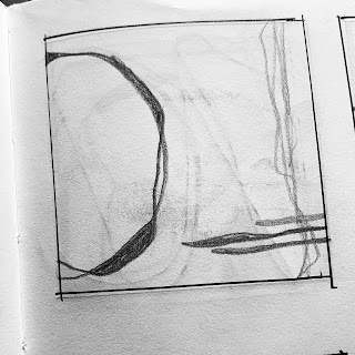
stepping back and loading up the marks as believe it or not, I have a direction

many stages have passed by and you too can see it is close

continuing to add those much needed bumps of color(s)


You can really see just about all the stages here if you look close. I know it is much harder online than in person. Sadly it really doesn't photograph well (in my opinion), green is on of the hardest to show its truest hue. Perhaps one day I will learn to photograph it and give it the justice it deserves.

You can see from the paint list below how quickly I forgot to simply use my color mixing history (ugh).  I know now it was me just trying to use up colors verses being smart on my choices.  This is also the piece that made me go back to the books and re read my studies on color mixings. As many of you know, I have been doing a deep dive on color theory as well as composition fundamentals over the past few years. Somehow I let much of it slip within my own process.

Golden Paints: Jenkins Green, Quinacridone Violet, Quinacridone Nickel Azo Gold, Burnt Sienna, Phthalo Green Blue Shade, Bone Black, Hansa Yellow Medium, Titanium White, Sap Green, Chromium Oxide Green, Sap Green, Zinc White and Turquoise Phthalo.

Color Marking: Posca Paint Pens, Liquitex Paint Pens, Caran D'Arche NeoColorII

Thanks for stopping by and taking a look!

Wednesday, October 6, 2021

202


"202"
24x24x1.5" wrapped canvas
profession grade artist materials - acrylics

I started this one mid December 2020. I had a plan from the start and surprisingly was able to stay on track right to the end. This piece was was based on the concepts taught by Julie Prichard's online workshop Expressionism Vol 2 (my personal favorite). I stuck with the steps she laid out but of course had to also use my own knowledge on what I knew and liked.

The only issue I ever really had with this one was the dominant color - Teal.  This is a color I have a real aversion to from a past instructor and let's not mention over kill on the market.  If you know me, I clearly don't follow the norm.

I was definitely able to get through this on fairly quickly, just less that three weeks start to finish. The visual layers on this one are very interesting and love the depth of colors, contrast and shapes.

Here are a few process images to show you how I got to the completed image...

as it always begins, getting paint onto the canvas

more paint coverage along with a few marks (acrylic paint pens)

more marks with paint (and paint pens)

the beginning of knowing where I want to go next

coverage, marks...all the while keeping an eye on the composition direction

the pushing and pulling continues

it's so close, just needs that final boost of color


Golden Paints: Cobalt Blue, Paynes Gray, Phthalo Green Blue Shade, Titan Buff, Teal, Titanium White, Hansa Yellow Medium and Prussian Blue

Color Marking: Posca Paint Pens, Caran D'Ache NeoColorII, Liquitex Paint Pens, homemade mixed paint pens using Molotow Empty Pump Markers


One thing to note when I state my colors, I often will mix colors on my palette, very seldom will a paint go straight onto my canvas in its original "straight out of the bottle/tube" color.

Thanks for stopping by and taking a peek at what's been going on.


Sunday, October 3, 2021

Grounded


"Grounded"

24x24x1.5" wrapped canvas (frame shown for display purposes only)
Professional Grade Artist Materials - Acrylic Paints and Oil Sticks

This is my newest piece that really took its sweet time in coming together.  In all honesty - not really its fault, but mine.  I was at a point of burn out this summer in more than one way.

We had a very unusual summer her in Northeastern Alberta (Canada) - it was very hot for well over the usual few weeks scattered here and there over the few months of summer we get here. Instead, we had a good 10 or so weeks of hot (and humid) weather, and needless to say, painting was did not happen in about eight of those. Then not to mention  the heat, I had put a lot of pressure on myself over the past two years to really focus on my art and push myself in all aspects of it.

This piece began early July and after a two month break of absolutely zero paint to canvas I got back at it in mid September. It was a real struggle to get back into the process, but with encouragement and positive input, I was able to finish it last week.

Here are some photos to show you how it evolved. My original goal was for this to be very limited palette, it didn't take long for me to go off the rails...

 getting the paint on

coverage and markings

trying to do something different

frustrations (or what I tend to call hissy fits) and cover ups

restarting...what you didn't see was me adding 
color to get the punch I felt it needed

staying the course

almost done, just needing that punch up of colors.

The final result...


This is the perfect way for you to see all the stages in a painting and just how much you will and won't see at its completed stage. 

Many artist fret over the layers of paint they apply to a piece - I prefer to call them stages. For me, layers don't matter as long as you get to where you want to go. It is a frame of mind, don't get hung up on the numbers...after all, this isn't 'paint-by-numbers'!

Golden Paints: Quinacridone Magenta, Benzimidazolone Yellow Medium, Phthalo Green Blue Shade, Titanium White (&/or Zinc White depending on the stage I was at)

Thanks for stopping by, I look forward to seeing you again soon!

Saturday, October 2, 2021

Coming back fresh...


"Mischief"
24x24x1.5" wrapped canvas
Professional Grade Artist Materials - Acrylic Paints and Oil Sticks

This piece took me on quite a ride. I struggled with it mainly due its colors. As much as I love red, it is not a color I will put in my work - ever. I wanted to really push myself out of my comfort zone and boy did I ever. 

This one really transformed within itself over an almost two week process. I went in with a vision and a plan that simply did not transfer from my brain to the canvas.  So after a lot of back and forth with my self and who I like to call my strongest mentor - Julie Prichard - I was finally able to complete it and call it done. 

Here are a few images to see how it changed along the way. This is also a great way to see what lies below and often cannot be seen online. 

Getting the paint on
 
paint coverage and markings

creating contrast with more coverage

detials

final push for contrast and color bump


I have been a student of Julie's for many years and only really started focusing on pulling more and more aspects from each of her teachings towards my own style and goals as an artist. Over this past year, it has shown. I have a better focus not to mention outcome in each and every piece I have completed. Her never ending support and nudges have made me the more confident artist I have become. Please be sure to check her site (julieprichard dot com) and social media platforms (@julie.prichard).

Golden Paints: Pyrrole Red, Benzimidazolone Yellow Medium, Phthalo Blue Green Shade, Titanium White (&/or Zinc White depending on the stage I was at).

Thanks for coming by, I look forward to seeing you back here again.


That Other Neutral Triptych

  That Other Neutral Triptych wrapped canvases 10x10x1.5" (x3) professional grade artist materials I worked on this smaller series at ...