I was talking to 'MaggieMylow' over at The Pink Camera and she asked if she could use gesso with Dyan Reaveley's Dylusions Ink Sprays. My first response to her was no, as you would not get the same effects that she creates. But after saying that - an idea popped into my brain - why not clear gesso? I wonder what would happen! So this brain of my went into immediate overdrive and this is the result!
What if I was to use the Dylusions Ink Sprays with...
1. Raw Paper
2. Clear Gesso
3. White Gesso
4. Matte Medium
This is the journal I did the trial in...

here are the 'mediums' I used....

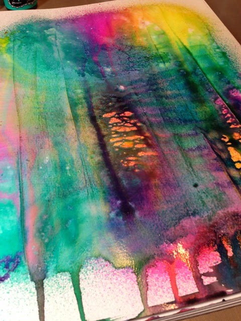
one the left hand side of the page is the raw sheet and the right side is Clear Gesso (applied with an old starbucks card)

I used the same three colors in all applications. Once sprayed, I immediately spritzed with equal amounts of water and tilted page up for maximum 'dripage'.

Raw Sheet:

Clear Gesso (be still my heart)!

the big difference here is the COLOR! Not to mention that the colors did NOT meld together and therefore no muddling!
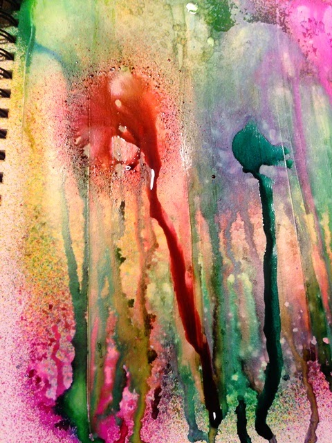
Next experiment is White Gesso (left side of page):

Matte Medium (right side of page):

once again - sprayed same three colors and water.
White Gesso:

Matte Medium (OMG)!!

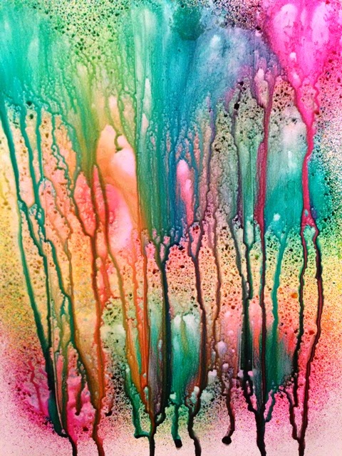
Here is the White Gesso once it is dried - absolutely beautiful and takes on an amazing watercolor effect.

Now the Matte Medium page...the colors and flow were AMAZEBALLS!!

Added more water to see what happens....

crap...too much water! became muddled and muted! Ick!!
Well, since it is Matte Medium, let's wipe and see what happens! The cool thing was that you could now see where the Matte Medium was applied and what it's reaction to the colors did. The muddled colors are on the raw paper, yet you can still see individual color(s) on areas where the medium was. Interesting isn't it?!

The next four photos are once the pages have fully dried (over night).
Raw:

Clear Gesso:

White Gesso:

Matte Medium:

As I was bummed that I 'wrecked' the matte medium one, I decided to try a couple additional things.
1. apply a second layer of the same colors
2. start a fresh page
so here goes...
1. second layer of sprays: not my fav by any means, but I know I can work with it at some point. Still too muddled for my liking. Tried adding more color once dried, still not happening for me though.


2. a fresh start: the three colors and water
just a tad more water (couldn't help myself)!

time to dry it!

The next couple shots are side by sides:
Dry Raw (left) and dry Clear Gesso (right):

Dry White Gesso (left) and dry [redo] Matte Medium (right). I'm thinking perhaps I should have used more lighting, but I really wanted the 'trueness' of the colors to come through if that makes sense.

This collage is of the original four taken last night when they were NOT yet dry. But seriously, I could look at these colors all day long! In order from left to right - raw, clear gesso, white gesso, matte medium.

So what did I learn? That I am so gonna use Clear Gesso and Matte Mediums with my Dyan Reaveley Dylusions in my journals! If you want some major color BAM, use clear gesso as your base. If you want serious dripage - use matte medium. If you want a watercolor look, use white gesso. I think it would be interesting to try these same mediums with other forms of color (ie Tim Holtz Distress Stains, Sprays and reinkers; Ranger Colorwash Sprays; Heidi Swapp Color Shine; Prima Color Blooms...the list goes on). If you try any, please let me know the outcome!
Again, one must take into account the paper I used, it does not have any form of a finish on it at all. I can't say for sure that the Dylusions Journal does either, but it is a different texture (smoother) paper.
So my NEXT big brainwave was to see how the Dylusions Ink Spray would work and look if I actually mixed it directly BEFORE applying to the page. First...epic FAIL when I fumble the spray when opening and it goes everywhere...including my PHONE! So after taking it all apart (thank God for cases) I only have a slightly 'jaded' ear piece on my white phone!

my hands after two good solids scrubs!

On a good note - not a drop on my clothes!
So here we go - mixing with clear gesso:


Matte Medium:


White Gesso:


Raw Paper:

All applications where applied with a palette knife. Here is a shot of them all together:

Aside from the color differences - I find it interesting on the textual differences too. The Matte Medium is smooth and slick, the white gesso is 'soft'; clear gesso is gritty and straight up is well...feels like paper. Interestingly enough, I would easily use any of the applications on a project. Great for creating a tint link layer over just about anything - why not?!
Thanks for checking out this weeks post, I know it was a tad long - but I do hope you found it interesting and yet informative enough to give something new a try. One can just never know what may come of a simple mistake or of a "what if....why not" moment!
Most products can be purchased over at the store (W2 Scrapbooking). Be sure to check me out over at Facebook where you will always find loads of tidbits, I would also appreciate a 'like' too while you're there. You can also find me on Instagram @bwdward with lots of fun photos.
Have a great day - let's make it a creative one!


No comments:
Post a Comment