Wednesday, November 17, 2021

That Other Neutral Triptych


That Other Neutral Triptych wrapped canvases
10x10x1.5" (x3)
professional grade artist materials

I worked on this smaller series at the same time as the addition of the two to larger pieces for the original neutral painting.  It is more or less the same paints, but have tweaked a few of the colors so it would be noticeably different than the larger set.

I will include a few images here that may be a bit confusing, but since I explained above on how I worked on these, you will see what I meant...

I began with taping the three together so I could paint all at once, This triptych is in the bottom left of the next three images.


I added German Dressmakers Tape (kraft paper 'tape')  to the pieces here and sadly am now seeing how few photos I took of this series progression.  Just know I used similar progressions but different as I did not want them to look the same - only feel similar.


๐Ÿ ‰ the color blockings are being added 
๐Ÿ ‹smoothing out the busyness below. 
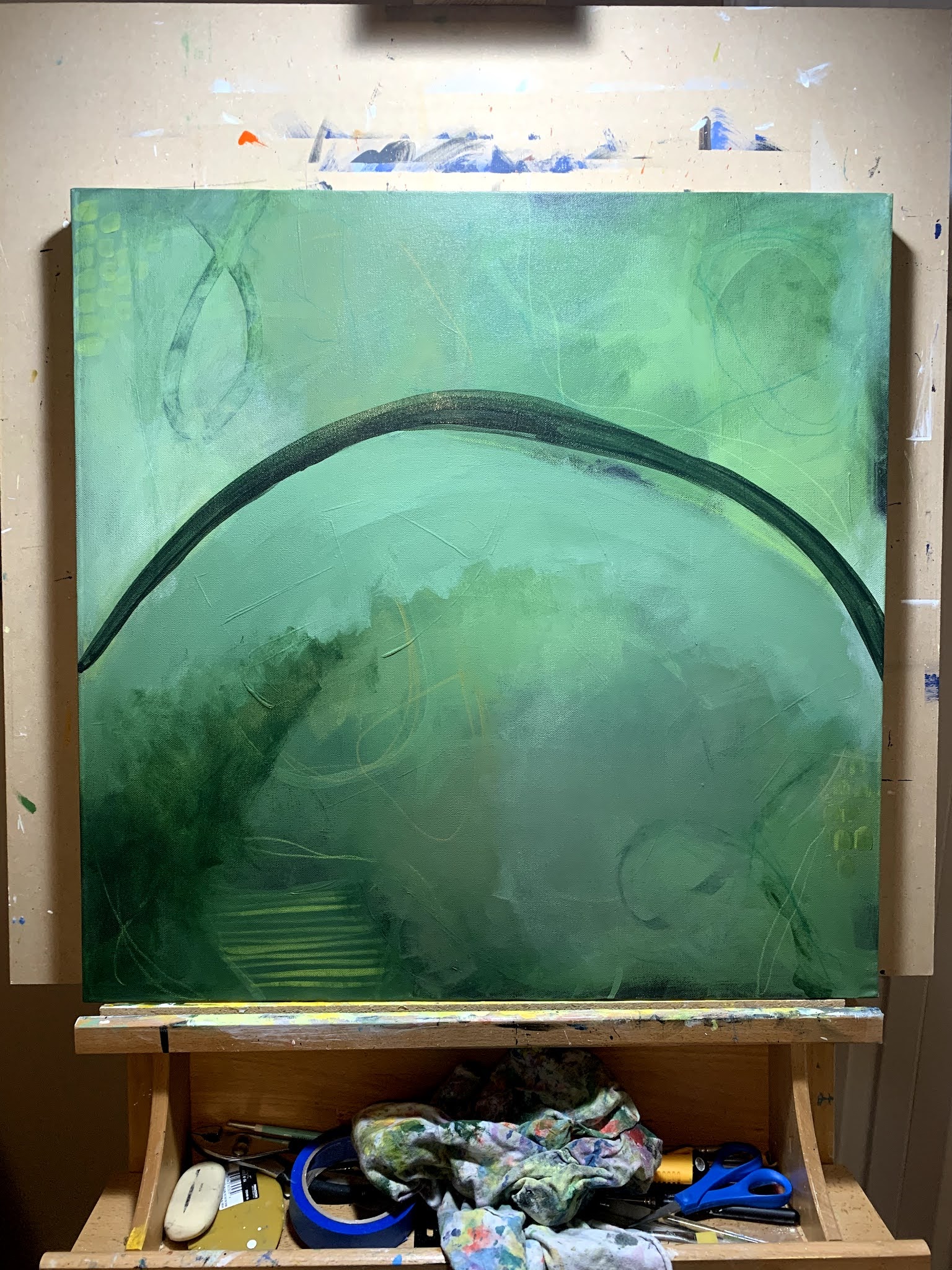
This is the stage where I brought in bone black so I could darken it up.


Attempting to set them on my easel to see them upright and in better lighting also wanting to see how they would look vertically.  I think these could be a very versatile depending how they get hung - not only as I show here, but the direction of each piece as well.


Time to start adding some brightness...


Wanting to add some more intense definition with the Yellow Ochre, so here is where I add the marks using Shiva Oil Sticks.


These are a really fun addition to the process. They are creamy and blend wonderfully.  I have also added more Black with with Shiva Oil Sticks on the edges as well. Once set, I spray them with a workable fixative and can then add more layers of acrylics on top.


This is when the push and pull of the final steps are so intricate. This can often take a few days due to the drying times as there is a lot of Acrylic Glazing Liquid used during this phase.


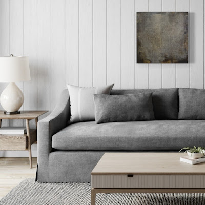
Finally, photos added to a mock up app to see how they look in yet another setting.


Golden Paints: Neutral Gray Values 3 & 6, Van Dyke Brown, Yellow Ochre, Zinc White, Titan Buff, Iridescent Stainless Steel, Micaceous Iron Oxide, Sepia, Transparent Shading Gray, Bone Black

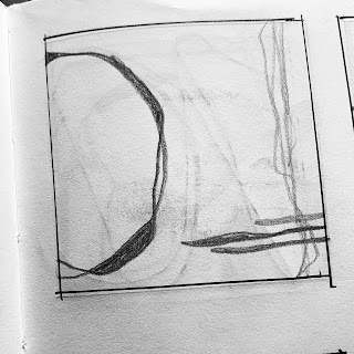
Color Marking: HB Pencil and Shiva Oil Sticks.

Thanks for stopping by and taking a look!

Wednesday, November 10, 2021

A Neutral Triptych


Neutral Triptych wrapped canvas
12x24x1.5" (x2)
24x24x1.5" (x1)
professional grade artists materials


I did say the neutral one needed a friend (or two) didn't I?! 

For the las couple of weeks I have been busy adding these two gems to the initial 24x24" piece and must say - love how they turned out!

Same color palette, same process...


It is times like these that I wish I had a large studio and/or easel (neither which are already small) ๐Ÿ˜! This was the best way for me to start matching up the colors and of course make the pieces cohesive. 


There is a lot of back and forth and I'm not going to bombard you with the subtle differences over the course of the weeks it took to get to the 
final results...


So happy with how these came together!


Golden Paints: Neutral Gray Values 3 & 6, Van Dyke Brown, Yellow Ochre, Zinc White, Titan Buff, Iridescent Bright Gold, Iridescent Stainless Steel, Micaceous Iron Oxide, Sepia, Transparent Shading Gray.

Color Marking: HB Pencil, Derwent Intense Watersoluble Ink Pencil (Bark) and Shiva Oil Sticks.

Thanks for stopping by and taking a look!


Wednesday, November 3, 2021

The Neutral One


"The Neutral One"

24x24x1.5" wrapped canvas
professional grade artist materials -acrylics

This is my "I've lost count" go at a neutral painting.  Surprisingly, it didn't take as long as my last few and I only walked away a couple of times - just not the usual week or too - out of pure frustration.

To start off, I pulled what I thought would be a good selection of neutral paint colors and that one pop - for me it is almost always yellow.

Creating a palette is a new process for me as introduced via Julie Prichard in her newest workshop Expanding on Color. I won't go into much detail here out of respect for her and her workshop. If you are interested in it, please head over to her site and check it out.  For now, here are a few images of the process I took while making this piece...


Apparently I didn't take photos of the beginning of this piece (maybe be more over on Instagram?) - here is me simply adding more marks over the base of the painting.


Now trying to get more intense coverage, blocking and the beginnings of my direction for composition...


Here comes the fun stuff. I had an idea on strong direction for this one. 
I wanted there to be visual lines. 
Not perfect, but intentional and yet suggested. Make sense?!


I have a bad habit of going back in after creating my markings and covering them all up (not intentional), 


then I have to go back and create new ones...


๐Ÿ ‰ same as ๐Ÿ ‹ - just in different light. Crazy how it changes and therefore an important practice to move your painting around your home to see it in not only a different view, but in a different light. It makes a huge difference!


Getting close here, bringing the entire feeling together now...


A bit of glazing to bump up the contrasts...


Once again, it was time to bring it upstairs to see the color change.  
Downstairs it has a totally warmer feel to it, but as soon as it comes upstairs - it cools right off.  The gray takes on a blue and gives it whole new feel.


I really loved working on this one and once I had moved it around my house (and yes, even took it my neighbors house who has white walls) and saw it in a whole new way...it needs a friend...or two, so stay tuned!

Golden Paints: Neutral Gray Values 3 & 6, Van Dyke Brown, Yellow Ochre, Zinc White, Titan Buff, Iridescent Bright Gold, Iridescent Stainless Steel, Micaceous Iron Oxide, Sepia, Transparent Shading Gray.

Color Marking: HB Pencil, Derwent Intense Watersoluble Ink Pencil (Bark)and Shiva Oil Sticks

Thanks for stopping by and taking a look!

Wednesday, October 20, 2021

Swept Away


"Swept Away"

18x24x1.5" wrapped canvas
professional grade artist materials - acrylics

This is a piece from April that came together pretty quickly, which as you may have noticed doesn't always happen. I had an idea of using Turquoise Phthalo along with  Cadmuim Orange and then of course the blacks, whites and creams for creating contrast and values.  I initially went off of a rough sketch from my sketchbook journal and quickly knew it wasn't going to work as I had intended.

The biggest thing I have learned over these last few years of sketchbook/journal work is that more often than not, they simply do not translate to the canvas. Makes me wonder if it is the sketch or if it is in my color choices, or because of the way I have currently been painting. That makes me think often, am I trying two totally different processes? Probably, but that is for another day!

Back to the piece...

The initial sketch...

The first go at coverage...

Adding contrast and accent color...
This is where I knew it wasn't going to happen. Time to shift gears to what I know.

Starting with some under (painted) marks, I more or less covered the entire canvas with varying values of the turquoise phthalo and the addition of some major pops of the cadmium orange.

Once I had a good amount of marks, I started in with layers and layers of coverage using varying levels of the pigments to acrylic glazing liquids to get the limited coverage I was after.

Always taking into account what I wanted to peek through. This is often takes a few days to get to where you are seeing just the right amount of what is under the veil of continuous layers of glazing.

A finished piece is always a back forth decision for me. I tend to hang paintings in my studio near my desk where I can look at them from different angles, lighting and times of the day to decide if indeed they are done. This one has sat since April, and more times than not, I think it needs just that extra punch of orange near the bottom, but just haven't worked up the nerve to actually do it ๐Ÿ˜. 
Maybe one day...
for now, I'll keep looking at it.


Golden Paints: Turquoise (Phthalo), Cadmium Orange, Mars Black, Titanium White, Zinc White, Titan Buff
Color Marking: Posca Pens, Molotow Pens (Empty) and filled with my color choices, NeoColorII, paint brushes with above listed paints.

Thanks for stopping by and taking a look. 

Wednesday, October 13, 2021

201


"201"

24x24x1.5" wrapped canvas 
Professional Grade Artist Materials - Acrylics

This is me again going (way) outside my comfort zone! I wanted to use a color once again I very seldom use - green! Boy, was in over my head for a while on this one.  I had to did deep and ask for a lot of input from Julie (and even her mentor Chris Cozen) to walk me off the ledge on this one. Once I got out of my own head, things really started to come together and I saw the finish line. And I will say I crossed it with a lot of satisfaction.

This piece was based on the process of another of Julie's classes - Caught Up in the Layers.  It provides a very thought provoking number of steps to get to your end game. Having a video workshop and companion printed book (and now digital version), make for a fantastic way to learn and implement your own art practices. Please note that not all the steps are shown or talked about due to this being a paid (and active)  class on her website.

the palette

getting the paint on and loading up on coverage

more coverage, contrast and markings

more markings

when the best laid plans go off the rails...

trying to fix it, it takes time and every ounce of my patience

stepping back and loading up the marks as believe it or not, I have a direction

many stages have passed by and you too can see it is close

continuing to add those much needed bumps of color(s)


You can really see just about all the stages here if you look close. I know it is much harder online than in person. Sadly it really doesn't photograph well (in my opinion), green is on of the hardest to show its truest hue. Perhaps one day I will learn to photograph it and give it the justice it deserves.

You can see from the paint list below how quickly I forgot to simply use my color mixing history (ugh).  I know now it was me just trying to use up colors verses being smart on my choices.  This is also the piece that made me go back to the books and re read my studies on color mixings. As many of you know, I have been doing a deep dive on color theory as well as composition fundamentals over the past few years. Somehow I let much of it slip within my own process.

Golden Paints: Jenkins Green, Quinacridone Violet, Quinacridone Nickel Azo Gold, Burnt Sienna, Phthalo Green Blue Shade, Bone Black, Hansa Yellow Medium, Titanium White, Sap Green, Chromium Oxide Green, Sap Green, Zinc White and Turquoise Phthalo.

Color Marking: Posca Paint Pens, Liquitex Paint Pens, Caran D'Arche NeoColorII

Thanks for stopping by and taking a look!

Wednesday, October 6, 2021

202


"202"
24x24x1.5" wrapped canvas
profession grade artist materials - acrylics

I started this one mid December 2020. I had a plan from the start and surprisingly was able to stay on track right to the end. This piece was was based on the concepts taught by Julie Prichard's online workshop Expressionism Vol 2 (my personal favorite). I stuck with the steps she laid out but of course had to also use my own knowledge on what I knew and liked.

The only issue I ever really had with this one was the dominant color - Teal.  This is a color I have a real aversion to from a past instructor and let's not mention over kill on the market.  If you know me, I clearly don't follow the norm.

I was definitely able to get through this on fairly quickly, just less that three weeks start to finish. The visual layers on this one are very interesting and love the depth of colors, contrast and shapes.

Here are a few process images to show you how I got to the completed image...

as it always begins, getting paint onto the canvas

more paint coverage along with a few marks (acrylic paint pens)

more marks with paint (and paint pens)

the beginning of knowing where I want to go next

coverage, marks...all the while keeping an eye on the composition direction

the pushing and pulling continues

it's so close, just needs that final boost of color


Golden Paints: Cobalt Blue, Paynes Gray, Phthalo Green Blue Shade, Titan Buff, Teal, Titanium White, Hansa Yellow Medium and Prussian Blue

Color Marking: Posca Paint Pens, Caran D'Ache NeoColorII, Liquitex Paint Pens, homemade mixed paint pens using Molotow Empty Pump Markers


One thing to note when I state my colors, I often will mix colors on my palette, very seldom will a paint go straight onto my canvas in its original "straight out of the bottle/tube" color.

Thanks for stopping by and taking a peek at what's been going on.


That Other Neutral Triptych

  That Other Neutral Triptych wrapped canvases 10x10x1.5" (x3) professional grade artist materials I worked on this smaller series at ...