I started my first day using strictly Carbon Black and Titanium White paint. I mixed in together to create my value scale. When I was happy with my mixing, I used the mixed colors to create a piece in my color journal. As you know, I am really intrigued by abstract art, so thought I would try using this format for the entire week. In order to have some sort of unity, I decided to create a modified template/stencil. I free hand cut them out of a 9x12" sheet of Bristol paper.


Hard to see the values in the black in the photo, but the main focus is that there are good values on the entire spread. I added the black singular line to connect the two solid shapes using a Charcoal pencil. Quite happy with the results.


Day two brought me mixing with three primaries (Primary Cyan/Magenta/Yellow) to get black and then of course the addition of white to get my value scale.

I made sure to take a photo of the two value scales side by side so you can see just how close I got them.
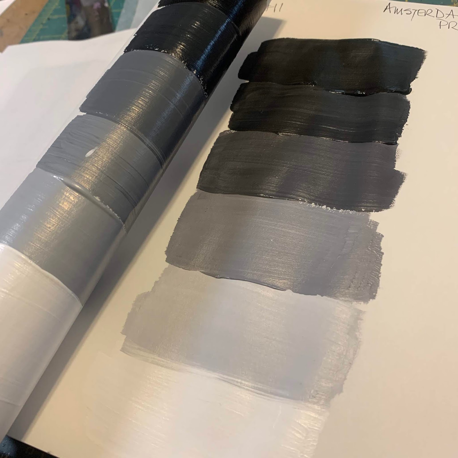
The scale on the left is using only black and white paints and the the scale on the right is using the three primaries along with white. I was really impressed on how well I did.
Not wanting to waste the mixed paint, of course I added to my color journal once again using my template again but in a different layout.

I once again used my charcoal pencil to unite the two separate images. I just wish I was talented enough to get the black to show its' variation better in photos.
Day three I decided to try using a version of primaries....individually to create a value scale. So for this version, I used Hansa Yellow Medium and created my values using the addition of carbon black and titanium white. I love the fact that when yellow and black are mixed you get green! Not sure I totally understand why yet, maybe due to color bias? Warm vs cold? You can be rest assured I am looking into why!

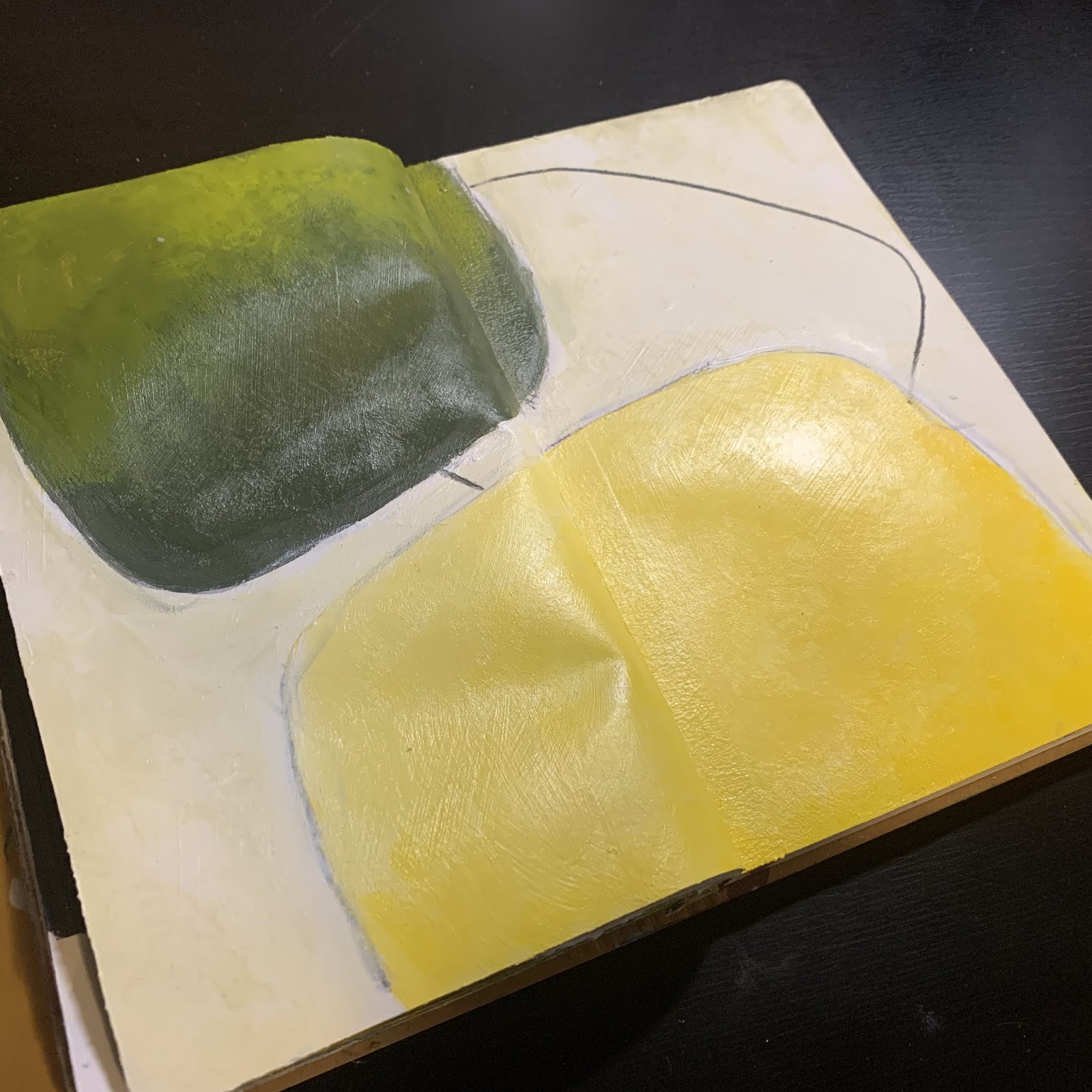
Not much else to say about this one, but I really love it!
Day four brought red into the family. Pyrrole Red. Everything the same as the day before, just a little different presentation.


I seriously love the red and black mixed to create value. It is quite the dance to get it balanced. I'd say it was a great success.
The final day was all about blue. Phthalo Blue (Green Shade). This again was an interesting dance with the white & black. I worked them a bit differently this day and it was a real struggle. I struggled with my brushes so often would blend and mix with my fingers. Needless to say, by the end of it I had some pretty Smurf like hands!


Here they are all shown together in a collage pic. It was a fun mini study and I know I still want to delve deeper into it using warm vs cool in the magenta/cyan/yellow families.
You can learn a lot about the values in your piece my taking a photo of it with your phone. Simply by editing the photo to b&w, you can see right away how effective your values (contrasts) are. Even without editing to b&w, you can often see where your mistakes are. It really is a powerful tool to keep close by.

Aside from learning a lot about colors and how they react to others,
I have discovered:
* I prefer a dry brush
* I often use 12 or more brushes in a sitting
* I like using my fingers to apply the paints
* I like using Glazing Medium to blend
*the more I paint, the more I want to learn about color.


1 comment:
Interesting. Thanks...
Post a Comment