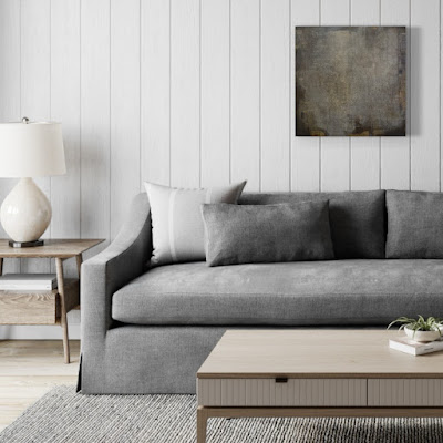
"The Neutral One"
24x24x1.5" wrapped canvas
professional grade artist materials -acrylics
This is my "I've lost count" go at a neutral painting. Surprisingly, it didn't take as long as my last few and I only walked away a couple of times - just not the usual week or too - out of pure frustration.
To start off, I pulled what I thought would be a good selection of neutral paint colors and that one pop - for me it is almost always yellow.
Creating a palette is a new process for me as introduced via Julie Prichard in her newest workshop Expanding on Color. I won't go into much detail here out of respect for her and her workshop. If you are interested in it, please head over to her site and check it out. For now, here are a few images of the process I took while making this piece...

Apparently I didn't take photos of the beginning of this piece (maybe be more over on Instagram?) - here is me simply adding more marks over the base of the painting.

Now trying to get more intense coverage, blocking and the beginnings of my direction for composition...


Here comes the fun stuff. I had an idea on strong direction for this one.
I wanted there to be visual lines.
Not perfect, but intentional and yet suggested. Make sense?!


I have a bad habit of going back in after creating my markings and covering them all up (not intentional),

then I have to go back and create new ones...

🠉 same as 🠋 - just in different light. Crazy how it changes and therefore an important practice to move your painting around your home to see it in not only a different view, but in a different light. It makes a huge difference!

Getting close here, bringing the entire feeling together now...

A bit of glazing to bump up the contrasts...


Once again, it was time to bring it upstairs to see the color change.
Downstairs it has a totally warmer feel to it, but as soon as it comes upstairs - it cools right off. The gray takes on a blue and gives it whole new feel.
Downstairs it has a totally warmer feel to it, but as soon as it comes upstairs - it cools right off. The gray takes on a blue and gives it whole new feel.

I really loved working on this one and once I had moved it around my house (and yes, even took it my neighbors house who has white walls) and saw it in a whole new way...it needs a friend...or two, so stay tuned!
Golden Paints: Neutral Gray Values 3 & 6, Van Dyke Brown, Yellow Ochre, Zinc White, Titan Buff, Iridescent Bright Gold, Iridescent Stainless Steel, Micaceous Iron Oxide, Sepia, Transparent Shading Gray.
Color Marking: HB Pencil, Derwent Intense Watersoluble Ink Pencil (Bark)and Shiva Oil Sticks
Thanks for stopping by and taking a look!


No comments:
Post a Comment