Friday, February 19, 2016

Weekend Junket #04

Please take this for what it is - simply some inspiration to get you creating!  There are no hidden agendas or objectives, no I have to or else, just some simple prompts to hopefully inspire you to create!

Remember, how you choose to interpret the prompts is totally up to you! You can apply them to an Art Journal, Mixed Media project, Scrapbook Layout(s), ATC's or even Cardmaking, you choose!  Perception is how YOU see things, not me (or anyone else for that matter).  There is NO right or wrong way to take these prompts.

If you choose to partake in the 'prize' part of this challenge, I do have a couple requests/rules.  I need to be able to find them.  So you will be asked to either link it to this post via the links button at the bottom of this post on the blog or put it on the W2 Scrapbooking Facebook page under the coordinating post.  If you choose to post on Instagram, please use the hastag (#) #w2wj_ _ along with the week number.  For example, this week will be#w2wj04

At the end of each month I will randomly draw with all the participants post(s) and they will be awarded a store credit to W2 Scrapbooking! Please note that prizes are only available to participants in Canada and the Continental USA (where the shop currently ships).

Here we go...February's set of prompts:

FEBRUARY 

Colors that Inspire...FAMILY


What color do you think of when you think of family?  Use that as yet another inspiration for you for your project(s) this time around.

#w2wj04

add character - literally, add a character!
tool - use a punch or a die
inspired by/muse - include a quote

At times I may find it interesting to put a twist on the prompts is to use the term....

Use something NEW, something OLD something BORROWED and something BOLD!

Now understand that I may not use the above on every challenge, but  I sure am gonna try!  

Here is my take on the challenge prompts:

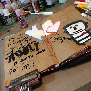
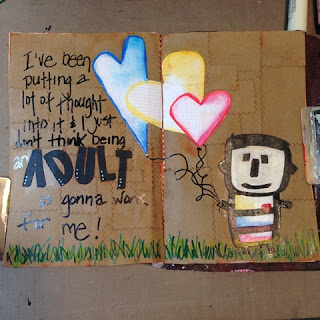
The character prompt got me right away - I knew I wanted to include "Julius" - he sits on my desk and he makes me smile.  The one here taking a peek is an extra I printed off last year when I was trying to work him into a Mix Ur Media kit reveal.  Julius is a character that Brian Miller created last year while attending one of Donna Downey's workshop.

I took a sheet of Jillibean Soup Kraft paper (loads on clearance on the site) and pulled out my seldom to never used pinking shears and cut up random squares & rectangles.  Enough to cover both sides of the journal spread.


I adhered them all down using Matte Medium


Now I pulled out my Sizzix dies from Stephanie Ackerman In Bloom Alphabet Framelits (#659953) and Hearts #4 (#659962).  I also printed off another Julius as I wanted him  to stand out more than the kraft one I had on hand.  Again, all was adhered using Matte Medium.  


Now it was time for a glaze - I mixed DecoArt Media Transparent Red Iron Oxide and Golden Glazing Liquid and covered the page. I added a layer of Dina Wakley Media Clear Gesso over the hearts and Julius so they were sure to come clear and white when done.


I let it sit for about a minute, then wiped it off using a baby wipe.


I repeated it one more time as I was not happy with the colors that were left behind.  You can see that Julius got a tad sh*tfaced so I had to add a layer of paint on him to brighten him up.


I took one of my Sharpie Chalk Paint Pens and wrote out the verse I had wanted.


Again, using my Sharpie Chalk Paint Pens, I added color to my heart balloons and smudge/blended the colors using my finger.  I also gave Julius a heart!


Then I added some nice grass below Julius' feet using a variety of paint and markers (Faber Castell Stampers Big Brush Pens, Sharpie Chalk Paint Pens and DecoArt Media Green Gold paint). 


Added some color to Julius' shirt using Faber Castell Pitt Pens 


He was looking pretty cute, but he still needed a little something something!


I added shading using my Faber Castell Pitt Pen (Black) to the heart balloons....


....and Julius!


and the die cut letters of 'adult' - just what it needed! 


Here is the final spread.  It is a cute one - a little bit of my twisted sense of humor put in for good measure.


Don't forget to either link them here or post on my Facebook Page under the  #04 prompt post.

Next set of prompts come out March 4.

Linked Submission:


Thursday, February 11, 2016

a little inspiration (wednesday) on thursday!

I am once again taking part in Donna Downey's Inpsiration Wednesday (2016).  I have been a stalker follower of Donna's for more years than I care to mention...let's just say - back to when she too scrapbooked (yes, that is a long time)!  If you are not aware of Donna and her awesomeness...you need to check her out!

Here are a couple projects I have done over the last couple of weeks that were inspired by her work in IW01.20.16 and IW2.3.16

Hope you too get inspired...

Working in my homemade journal - I plastered the pages with Liquitex Modeling Paste - I kept it pretty rough as I really wanted texture.


making extra marks along the way.


Added metal ephemera, masking tape and a tape all adhered using Prima 3D Gloss Gel and Matte Medium (where needed).


Here are a few close ups so you can easily see the amazing texture I was able to achieve.


I then added my usual - number rub ons (can never seem to have enough of these).  In this case, Tim Holtz Remnant Rubs - Numerals .


Now it was time to grunge it up a bit!  I mixed Dina Wakley Heavy Body Acrylic Paint (Umber) with DecoArt QuinacridoneGold and Golden Acrylic Glazing Liquid and painted over the entire page (including the inclusion) being sure to really get the glazing mixture into all the nooks and crannies!!


waited the token 90 seconds (I think) and wiped it off with baby wipes. 


Of course I couldn't leave it alone, so added some of the DecoArt Antiquing Cream in Patina Green


again, waited the token 90 seconds and wiped off what I wanted with a baby wipe.  


a great tip with glazing/painting and such with baby wipes, is you can use the 'dirty' wipes to put color back on (especially in areas you may have cleaned off too much).


One last trick Donna did in here piece was burn up some of it's parts!  I tried hard to burn parts of mine - but as you can see, I had some serious issues!  It would literally start to burn and fad out as fast as it lite.  Aside from going out to hubby's shop and using the blow torch...I called it done!


The next one was a fun one too.  For me, it was about using colors I am not really accustomed too.  For me...that is PINK!

I tend do do things rather differently than most (as you have now learned) and I decided to go laterally across the page. I had an other idea for color blocking but decided to save that for another time.  I used tow different widths of Washi Tape  to mark off my areas I was going to paint. I knew I wanted to use some of the new DecoArt Media Fluid Acrylics I had just brought into the shop, so I pulled out the medium grey first and then pulled out the sheet I printed off from the Facebook post about "The Ultimate Color Combinations Cheat Sheet" and looked to see what went with grey.  Well of course it was 'violet','fuchsia' and 'pink' just to name a few!  So I thought I might was well dive right in with the 'pink' theme.  I chose the DecoArt Media Quinacridone Violet and Dina Wakley Media Heavy Body Acrylics in Magenta.

Before I started applying the paint.  I applied some Liquitex Modeling Paste with my palette knife.  Once it was dried, I started adding the paints.


The paints were simply brushed on using my Dina Wakley 1" Flat Stiff Bristle Brush.


When the paints were (somewhat) dried, I peeled off the washi tape to expose the (hopefully) crisp clean lines.


The bottom line was perhaps a tad too thin, but I made it work anyway.

For the drip part, I actually diluted the DecoArt Fluid Acrylic with Golden Airbrush Liquid and applied with a fairly water saturated brush.  Then of course, sprayed heavily with water to get the extra drips I wanted.  I applied more paint in areas that needed it.


Once it was all dry enough, I took out my Fineliner and  scribbled away 'within' the lines!  My mixture in my Fineliner is actually equal parts of Carbon Black Fluid Acrylic Paint and Golden Airbrush Liquid...along with a little black gesso and water to get it to the consistency I like.  It is seriously an hit and miss when it comes to this - just keep trying.


Once it was dry enough for me to handle, I brought out my Prima Distress Tool and roughed up all the edges.


Thinking it needed more, I pulled out my Prima Finnabair Stamps and added some circles to the 
 bottom corners. Then I wanted to add something in the center stripe - so I dug through my stencil and and decided on this one - from Stencil Girl Products (designed by Carolyn Dube) and is called Wall of Words.


I allowed it to dry fully before I went on with the next step. Glazing!  I decided on Burnt Umber by DecoArt Media - like before, I made sure I got the glaze into all the nooks and crannies.  I let it dry for closer to 2 minutes.


Wiped it off...


Then I thought...why not? I took the Prima Distress Tool and really went at it with the grater edge and ground the modeling paste good as I really wanted to see the scratches (hopefully) when I applied a second layer of glaze! 


note, the crap in my grater...that is not gonna be fun to clean!


So much better!


in this close up, you can see the glaze remnant in the grooves!


I really love how this one turned out!


Thanks for stopping by and checking out my part of the world.  Hope you too are able to join in on the fun and creative wonder of Donna Downey!  So worth the inspiration.


That Other Neutral Triptych

  That Other Neutral Triptych wrapped canvases 10x10x1.5" (x3) professional grade artist materials I worked on this smaller series at ...