Showing posts with label art trials. Show all posts

Monday, June 29, 2020

#getyourpainton (part one)

I have been doing a somewhat of a deep dive on composition in art for well over a year now, but really sat down this past month and went through my notes, looked at past paintings (mine and on the net) to see if I could finally comprehend it all.  Good new...I did and I do!

I have a journal full of notes, a binder full of printed pages for reference. So I planned out a week long self study on seeing how I could get paint to paper using what I hoped would now be more natural habits that I have instilled in myself after all the 'studying' and practice.  

I decided on a practice used by many instructors over the years where you take a sheet of paper and divide it off in sections using masking tape. I chose to use a quality Watercolor Paper as I knew it would handle what I was about to do to it. I also wanted to use different color palettes each day, mix up my brushes and at the end, I even changed up my paints for Inks.

I stayed with Golden Acrylics for the most part, but one day I did use some of my craft paint stash (Martha Stewart Crafts - seriously, I need to use this stuff up) and the final day was Daler Rowney FW Artist Acrylic Inks.

Here we go....

Day 1:

Strathmore Series 400 Watercolor 12x18"
Gesso - Liquitex Professional (White)
Golden Fluid Acrylics - Titanium White, Carbon Black, Transparent Red Iron Oxide, Titan Buff, Iridescent Stainless Steel (Coarse) and Iridescent Bright Gold (Fine).
Brush - Princeton Catalyst Bright #12 & #8
Stabilo Woody - Black

This was a palette I was using on another piece and I had a good amount out so thought why not start here. I decided to start off just making 6 squares (approx 6x6") and simply used limited strokes and tried my best to only stroke one at a time. I either would go in a single swoop or short swipe.  The more I added, the longer and larger my strokes seemed to get.  I also found that I got over zealous and was getting too much paint on the piece. 


Pretty interesting how by simply taping off a sheet a paper, the drastic change it can make.  I find it allows you to see everything in a whole new light.  It is like using a random viewfinder on your piece and then when you cut them into their individual pieces - is when the fun can really start.  If you look at the first image, you can see how I covered almost the entire 6" section, the white spaces really are not really visible until I remove the tape. The strokes are thick and somewhat random, but look at their direction. Color placement is there to give each one a nice focal point, but really noticeable until they are cut and standing on their own.

Here are a couple interesting points I have discovered to help simplify wanting to evaluate and understand my work. These are simply my translations and work for me and my thought process.  You may not think the same way, that's okay.

Elements are visual, look for them in your art. You don't need to have them all, but odd numbers are best. Principles are feelings. It is often how the artist uses the elements to create an effect and then in turn aid with the visualization of their intent. Principles are your tools of arrangement of the various elements. Elements are your building blocks that will influence your process. Their end result is to achieve unity in the composition of your art.

A quick check of the elements - does it have Line, Shape, Space, Form, Color, Value or Texture?  It doesn't need to have them all, but should have at least three.

A quick check on the principles - does is feel Balanced, is there Contrast (in color, value & texture), is there emphasis (focal point), is there Unity/Variety (in the elements), is there Movement (think line), is there pattern (marks, shapes, etc that create a pattern), or Rhythm (implied by repetition of elements)?

A painting does not need to have all the principles, but a successful one will have Unity, Variety, Contrast & Emphasis.  It will also be visually Balanced and will Move(ment) the eye around. This is good composition.

So back to my #getyourpainton study...

Looking at the last photo, you can definitely see line, shape, (visual) texture, value & color. You can also see emphasis on most, contrast, variety and balance. The other principles could be included as well depending on your interpretations of course.

Let's move on to Day 2:

Strathmore Series 400 Watercolor 12x18"
Gesso - Liquitex Professional (White)
Amsterdam Standard Acrylics - Yellow Green, Permanent Violet Light, Primary Cyan & Primary Magenta
Liquitex Basics - Neutral Gray Value 5 and Mars Black
Brush - Princeton Catalyst Bright #12 
Catalyst Wedge No.6
Stabilo Woody - Black, White & Lime Green

I wanted to challenge myself with the colors as these are not ones I use often at all. I will happily use them in my journals, just not in something I would 'paint'.  But since this was a study, why not.  I also decided to change up the taping this time.  I much prefer to paint large, so this is a great way to push my boundaries and push me even more outside my comfort zone. The main application of paint was by use of the Catalyst Wedge.  I love this tool and use it often on my larger pieces.  So using it here really provides some bold movement and impact.


I had a lot of fun with this one.  I found myself being aware of the tape. But I do feel that many of my placements are habits due to my many years of simply playing to see what happens - thus becoming intuitive/instinctive....for me. You will also note that I did my cuts a little different as well.  There were a few that I thought could use the addition of some extra white.  It almost gives them a mock polaroid look, which I am really liking.

Now - let's look for the elements. I see line, shape, space, color & texture for sure. As for the principles - movement for sure, pattern, emphasis, contrast and balance.

Day 3:

Strathmore Series 400 Watercolor 12x18"
Gesso - Liquitex Professional (White)
Golden Fluid Acrylics - Transparent Pyrrole Orange, Titan Buff, Naphthol Red Medium & Anthraquinone Blue
Brush - Royal SG700 3/4" & SG3010 #8
Stabilo Woody - Navy Blue, Orange & Pink

The one thing I haven't mentioned before is that I always gesso after I put the tape on.  I do this as I prefer the raw look of the paper after the tape has been peeled. The one other thing to note is the 'tearing' of paper when the tape is removed. It is dependant on a few things - the tape you use. Buy the good stuff, it is worth it. I prefer the Blue 3M Painters tape. Also, I have found in the past that if you tape on the smoother side of the paper (cold press), I never get tears/lifts.  Also, how hard you burnish makes a difference too.  I tend to simply rub my fingers along the inside edges and of course across the center intersections. I also do not load my brush up too much with paint.

I also neglected to take a photo of the sheet before I did the peel off, but I'm sure it doesn't make that much of difference to you aside from just not being able to see the comparison.


As I have done these for three days now, I am finding myself more and more aware of  the tape placement and look for the color variations within each section - after I have put the initial stroke(s) down. I was oddly excited about this one and did forget to do my woody scribbles before taking the tape off.  So I was more conscious of my marks and their placements as I did not want to go on my white borders. I am once again strategically cutting these to eye pleasing directions.

Let's check for the elements. I see line, shape, space, color & texture.  As for the principles - contrast, variety, emphasis, movement and balance. Always note, not every one will be a master piece, but the purpose it to just get your paint on the paper, practice your brush strokes, color combinations and compositions.


I will end it here today for part one of the series. Come back tomorrow for part two.

Saturday, August 5, 2017

Faux Encaustic?

Well as usual my blog posts got the better of me and I once again neglected it. Seems to be the story of my life.  I am trying real hard to take time away from the shop to actually work on art, but life just seems to continually get in my way.

The rest of May & June were beyond busy in the shop and for that I thank you all for your continued support.  I also in my infinite wisdom finally caved and took on a teaching schedule at a local shop. I taught 4 classes during that time and am looking forward to starting up again in the fall.  Had a great group of ladies that had a ton of fun seeing into my world of crazy art creations.  Pretty sure I scared some and scarred others, hahaha!!

July was a total blur as we had about 10 days of actual holidays where we spent it with my family celebrating my Dad's 85th birthday.  We had 19 out of the 34 of us which is a pretty good turn out.  Ever since we lost Mom, we make a point of getting together as a family and celebrating any milestone possible.  Needless to say, this was an important one.  We came back from our holidays a few days early as we needed to help out Hubby's Mom.  She had knee replacement surgery this past fall and it has not been an easy go.  After taking her back and forth to the city a few time for Dr appointments and tests - it was determined to be a cracked knee cap.  She has no idea how it happened but  it has and now we need to wait a bit longer to see if it will heal on it's own.  Totally unsure how that works considering it is a knee replacement, not a real live bone...but what do I know, I'm not the Doctor.

So we've been back for a week now and I took full advantage of it an decided to delve into some Faux Encaustic work.  I took an hour or two each day and tried my hand at it.  I have been reading a lot of books lately on this and even though it may be basically the same process, how they all go about it is so different (frustrating).

The first one I found about it that I thought I would try my hand it was in a book called The New Acrylic - The Complete Guide to the New Generation of Acrylic Paints (Rheni Tauchid).  I was reading it while in one of the many waiting rooms over the past couple of weeks.  I came across the article on Acrylic Encaustic so thought I would give it a try once I was home.  So in Wendy fashion, I dove right in head first, only to get hung up pretty quick.  The article did not give near enough information which I figured out too late.  So if you follow me on Instagram (@w2scrpbk) or the shops Facebook page (@W2 Scrapbooking & Mixed Media Art Studio), you will have seen a good amount of this already.

Day One...

I am working on a 12x12" (Mdf topped) Cradle-board that I made myself.  I prepped the surface with two good coats of White Gesso.  Once the gesso was totally dried, I applied a mix of  Adirondack Acrylic Metallic Pearl and DecoArt Fluid Acrylic Interference Blue paint with a 1/2" Flat Wash Brush


Once it was dry, I applied a thick coat of  3D Gloss Gel with my metal palette knife.


No need to get it too smooth, just be sure you have the entire substrate covered. NOTE: be conscience of the amount of gel you use.  I used way too much and most of it went into the garbage as I did the squeegee step!


While it is still wet, apply a thin layer of diluted transparent paint - in this case I used Golden Fluid Acrylic Phthalo Blue (Red Shade). Reminder that Gels are white out of the container but do dry clear.


Now take a squeegee or large palette knife and smooth out the surface.


Now, using a mark making tool of some sort, etch in some focal points in the wet surface.  I used a small wooden dowel.


The great part here is if you are not happy with your markings, just go over them again with your trowel/knife/squeegee, which is what I did.  Only downfall is that it will continue to move the colors.  This is how it looked at the end of day one.  


It now needed to fully dry for at least 24 hours now.  It has been a very humid summer for us which is not normal by any means.  Surprisingly enough, I was able to find my patience and wait the 24 hours! Yay me!! 

Day Two...

This was where I was starting to get frustrated on the directions in the book and the direction the piece was taking.  So after applying the wash, I went totally off and decided to add some more texture, literally!

The photo below shows the application of a Phthlo Blue (Red Shade) wash over the dried piece.


The book did not really tell me what color of wash to use, I just thought it should be a dark one as it was quite 'white' still.  So once I wiped off some of the wash with a rag, I decided to add some texture in the form of found items in my stash.  I used rough cut pieces of rug gripper, drywall mesh, a mesh ribbon and some bits from circular plastic canvases.  All applied using the same 3D Gloss Gel.


Here are a few close ups so you can see the textures.


 I needed to do some more reading and research on the Internet (videos and such) for other artists who did this sort of thing now as I was not at all happy with the direction it was going.  Once again it needed 24 hours to dry as I was using the heavy gel.

In my Internet search, I came across an interesting site with a French artist who is let's just say, very inspiring!  Laly Mille has some of the most beautiful work I have seen in a while.  I found her (again) when I did a google search of 'Acrylic Encaustic' - I say again as low and behold I already follow her on Instagram! Go figure! The one that really stood out to me was this video I found on YouTube (her channel link here). It got my mind really swirling with ideas on how I could improve what I had started and how I could do future pieces.

Day Three...

I started out applying a new 'wash' - but in this case, I decided on doing a glaze.  I used Golden Acrylic Glazing Liquid (Satin) with Golden Fluid Acrylic Quinacridone Nickel Azo Gold.  I allowed it to set for about two minutes then I proceed to wipe it off with a baby wipe.


I let it sit for about three minutes (ya, lost my patience again) and poured over Golden Self Leveling Clear Gel and tried to tip and tilt the board to spread it out and gave up quickly and used a palette knife.


Now once again, this needed 24 hours to dry! UGH so not good at this part of arting!  NOTE: at this point, I should have tinted my gel and I think I would have been happier, but hey...there's always a next time!

I continued to do more reading on this and pulled out some of my books in my ever growing art book collections and came up with two more that I thought were helpful.  Rethinking Acrylic - Radical Solutions for Exploiting the World's Most Versatile Medium (Patti Brady) and Acrylic Painting for Encaustic Effects - 45 Was Free Techniques (Sandra Duran Wilson).  The Patti Brady one was my favorite - not necessarily for the information (there really wasn't a lot), but it is so loaded with more general information on understanding acrylics in general.  Patti is not only an accomplished artist, she is Golden Artist Colors Inc Working Artist Program Director and you will often see her in their videos.  Here is the link to here site.  Another artist I looked for info on this was Jodi Ohl.  She has a workshop called Fearless Faux Encaustic that I have had for a while and think I need to go back and look at again.  It has been a long time and I honestly can't remember much about it. 

Day Four...

If you can imagine, even after 24 hours this was not totally dry!  But I push on and scratched and scraped in some marks using a piercing tool, chopstick and a metal staple remover.


Hard to see here, but as I was pushing in using the chopstick, it actually kind of molded back into it's flattened state.  I was able to finally get a few ridges, but hardly noticeable.


I added some F+W Acrylic Ink in Sepia in the areas where I scratched and scraped.


really working in with the brush...


I then used a cotton rag and wiped it off so to leave the ink in the cracks and crevices. 


I again was not overly happy here, so i decided to  add some solid color in the form of a mixture of Golden Regular Gel (Matte), Liquitex Heavy Body Paint Titanium White and Prima Artisan Powder in French Sage.


I wiped and added until I was happy(ish). 


End of day, getting to like it again, even though I can pretty much say there is nothing Encaustic about this anymore.  But staying positive on it as I am learning a ton on what not to do and what I can do in future applications - in the wise words of Mr Tim Gunn, "Make it work!" That I am!!

Day Five...

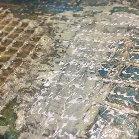
Here is what I was (am) hoping to be the last day of applications!  I took note from a part of Lay Mille's video and added some white scribbles using Golden High Flow Acrylic Titanium White paint in a Fineliner.


I also used some Golden Fluid Acrylic in Raw Umber in hopes of adding more emphasis on the scratches and areas of texture. 


The final application was to tone down the shininess of the piece.  For this I used a mix of Golden Soft Gel (Matte) and Golden Fluid Acrylic Iridescent Gold (Fine) and applied it with a brush first then tried to smooth it out with my Ranger Craft Squeegee. 


I did make sure the scribbles were totally dry before applying this final coat.  I used my Ranger Heat Tool and a little bit of my patience!


Here are a few close ups...


You can see already in the photos that the shininess is not as prominent and that makes me happy.  You know how I get with Shiny Objects...Squirrel!!


Here it is today, day six, fully dry and not near as shiny!  Am I happy with it? Not sure yet, not something I would normally do outside a journal.     


But will say I did learn a lot and will definitely try more like this.  I already have some cool ideas on how to do this on another substrate but not actually leaving the found objects in the piece.  I would like to do some using collage elements as well, I think that would be very interesting and possible not as time consuming!

If you lasted all the way through this very long post, thank you, hoping you enjoyed my trials and errors along the way and look forward to hearing your take on it too!

Until next time...hopefully not a long time...

That Other Neutral Triptych

  That Other Neutral Triptych wrapped canvases 10x10x1.5" (x3) professional grade artist materials I worked on this smaller series at ...