Here is the color palette...
 |
| Claudine Hellmuth Studio Paints |
Started with a freshly gesso'd page and then started layering on the colors with a palette knife.

to tone the brightness down (note my fan of bright colors), I started layering different lower tones, but found the best thing to use was my Tim Holtz Distress Stain Old Paper. Worked perfectly. Then I started with some bubble wrap (plain first) and blotted it around the page where the paint was still wet and I could make some sort of a 'mess' with in. Then added small quantities of the smidge of blue paint on the bubble wrap and dabbed it here and there. Then did the same with the pastel yellow.

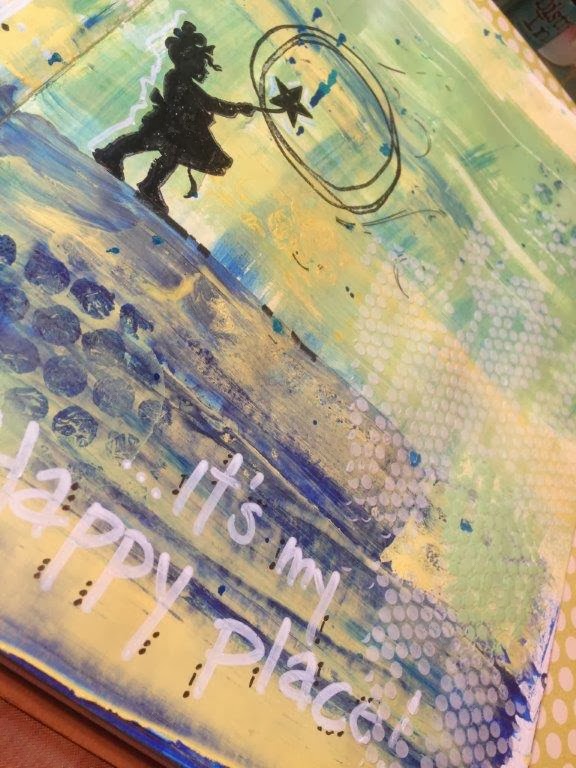
Above: I added a stamped image (Jenni Bowlin Whimsey Silhouette) using my Ranger Ink Archival Ink Jet Black. Then I used my Claudine Hellmuth Creative Layers Stamp Bloom to circle the star and act as my 'bubble'. I added more 'bubbles' but this time I used a Crafter's Workshop 12x12 Template #361 (Tiny Circles) and applied texture with light molding paste then added more with mixing the modeling paste and the landscape green paint.
Below: I added my phrase "Please don't burst my... It's my Happy place!" The drops are from me using some of my Smooch Spritz's I believe in Sea Breeze. I literally flipped my journal upright and started banging it on the desk top to make it drip. Love it, almost like rain drops.


I added a few bits of rub ons...

looked at it, didn't like it...walked away for five minutes and went to look at a few blogs....

Came back and right away knew I needed to add the black around the edges (using my black gelato) and then wet my finger and smudged away! Wanted to be almost like the black cloud that sometimes follows us, go away!

here are some more shots...


Thought the letters needed to stand out some more, so added a few dots and dashes around the letters to help them pop just a little.

Not sure that it is totally done yet, but that is the joy of the journal, come and go as you (that being me) please. It is for you and you to critique and enjoy.

Thanks for stopping by....


No comments:
Post a Comment