Showing posts with label claudine hellmuth. Show all posts

Saturday, February 8, 2014

Journal52 #3

Well I have been working on this page on an off for the week, do not think I am totally finished with it yet, but that is the glory of this type of creativity - you can walk away at any time and choose to come back at any time...it just doesn't matter!

Here goes... My color palette:


Trying real hard to get that perfect red...getting there, think I used just about every shade of red I had in my arsenal (even added some Red Pepper Alcohol ink to get the richness I was after).  I think what is bothering me the most is that the black atound the heart is simply too thick for my liking.  Of well...I'll survive! 


Here I attempted to use black gesso on a intricate damask stencil...not a great turn out (close up anyway)...but it will have to do!


Below - thought it was about time I added some 'paper' to my journal...it's been a while since I have been on a paint kick for a while!  The pages are from Glitz Designs, Color Me Happy Paper Layers. Added some Feathered Peacock Distress Ink Re-Inker and then sprayed with some water to dilute and spread.  There is also a bit of Squeezed Lemonade Distress Ink Re-Inker on there as well.  Paper edges were distressed and then inked using (you guessed it) Tim Holtz Distress Ink Gathered Twigs!

You will also see that I added a stencil - Donna Downey's Prima Turkish Grunge.  I used Liquitex's Modeling Paste (very heavy & thick) mixed with black paint...must say, not may favorite application for an art journal page.  But am now reading that I can sand it...hmmmm!

The circles you are seeing are simply the lid from the Distress Paints dipped in it's own color (in this case, fired brick).


Here are a few more close up after some water was added to make a 'mess'!


notice what I emphasized on the page?


as it stands now....


This is where I got the inspiration for this page.

thanks for stopping by!

Friday, January 31, 2014

Journal52 - #2!

Yay, twice in one week!  The prompt for week 2 was "A Simple Place" - well, needless to say, I took a tad bit of creative licensing on this one...

Here is the color palette...

Claudine Hellmuth Studio Paints
Started with a freshly gesso'd page and then started layering on the colors with a palette knife.


to tone the brightness down (note my fan of bright colors), I started layering different lower tones, but found the best thing to use was my Tim Holtz Distress Stain Old Paper.  Worked perfectly.  Then I started with some bubble wrap (plain first) and blotted it around the page where the paint was still wet and I could make some sort of a 'mess' with in.  Then added small quantities of the smidge of blue paint on the bubble wrap and dabbed it here and there.  Then did the same with the pastel yellow. 


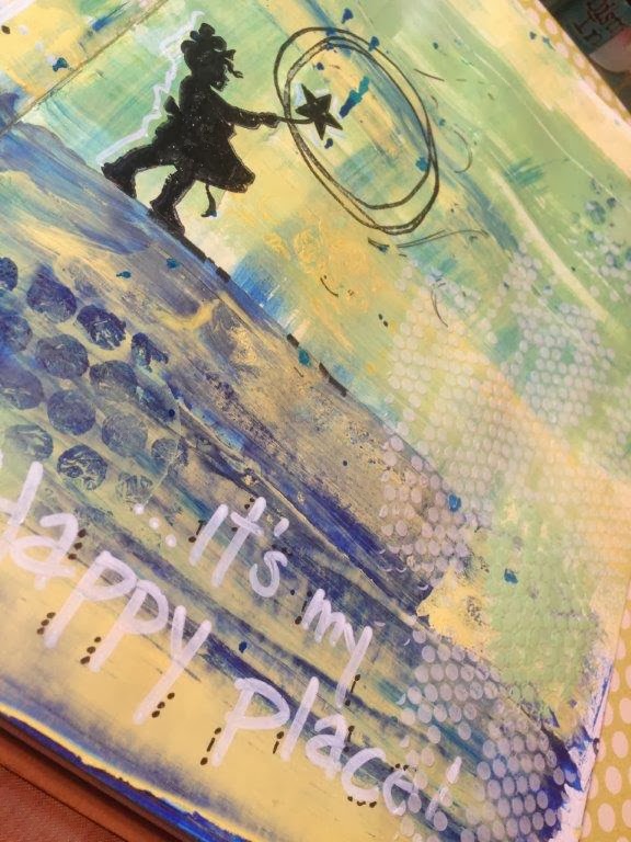
Above: I added a stamped image (Jenni Bowlin Whimsey Silhouette) using my Ranger Ink Archival Ink Jet Black.  Then I used my Claudine Hellmuth Creative Layers Stamp Bloom to circle the star and act as my 'bubble'. I added more 'bubbles' but this time I used a Crafter's Workshop 12x12 Template #361 (Tiny Circles) and applied texture with light molding paste then added more with mixing the modeling paste and the landscape green paint.

Below: I added my phrase "Please don't burst my... It's my Happy place!"  The drops are from me using some of my Smooch Spritz's I believe in Sea Breeze.  I literally flipped my journal upright and started banging it on the desk top to make it drip.  Love it, almost like rain drops.


I added a few bits of rub ons... 


looked at it, didn't like it...walked away for five minutes and went to look at a few blogs....


Came back and right away knew I needed to add the black around the edges (using my black gelato) and then wet my finger and smudged away!  Wanted to be almost like the black cloud that sometimes follows us, go away!


here are some more shots...


Thought the letters needed to stand out some more, so added a few dots and dashes around the letters to help them pop just a little.


Not sure that it is totally done yet, but that is the joy of  the journal, come and go as you (that being me) please.  It is for you and you to critique and enjoy.


Thanks for stopping by....

Monday, January 27, 2014

Journal52

I know I have been a tad 'm.i.a' lately, but as most of you know, January is simply my busiest month behind the scenes.  It is my year end and CHA - can't get much worse.

To add to my busy schedule, what do I do...take a few classes!  One on the go right now is Journal52 - a Facebook Group hosted by Chelle Stein (www.journal52.com).  I feel bad that I am so far behind (they are on week 4 already), but I will catch up, we simply cannot rush creativity now can we?!

Well, here we go, some more shots of the art journal page....

Using my Dyan Reaveley Creative Journal I prep'd it using Claudine Hellmuth's Studio Gesso allowed it to dry (okay, probably not as long as I should have), then randomly dripped Tim Holtz Distress ReInkers in Peacock Feathers, Squeezed Lemonade and Old Paper. Used my Ranger Ink Craft Scraper to spread out the drips (in an upward motion)! Of ourse used my Ranger Mini Mister filled with water to make it do what I thought it should do.


Here I added a bit of texture using my Crafter's Workshop Chunky Chevron Template and Liquitex Light Modeling Paste (then should have waited longer to dry, but didn't - I'm impatient that way - but still turned out cool).


This is the 'flip side' of the template, using up the excess paste that was on the top (used on right hand side of page).


Added bits and pieces of some older Prima rub ons and a lot of paints from Claudine Hellmuth Studio Line including Yellow Pastel, Classic Teal, and Black Gesso.  The stamped image is from Kaisercraft Textured Clear Stamps series.


The drips are from Heidi Swapp Color Shine - Black Velvet; stamped letters are from a set of my via Cocoa Daisy Stamp of the Month set, stamped using Ranger Ink Archival Jet Black Ink Pad of course.


This little number is from Splash of Color Collage Sheet Vintage Girls.  Cut her out and slapped her on using Ranger Ink Claudine Hellmuth's Multi Medium (a fav of mine and of course a must have). 


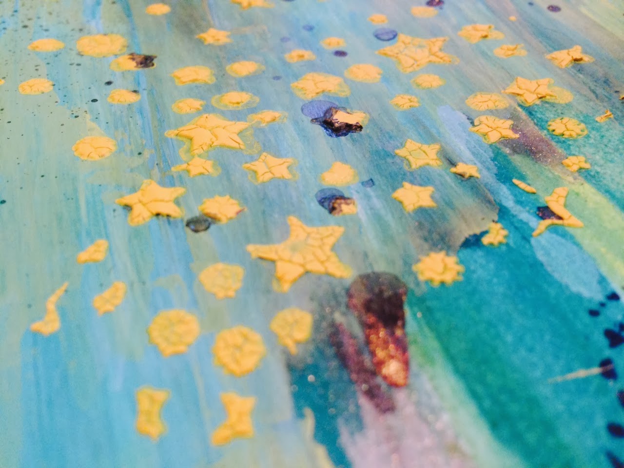
Below is a fun one I like doing - using Tim Holtz Distress Crackle Paints and stencils/templates.  The color I used here was Mustard Seed (yellow is obviously a favorite of mine as you will see) and the stencil was a Studio Calico Huey's Mask Star Pattern.  Love how it always turns out!


Here are some of the final results, I added Faber Castell Gelato's to the modeling pastes and the the outside edges of the page(s). Hard to see, but on the right hand side in the long smudge of teal, I scribbled with my Faber Castell White Pitt Marker (love love love).


Thanks for popping by and checking me out.  Head over to the shop to see what you too can get your hands on or join me on facebook and see what is happening there (be sure to like W2 Scrapbooking while you are there)!  See you again soon...I hope!

That Other Neutral Triptych

  That Other Neutral Triptych wrapped canvases 10x10x1.5" (x3) professional grade artist materials I worked on this smaller series at ...