Showing posts with label tim holtz. Show all posts

Thursday, November 9, 2017

A weekend of Inspiration & Creativity!

This past weekend was my semi annual getaway with my girlfriends - we have been doing this since 2012!  Twice a year we go to a place called Bittern Lake Lodge.  It is 'short' 3.5 hour drive away, but once we are all there...it travel is quickly never a big deal anymore.  And let's face it...living in Alberta (or Canada for that matter), distance is never a big issue as we all seem to to have to travel some sort of distance to get anywhere!

There are 14 of us that get together and the group can change slightly from time to time due to other commitments with some of our regulars.  But we always have a lot of fun and always look forward to the next time we get together.

This time around I really wanted to focus on one (okay, maybe two) projects.  I really edited what I was going to bring and still didn't use it all!  One day I will learn (not).

Here is a run down of what I worked on along with a few scenic shots (at the end)...


I decided to work on the Rae Missigman Scribblepedia class that I signed up for at Jeanne Oliver.  I will not go into too much details as this is a paid class and of course that would be just wrong!

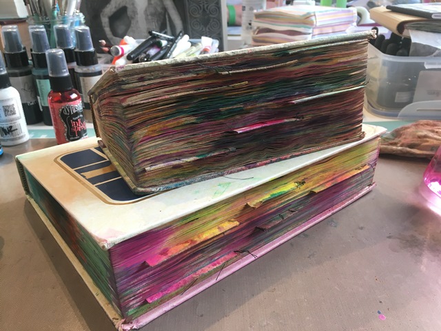
After completing my altering of my books (I created two, one in an old Readers Digest and the other an old Encyclopedia), I began to ink it up!


Love how big it is getting with the addtion of moisture to the pages!  Some don't like this part...I LOVE it!


I used a variety of wet mediums - Dylusion Spray Inks, Jane Davenport Mermaid Markers, Dylusions Paints, Dina Wakley Heavy Body Paints, Tim Holtz Distress Crayons, FW Acrylics, Lindy's and just about anything else I could come across that I could add color to my pages!


Just look at all this color - a book full of bright, vibrant and fun color! 


I even tried manipulating the inks with my keycard to see if I could bet different designs on my pages! Why not?!


Didn't work as good as I would have liked.  But I did learn that I should have done one side at a time and then it would be way better! Live and learn!!


I am getting so excited with the look here! The colors are so bringing me joy - I do realize now that I will have to figure out some sort of closure eventually!!


Here I am doing the same thing but now in my encyclopedia.  I did notice that the sprays reacted very differently on these pages verses the (really) old book.  I was totally okay with it though.  I quickly discovered which paints and inks worked best - in this case, the FW Acrylic Inks and all of the paints.  The Spray inks I really have to work with, but you can see in some of the images that they worked out really good...


...that was due to me NOT adding the spritz of water!


Now it was time for me to move into one of my upcycled journals you saw me create in a previous post.  This particular one is the Sunrise Sunset one (see it here).

Used loads of Stencil Girl Products stencils and Dylusions paints.  For this particular one, I used the new Dylusions paint release (fall 2017).  I will list the stencils used under each photo.


As I added more colors, I added more stencils.  Important to note that in the way I use stencils I often use the same one for several colors and layers.  I simply keep moving, flipping, turning, and what ever else I think will make a difference...as I proceed on my page.


Time for yet another stencil...


More layers of paint and stencils...

StencilGirl Products M109 & S200


Now the addition of a few scribbles using waxed crayons.
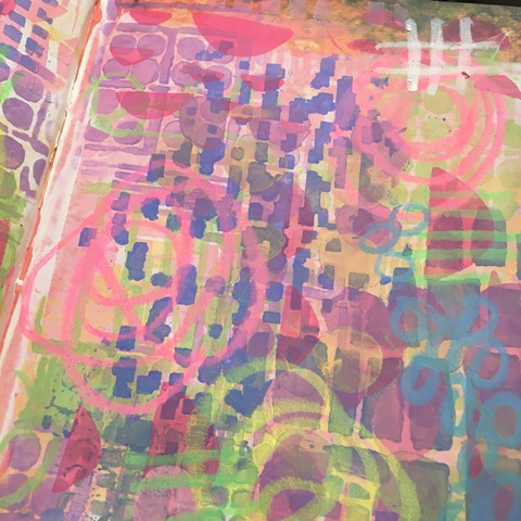


StencilGirl Products M046, M103

and more doodles with the AC Chalk Crayons.


Onto my next page, having a blast with the Dylusions paints, this time onto the original 2015 release colors! 

StencilGirl Products M108, S378

StencilGirl Products M105, M092, M080
Along with the stencils used in the above image, I also used my brush to create marks and some of my very old American Crafts Chalk Crayons (which are basically the same as Tim Holtz's Distress Crayons).

StencilGirl Products S424, S506, M109, S503

This next one I seriously forgot to take pictures along the way!  I was having so much fun and was on a roll...

I used the Dylusions January 2017 release colors and of course more StencilGirl Products stencils (the white scribbles are using the Sakura Gelly Roll White Pen)! 

StencilGirl Products S503

Additional color scribbles are my American Crafts Chalk Crayons.

StencilGirl Products M080

Really like how this page turned out!!


On that, I will sign off for today as to not keep you here too long!  There are more pages to come tomorrow, hope to see you then.

But first, as promised...here are a couple pictures of us all creating away!


See you tomorrow...

Don't forget to keep an eye on my Instagram and Facebook accounts (and I'd love it if you would follow along) as I tend to post there more often (just not as much detail)!

Most products are linked to my online store W2 Scrapbooking & Mixed Media Art Studio and if I don't carry it, I will often link to where you can find it.

until next time...

Thursday, September 1, 2016

Just a little MORE Summer Inspiration!

Are you tired of me yet?

I only have a few more to share with you, then  promise to leave you alone for a bit!

During my visit with Catie, a large shipment arrived to the shop - all the new Donna Downey Studios newest stencil release, Artistry Series!  Needless to say, I pulled a few to start playing with (yesterdays Iris one also one of them).

I once again pulled out my 6x12" homemade journal (made similar to the Donna Downey Inspiraton Wednesday Journal format ).  I roughly prepped a two page spread including the insert with Black Gesso.


Once it was dry, I pulled out the Cone Flower stencil.  I wanted to try two different paints to see how they would look on the black gesso'd base.  The first one was using Dina Wakley Media Heavy Body Paint in Fuchsia.  I used this on the petals, then used a mix of Elephant and Evergreen (obviously more Elephant) for the 'cone.'  The stem I used DecoArt Media Fluid Acrylic Interference Green.


The next one, I used everything the same except for the petals in which I used DecoArt (Americana Decor) Chalky Finish Paint in Inheritance (yellow).


Sadly, this is where these are still sitting - thinking I might want to doodle/scribble on them, but really do not want to do too much more on them.  I know they are 'flat' and could use some depth...but I am still working on that part of my painting.  I will get there one day...just not today!

INSERT IMPORTANT INSPIRATION NOTICE:  If you haven't been following along with Donna Downey (Facebook, Blog, Instagram), she had a phenomenal segment called Stencil Mania going on for the full month of August.  She had six designers/artists each do a set number of videos using certain stencils from this new release (there were 17 new stencils released in July).  Head over to her Blog or YouTube channel for all the inspiration and sharing!


This next was one I was attempting to actually do using prompts from one of the Weekend Junkets (#16 I believe).

I used my moleskine/canson sketchbook journal and prepped the page with a good coat of white gesso.  I took out a sheet of Kaisercraft printed paper from the Base Coat Series, this one was called Redwood. As I started tearing the sheet I got an idea of using the Tim Holtz Layering Stencil Woodgrain (THS023).


I decided to use some Super Heavy Gesso as I had an idea that I thought would be really cool...

I moved the stencil around the two page spread, overlapping where I could and trying to leave the center open where the torn paper would eventually go.


I adhered the paper down using gel medium, being sure to leave the torn edges exposed where I could.  Is it just me or does the paper not look like bacon?


K, now this is where the page goes a tad south....

I sprayed a mix of Stencil1 Ink Sprays and Lindy's.  I used mostly Stencil1 as they are way more potent and maintain their colors much better when dry.  


Can you say...blood bath?! Ugh, Ick, Yuck...take your pick!


Super Heavy Gesso to the rescue!


I made sure I put on a good coat, but also scraped along the previous stencil markings in hope to get more texture. 


Now I thought I might try an Ombre look, so out came the Heavy Body Acrylics.  Using my palette knife, I scraped on layer roughly of Liquitex Heavy Body Acrylic in Cadium Yellow Medium Hue.  Had to let it dry an hour or so at this point. 


Next came Dina Wakley's Heavy Body in Cheddar.  I repeated the same step as above.


Finally came the last color, DecoArt Media Fluid Acrylic in Burnt Umber.  I did not have a heavy body, so I simply mixed the fluid acrylic with some heavy gel medium.  Again, applied using my palette knife.


As usual, I am not happy with it, so a coat of Golden Absorbent Ground has since been applied to this page.  Beginning to sound like a bad habit isn't it?! More staining to come on this one!


Time for some fun! This next one was totally inspired by Denise Alloca's video from Donna's Stencil Mania.  I had some serious fun with it!

As usual, I pulled out my Dina Wakley Media Heavy Body Paints (simply my FAVORITE when printmaking).  As you can see I used a variety of 'pinks' (which seems to becoming a 'bad' habit of mine), Fucshia, Balckverry Violet and Magenta.  Spread it out using my brayer on the gelli plate.


First I laid out the Iris stencil then simply laid a sheet of white cardstock over top and burnished it with me hand.  If are not concerned with getting paint from your brayer (if you haven't cleaned it of in other words), you can use it...


I find I can often get two and even sometimes three images off one application of Dina paints on my gelli plate.  In this case, I just did two as I wanted the postive and negative image.  To get the negative, pull off the stencil then put a fresh sheet down, burnish.  Peel it back and look at your masterpiece!


Now I thought I might try something a bit different and use a single color and layer it onto an already printed image.  This is where it tends to get tricky as you need to somewhat line up the image and the stencil.  I did not want a perfect image, so having it offset was perfect.


Now I wanted to go even a step further, let's try a different stencil (or two)!  I chose to use Dina's Gilt (Gold) paint this time and Love LOve LOVE how it came about.

additional stencils used: Create Truth and Scribble Script, 


You can see in this photo how I sometimes only used PART of the stencil.  Masked off sections for certain transfers.  It was a blast as you can see.


That's it for today!  Don't forget tomorrow is the next round of  Weekend Junket!


That Other Neutral Triptych

  That Other Neutral Triptych wrapped canvases 10x10x1.5" (x3) professional grade artist materials I worked on this smaller series at ...