Showing posts with label online class. Show all posts

Wednesday, November 15, 2017

Just add Color!

In today's post I'll share a few of my pages I have been working on while partaking in Kiala Givehand's "Hacking the Color Wheel."

If you have followed me for a while, you would have heard me talk about Kiala before (remember the Inspiration Decks?).  Anyhoo... I decided to take part in this class as we all know I have an affliction for color. If there is something out there to learn about it, I want to learn it!  So far I haven't had the chance to do all the lessons, but I have singled out a few that I really enjoyed.

As this is a paid for class, I can't share too much, but I will share the instructor's website link and my thoughts on the actual lesson that I have done (or still working on).

Here are a some peeks at them...

Emily Mitchell's Color Weaving


Colors used: Golden Heavy Body Ultramarine Blue, Golden Fluid Acrylic Burnt Sienna, Liquitex Heavy Body Titanium White; Golden Glazing Liquid Satin Finish.

The basic idea of this piece was to work with color to push and pull your colors on your substrate.  By this, she means the use of color AND mediums.  By pushing in and pulling back your colors, she achieves what she calls 'color weaving'.  Understanding your mediums, helps with this process.  If you go to the manufacturer's sites, they are loaded with information to help you figure it all out.  If there is something you still don't understand, fire them an email - they are always so helpful.

Emily's medium of choice is Liquitex Glazing Liquid.  She blends this with her paints when she wants to get the transparency of colors that will then allow for the reveal of the under painting.  It creates depth and yet luminosity to your piece. 

Tipster: it (glazing liquid) does tend to speed up the drying time, so if you are wanting to extend this, you will have to add another medium - Liquitex Slo-Dri or Golden's Open Medium.

Here's how I got started:


This image shows the difference between paint mixed with glazing liquid (L) and straight up paint (R). It is very obvious the difference and you can see how it will produce depth in your art. 


I didn't take a lot of pictures along the way, I started applying with my brush but quickly wnet to my fingers.  Blending with the Glazing Liquid is awesome!


You can see marks within the image shown; these were done with bubble wrap, dowel and my paint brush or finger.


Here is how it stands now.  There is still so much to do on this one - I have some great ideas on taking to the next level, having said that, I do quite enjoy where it is right now, and may very well leave it there and start this format on a larger substrate (wood or canvas)! 


One important note I did take from this lesson was the comment of  "intentional art verse intuitive art."  This is something we all should think (or not think) of while we are painting....in other words....JUST PAINT!

Mary Nasser's Mixed-Media Stenciling Techniques & Color Schemes


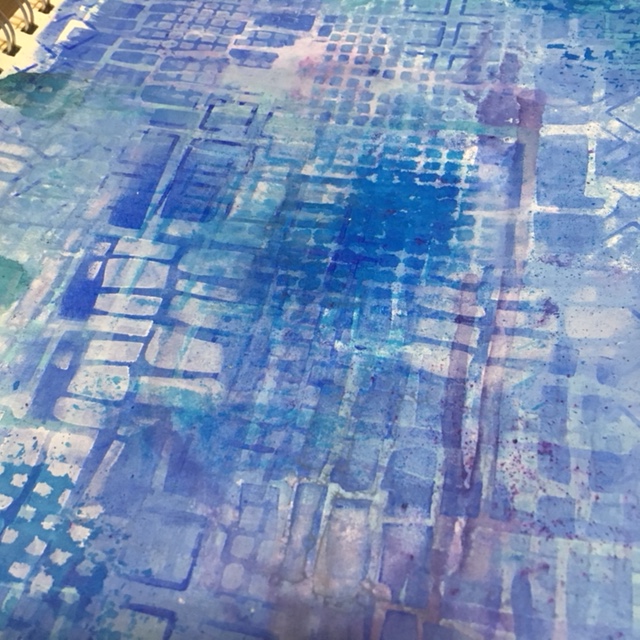
Paints used: Dina Wakley Media Lapis, Sky, Ocean,; Golden Heavy Body Ultramarine Blue, Liquitex Heavy Body Titanium White, Decoart Media Tinting Base, White Gesso, Ken Oliver Color Burst, Ranger Alcohol Ink, FW Acrylic Indigo Ink, Dylusions Ink Spray.

This one was a fun one, Mary's style is very similar to mine - where as she is not afraid to try different colors and mediums on the same piece.  She also uses a ton of stencils (she designs for StencilGirl Products).  I didn't take very many photos along the way as I was really on a roll and having a blast!

As you can see from my color listing below the image above, I used a lot of variety.  I simply just started pulling anything that was liquid and was blue!  Having thought back I could have used some more paints (Tim Holtz, Decoart Media, Prima, etc) and also use some more liquids (distress stains/sprays, Lindy's, Prima, Studio Calico), you get it - just start pulling out of your stash!

I simply started creating layers with the stencils, doing my usual flip, flop, turn, move and manipulate the stencils all over the page.  I tried to keep with a 'square' them on the page and used the following stencils from StencilGirl Products - S505, S414, S374, S375.

TIPSTER: When layering your stencils, be sure to not only change the colors (light to dark), but when moving, flipping, flopping them around, there is actually a method to my madness! Always look for white space (not necessarily literal) to add the next layer of color.

As you peruse the images below, you can see how I accomplished this.  You will also not that I tend to add white to my pages along the way to either brighten or tone down an area.  I used Decoart Media Tinting Base a lot on this page.  I really like using it as it tints the color without actually loosing the pigment of the color and depending on how much you use, can make your color opaque.




It was a fun lesson that allowed you to PLAY!  She encouraged you to just try.  That is something I encourage all the time - what is the worst that can happen?  You start another page/canvas/board.  It is JUST PAINT...so JUST PAINT!


Kiala Givehand

This next one was a live session with Kiala where we talked about color and how they made you feel.  I am not really a color feel like of person to that depth (ie meaning behind the colors you choose), I am the person that just grabs a color and paints. There probably is a meaning behind it, but I just want to paint.

She started us off using watercolors on our page... (sorry no pictures).  I was not overly impressed with the base, so I decided to paint over it.  I pulled out my Liquitex Heavy Body Titanium White Paint as I find it gets some of the best coverage.  Having said that, the lesson from Emily popped into my head and so I decided to bring in the Glazing Liquid into play here!

The different shades of color you are seeing are actually the mix of the glazing liquid with the white so you are able to see the under painting.  I wiped and added, wiped and added again; pulled out a couple stencils S375 & S505 - wiped an added yet again.  Then I wanted to add some black, so I used Charcoal Vines (dipped in water) to get mark making effect I was after.


These last two photos I decided to edit on my phone to show you how a simple click of a button you can change the perspective and perception of an image.

These are the same photo, I just edited them both with filters.  One was enhanced using  the Instagram filter  Lo-Fi; the next is zoomed. cropped and filtered to black & white on the iPhone Photos editing tool - Noir.


The pop of color and and the depth that one gets from these is very interesting to me. Perspective and perception are interchangeable, especially in art. Using 'words' in art is an interesting concept. 

Ones perspective can change ones perception and perception can change ones perspective.  Just a little thing to think about next time you look at your own work or even someone else's.


Don't forget to keep an eye on my Instagram and Facebook accounts (and I'd love it if you would follow along) as I tend to post there more often (just not as much detail)!

Most products are linked to my online store W2 Scrapbooking & Mixed Media Art Studio and if I don't carry it, I will often link to where you can find it.

....until next time.

Friday, June 17, 2016

21 Secrets - Tools & Techniques

I am taking part on an online workshop put on by Dirty Footprints Studio trying to challenge myself with doing different techniques.  Some have challenged me and others I just can't seem to get into (yet).  That is the great thing with with (most) online workshops - they offer lifetime access.  Now understand lifetime access means lifetime of the site!  If they shut down the site/business you too lose out on the information - unless, they offer downloadable content. Now having said that, you need to have the space available to do it too.  I have external hard drives for my online courses for that reason.  Makes life so much easier.  Then I can simply go through it as I wish when I wish.

I also like it when they have downloadable PDF's.  As I don't know about you, but I am continually making notes on classes and it is a great help if there is content to relate back too.  I have several presentation binders that I have printed of the course material and info and they are my go to when I am researching info or simply inspiration.  One day I will do a post on that, but for now - let's get to the the class I did recently that was part of the 21 Secrets Tools & Techniques.

Note: as this is a paid for class, I will not go into too much detail as that would be very disrespectful to Dirty Footprints and the instructor.

This class was taught by France Papillon and called Tango with Tengucho.  If you have been part of the scrapbooking/mixed media/art journal world for any length of time, you should have heard of France - she is one talented lady and is oozing with inspiration. She is in Belgium.  The first time I came upon her talent was via the Mixed Media Place and Art from the Heart blogs many many years ago.

Any hoo, be sure to search her out - she will no doubt inspire you as well.

The product she was showcasing was called Tengucho.  Now I don't now about you, but I had to go on a few hours internet search for find out what exactly with even was.  From what I have found (aside that I can't find it here in Canada), was that it is a man made.


Tengucho Paper
For centuries, handmade Tengucho (or Tengujo) was made in Japan out of Kozo fiber and known for its transparency & flexibility in uses. Machine made Tengucho paper have now replaced most Tengucho production, and is especially sought for conservation & repair, collage, and more. 
via Hiromi Paper Inc.

After several hours of searching and trying to see if there was anything 'similar' out there to it, I decided that dry sheets were the closest I could come up with or maybe interfacing.  Is it the same? I simply have no idea, but they look the same! So hey, why not try it out!!  I had found a post on a lady using dryer sheets for something else I thought what was the worst that could happen?  Knowing that I have allergies (and scents being a large one), I washed them again after they had been used.  Yes, even though they are already unscented ones!

I will showcase the two pages I did using this product, but there are many more uses for this product.

I chose to use color my sheets using Lindy's Stamp Gang's Flat Fabios Neon Graffitti.  I sprayed my non stick craft mat with three colors and then then spritzed with water and dropped the sheets onto the mat and mushed away.  I let them dry fully before adhering to my journal.  I did not prep my journal (I used my Canson Spiral Bound Mixed Media Journal) in any way as it was simply going to get adhered down with Matte Medium.  I only did one sheet (9x12).  One thing that I thought was interesting was how the colors really popped once the matte medium was applied and stayed even after it dried.  The texture is very cool.  I went an extra step and put a stencil over top and laid out some Super Heavy Gesso through it. Loved it!


I came up with a very cool idea (or so I thought) as I was laying it down onto the paper.  Wonder what kind of texture I could get it if I was to start with a textured page first!  So I pulled out my homemade 6x12" journal and used Light Modeling Paste through a Dyan Reavely Dylusions Stencil called Flower Medley.  I laid it on both sides as I wanted to try it two different ways. 


Once fully dry, I spritzed it heavily with water then dripped on some of my Daler Rowney Acrylic Inks (Paynes Grey and Flame Orange.


These needed to dry fully before I could go onto next step.  I first wanted to adhere down untreated (colored) over top of this side that was already colored.  Then I wanted to put a colored sheet over top of the plain modeling paste page and simply see what the difference would be. 


I used the same color combo on the sheet to be applied to the opposite page.


I should have had my first clue with how the colors turned out on the sheet.  Very dark and muddy!  I decided to cut up the sheet and adhere it down that way hoping it would show even more texture.


Ya, not so much! No matter how close I get with the camera, you still can't see the 'texture' underneath.  Thinking that I if had stuck to the lighter colors I had used before, I might have had better success.


So not wanting to ruin another page, I decided to simply put a deli sheet down over the pre-color page.  Better, but still not happy with it.  


Really not sure what to do here, so for now...
Lived it , didn't love it, learned from it, moving on from it.

Remember, this was totally my idea, nothing to do with the class!  I find that many classes allow me to expand on their thought and therefore inspire me...sometimes it works, sometimes not so much!

Have a great weekend!

Friday, May 20, 2016

Friday Inspiration

Finally getting back into the swing of things, this cold really took it's toll on me aside from the daily grinds of life.  All is good in my world and I took time to get creative and work on some classes and just play.

I pulled out a class I signed up for over a month ago called 21 Secrets.  I really wanted something that I thought would be out of my usual realm of creativity and comfort.  I picked a doozer!

Without going into too much detail on the class itself, let's just say printing off pictures of yourself and putting them into a journal...ya, uncomfortable.  I am not used to being the center of attention.  But I will say, I thoroughly enjoyed it once I got going.

I started out in one of my Canson/Moleskine Sketch Journal and added a dictionary page to each side using Matte Medium.  Once that was done I applied some black and white images of myself again using Matte Medium in a collage style.


Once it was all dry, I used my All Stabilo pencil and (sketched) traced out the images 


Then I started to color block with some bright colors - here I decided on Prima's Finnabair Art Alchemy Metallique Paints in Rich Turquoise, Dark Velvet, Fresh Orange and Lime Peel. 


I was finding it just too bright (and shiny), so added Black Gesso in some of the blocks as well as adding some lines to break it up. 


Next, I pulled out some Faber Castell Stamper's Big Brush Pens to start coloring some of the photos


For my hair, I also added the Finnabair Art Alchemy Fresh Orange paint along with the Stamper's Big Brush Pens.


I added some doodling with the Fineline Applicator in Black.  The white doodling is a Liquitex Paint Pen.


Here is the finished spread.  So different from what I usually do, but must say a nice change and really enjoyed trying something a little different. 


The next one fro the 21 Secrets I worked on was one encouraging to open up and revisit classes you have not either finished or even looked at (yes, kind of funny)!  We are all guilty of it, I am no exception.

I used some stickers from my stash  (Heidi Swapp in this case) and built the page filled with words and thoughts that transcended from my feeling about the courses. The next part of the class, I did not take photos.  I had written out many thoughts, frustrations and feelings about classes in general and then decided to gesso over the entire process (aside from the sticker words I had put down).


Then of course I had to add some more color and thoughts on top.  This time I used either my Liquitex Paint Markers or Sharpie Chalk Markers to finish it up. Very happy with the results as again, this is something very different than I would normally do. 


To find out more about this class, please visit Dirty Footprints Studio here.

As many of you know, I have an issue with stencils...I can't get enough of them!! I have several favorite lines, but will say my biggest weakness are Stencil Girl Products.  I found them by chance a couple years ago when I was surfing Instagram and saw some really cool images by Traci Bautista (@treicdesigns) and then of course the search was on.  Once I  found out who the company was, I tried to get them in the shop but unfortunately, they are not selling to online shops at this time (bummer).  But as you can see, it hasn't stopped me from buying them!  I choose to buy directly from them as shipping is very reasonable and if you buy six (do not have to be the same, just same size), you get a 10% discount...which ends up paying for the shipping!


Needless to say, I needed to play with one last night!  I had a black gesso'd page already, so I decided to put a layer of DecoArt Media Cobalt Teal Hue Fluid Acrylic Paint.  Let it sit for about 30 seconds (yes, I am that impatient), and put the stencil down!


Took my baby wipes and started randomly wiping away the teal.  This stencil is the Maltese Mix 9x12" stencil.  


Usually I wait longer for the top coat to dry as I find otherwise you tend you peal off the layers of paint (they stick to the stencil).  In this case I am okay with it, works with what I am going for.  I repeated on the other page, flipping the stencil so it wasn't quite the same pattern.


This is how it stands right now.  I am hoping to get back at it today along with another 'secret' from the 21 Secrets Workshop.  It is still hot here, no rain, wind blowing towards the forest fires so no smoke for a change - may be a good afternoon to hit the deck and read one of those classes!!

Have a great May Long...stay safe!

That Other Neutral Triptych

  That Other Neutral Triptych wrapped canvases 10x10x1.5" (x3) professional grade artist materials I worked on this smaller series at ...