Showing posts with label daler rowney. Show all posts

Sunday, April 29, 2018

Sunday Inspiration

2018 has been a challenging year for me so far - so much going on behind the scenes that have really limited my time in the studio.  When I do get in however, I make the most of it!

I have not had much time to share here on my blog, so today I am taking a bit of time to share one of the pieces I did - I hope you enjoy!

Inspiration - Alcohol Inks

Playing with Ranger Alcohol Inks on Yupo paper isn't something I have done for a few years!   I had been taking an online workshop by Wendy Brightbill and this was something she was showcasing in her workshop.

I must say, it is always fun to delve back into something you haven't even looked at in three years!

In the first photo, you can see the colors I chose to use (Dandelion, Wild Plum, Aquamarine, Red Pepper and Pitch Black)


In the images that there is more 'flow' (vs seepage), that usually depicts that I have a good amount of Rubbing Alcohol down.


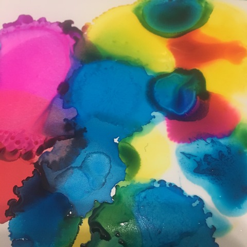
Here, I have dropped the Rubbing Alcohol directly onto the 'cells' in hopes of making some interesting visual textures. Really like how they look when wet, but they often dry with a smoother look, which you will be able to notice further into this post.


Now that this layer is dry, I have decided to add another layer on - Daler Rowney F+W Acrylic Inks.

You have seen me use these many times in the past, but I had never used them along side my Alcohol Inks...fun results!

Colors used: Lemon Yellow, Turquoise, Process Magenta & Purple Lake


Yes, these are a fluid, but I even added more fluidity to them with the addition of water and/or rubbing alcohol!


When I get larger puddles. I will pull our a shaping tool and move the colors, puddles and rivers around.  Getting them to flow more, intersect and create yet more patterns and colors.


You can see in a few spots I tried to add a few marks - these were done using Alcohol Markers (Copic)


I introduced the White from F+W Acrylic Inks in hopes to lighten up the piece a bit.  I tried t make it so that it was diagonal in nature and therefore would draw your eye along the piece.


There was an area that was too dark in the top left, so I added white there as well.  Along with some water and forces the colors movement using my shaping tool.


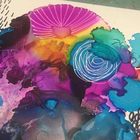
I love the close ups on this piece - they remind me of sliced geo stones. 


Now it was time for some mark making!  I varied my tools from Sakura Gel Pens [Souffle & Raised Ink (Clear)] along with Golden High Flow Acrylic in a FineLiner.


I found it once again getting too dark and even busy if you can imagine - so I added more water to the river that ran through it....

Yup, too much!  Sometimes this works to my advantage, other times not so much.  This time, I was not wanting this to happen.  


So how does one fix this?  Well in my case, I added even more fluids....


 Golden High Flow Acrylic Paints (Teal, Quinocridone Magenta, Hansa Yellow Medium and Naphthol Red Light) along with even more water of course!


Really was not happy at this point and was about to toss it.  You can see areas that I added more alcohol inks, paints, inks, water and even rubbing alcohol - UGH!


Gesso to the rescue! Super Heavy Gesso and a good amount of water!


 I walked away at this point, thinking it best to let it dry and decide at that time if I wanted to continue or simply move onto my next inspiration....

You can usually find me more often over on Instagram or one of my Facebook Pages W2 Scrapbooking Mixed Media & Art Studio (only until end of 2018 then it will be removed) or the newer W2 Studio Arts

Don't forget to check out the online store - there are loads of great deals to be had with this being the last year - stock is moving fast! Be sure to use the coupon codes, they can be found on the home page.

until next time...

Friday, November 11, 2016

Weekend Junket #23


#w2wj23

add character - write out the words to your favorite song on your page
product focus - acrylic inks
technique - cover words with transparent tissue papers or other fibrous papers

I don't know about you, but when I listen to music I do not usually actually 'listen' to the words.  I am more of a music (tune/melody) kinda girl.  I may sing along with it, but honestly I know I usually do not really comprehend what  the song is about let alone what the singer is actually singing at the time. The song I choose to write out this week did however catch a few lines that really stayed with me. There were many words and phrases I tend you use on myself and others. 

I often get a kick out of going to lyric sites and seeing what the words actually are. If I am still intrigued, I will go to YouTube and see if there is a video of it as often there are descriptions by the artist depicting what the song is actually about.

Have some fun with this one, go to your playlist and see what song you tend to listen to over and over again; one that has the highest play count on it; one that have amazing (or even tough) memories of.  Write it out - READ it, SING it - then take it to the next level...cover it up! Then add some color and brighten it up!

Here is a quick process of what I did...

In my handmade Urban Journal on a sheet of Ranger Inkssential Manila Cardstock, I wrote out the words to my song,


Next I took some of my Hazel + Ruby Tissue Paper (Quote Collage HR-TR345) tore off some random pieces and prepared to adhere it down using Gel Medium. As you can see from the photo, I also used a paper doily (why not)!


Once is was (kinda) dry, I doodled a few flowers onto it. Yes I know, I am a tad impatient.


Now it is still wet as I type this (because as usual, I am running behind).  I will need for it to dry now before I start on it with my Daler Rowney FW Acrylic Artist Inks. If I use them now, everything will just bleed.  So for now I wait!

On a positive note, I am writing this Thursday night, so technically, I'm ahead of the game!  Time will tell if I get to posting the next photo's before this blog post goes live.  If you see this, time was not on my side!

Have a great weekend - only one more Weekend Junket to come! See you for the last one November 25!

Friday, June 17, 2016

21 Secrets - Tools & Techniques

I am taking part on an online workshop put on by Dirty Footprints Studio trying to challenge myself with doing different techniques.  Some have challenged me and others I just can't seem to get into (yet).  That is the great thing with with (most) online workshops - they offer lifetime access.  Now understand lifetime access means lifetime of the site!  If they shut down the site/business you too lose out on the information - unless, they offer downloadable content. Now having said that, you need to have the space available to do it too.  I have external hard drives for my online courses for that reason.  Makes life so much easier.  Then I can simply go through it as I wish when I wish.

I also like it when they have downloadable PDF's.  As I don't know about you, but I am continually making notes on classes and it is a great help if there is content to relate back too.  I have several presentation binders that I have printed of the course material and info and they are my go to when I am researching info or simply inspiration.  One day I will do a post on that, but for now - let's get to the the class I did recently that was part of the 21 Secrets Tools & Techniques.

Note: as this is a paid for class, I will not go into too much detail as that would be very disrespectful to Dirty Footprints and the instructor.

This class was taught by France Papillon and called Tango with Tengucho.  If you have been part of the scrapbooking/mixed media/art journal world for any length of time, you should have heard of France - she is one talented lady and is oozing with inspiration. She is in Belgium.  The first time I came upon her talent was via the Mixed Media Place and Art from the Heart blogs many many years ago.

Any hoo, be sure to search her out - she will no doubt inspire you as well.

The product she was showcasing was called Tengucho.  Now I don't now about you, but I had to go on a few hours internet search for find out what exactly with even was.  From what I have found (aside that I can't find it here in Canada), was that it is a man made.


Tengucho Paper
For centuries, handmade Tengucho (or Tengujo) was made in Japan out of Kozo fiber and known for its transparency & flexibility in uses. Machine made Tengucho paper have now replaced most Tengucho production, and is especially sought for conservation & repair, collage, and more. 
via Hiromi Paper Inc.

After several hours of searching and trying to see if there was anything 'similar' out there to it, I decided that dry sheets were the closest I could come up with or maybe interfacing.  Is it the same? I simply have no idea, but they look the same! So hey, why not try it out!!  I had found a post on a lady using dryer sheets for something else I thought what was the worst that could happen?  Knowing that I have allergies (and scents being a large one), I washed them again after they had been used.  Yes, even though they are already unscented ones!

I will showcase the two pages I did using this product, but there are many more uses for this product.

I chose to use color my sheets using Lindy's Stamp Gang's Flat Fabios Neon Graffitti.  I sprayed my non stick craft mat with three colors and then then spritzed with water and dropped the sheets onto the mat and mushed away.  I let them dry fully before adhering to my journal.  I did not prep my journal (I used my Canson Spiral Bound Mixed Media Journal) in any way as it was simply going to get adhered down with Matte Medium.  I only did one sheet (9x12).  One thing that I thought was interesting was how the colors really popped once the matte medium was applied and stayed even after it dried.  The texture is very cool.  I went an extra step and put a stencil over top and laid out some Super Heavy Gesso through it. Loved it!


I came up with a very cool idea (or so I thought) as I was laying it down onto the paper.  Wonder what kind of texture I could get it if I was to start with a textured page first!  So I pulled out my homemade 6x12" journal and used Light Modeling Paste through a Dyan Reavely Dylusions Stencil called Flower Medley.  I laid it on both sides as I wanted to try it two different ways. 


Once fully dry, I spritzed it heavily with water then dripped on some of my Daler Rowney Acrylic Inks (Paynes Grey and Flame Orange.


These needed to dry fully before I could go onto next step.  I first wanted to adhere down untreated (colored) over top of this side that was already colored.  Then I wanted to put a colored sheet over top of the plain modeling paste page and simply see what the difference would be. 


I used the same color combo on the sheet to be applied to the opposite page.


I should have had my first clue with how the colors turned out on the sheet.  Very dark and muddy!  I decided to cut up the sheet and adhere it down that way hoping it would show even more texture.


Ya, not so much! No matter how close I get with the camera, you still can't see the 'texture' underneath.  Thinking that I if had stuck to the lighter colors I had used before, I might have had better success.


So not wanting to ruin another page, I decided to simply put a deli sheet down over the pre-color page.  Better, but still not happy with it.  


Really not sure what to do here, so for now...
Lived it , didn't love it, learned from it, moving on from it.

Remember, this was totally my idea, nothing to do with the class!  I find that many classes allow me to expand on their thought and therefore inspire me...sometimes it works, sometimes not so much!

Have a great weekend!

That Other Neutral Triptych

  That Other Neutral Triptych wrapped canvases 10x10x1.5" (x3) professional grade artist materials I worked on this smaller series at ...