Showing posts with label decoart media. Show all posts

Monday, May 14, 2018

My Weekend Getaway - Part 1

Twice a year I get together with some girlfriends and we get artsy! This past winter has been a tough one for many of us and this time around many of us didn't get as much done as in previous getaways - but that is okay - we all left feeling good and rested.

I had ONE really productive day and the others were little bits here and there, but more just resting the brain and taking time for friends.

Here is what I worked on:


Foo Fighters Canvas

I started off working a trial piece my some asked for - a Foo Fighters canvas painted by me for his birthday (which was in February, oops).  

I did the trial version on an 11x14" canvas. I painted the base in a mix of DecoArt Media paints in Titan Buff, Bone Black, Titanium White and Medium Grey Value 6 Fluid Acrylics.  The brunt of the images on the piece is using layered image transfers.  I wanted a worn look and this was the best way I knew how to get the look fast.

The base are lyrics from a few of his favorite songs, then I added the Foo Fighters logo then the name in print.  As you can see I made sure I allowed for extra peeling as I did not want a perfect transfer, and where I did get it too good, I peeled or rubbed it off (even tore it).


Once it was totally dry, I went over it with paint to brighten up and cover up where I wanted imperfections.

This is how it stands now -he is more than happy with it ans says he'll take it as is - me being who I am, says nope...have to wait for the real piece!  Next one will be done on a 16x40" Gallery Wrapped Canvas...eek).


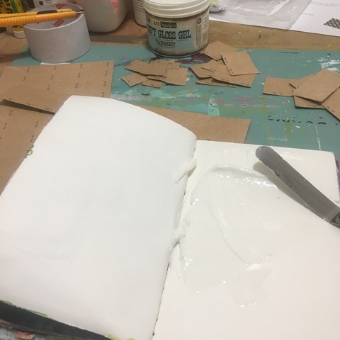
 I had signed up for this class thinking I would have time to do it 'live' - ya, nope! So I grabbed a few of my paper stashes and thought I would create the base of the journal while at my getaway.  Typical me, I go off on my own - not really following the videos (heck, haven't even watched most of them), but thought I would use this opportunity to use a bunch of my found papers along with papers from my stash of Flow magazines & books!

I simply gutted the book, and used the shell as my cover and added homemade signatures that were created with a boat load of  papers as mentioned above.  I used the five stitch binding to attach them to my cover.  As I was digging through my stash, I came across the packing tape from an order from Roben-Marie's shop a year or so ago and thought it was a perfect addition to the spine!


A peak at the papers in the signatures.... 


A perfect finishing touch!  A library pocket and of course had to add the date stamp.  It is an homage to my Mom who was a Librarian.  Even though she would no doubt give me a hard time for destroying a book, she would appreciate the creativity behind it! 


Collage Panel

Working on one of my homemade wood panels (9x12"), I pieced and placed out my design first to see if I liked it. If you can imagine, it all started with the window envelope and I designed it from there.  
The brunt of the vintage papers are ones I have gotten through SawatSKY's CREATIONS  (aside from the envelope of course).  She is favorite of mine to shop from as she is a Canadian based store and love to support a fellow Canadian!


One thing I do to extend my vintage finds is to scan some of my favorites.  I use them in a variety of different ways - in this piece, I used them on sticker sheets (check out the round label)!

TIP:  I take a photo of the layout so I have a reference point to reassemble!


I have taken so many classes over the years and learnt so much. For me the biggest thing was to TRY something DIFFERENT!  I got this idea a few years ago - to mix acrylic paint with Dorland's Wax to get a cold wax/encaustic look to a piece of  art, why not? Many artists and manufactures will tell you water and oil don't mix - I say Bu!!sh....

The whole idea with art, especially your own - is to just try, worst case scenario is it doesn't work...best - it does! When you create something that works and looks amazing, it is such a great feeling.  I truly love this technique and the look is so luscious and looks and feels like Italian plastered walls!

As I mix the DecoArt Media Titan Buff paint to the wax with my palette knife, I work it just until it is blended. 


I apply it to the board liberally and make sure I get it into all the nooks and crannies of the piece. The top right corner of this board has a torn piece of packing paper with all the wax pushed in to the edges and crinkles.


I adhere full sheets using collage medium on the reverse side of the paper only - and simply burnish down with my hand and/or brayer.


with each layer, I apply more of the wax mixture.  I am not overly concerned with bubbles and creases as they often dissipate as the piece dries or I work them into the final look. 


You can see where I really work the wax into each layer, edge and crease.  This has to dry naturally of course since if you heat wax....it melts; which at some point is a pretty cool effect!


I've already started to add another layer of colored wax here - gray. I just keep applying and scraping and rubbing in as I go along with each layer of paper added. 


The one thing I make sure along the way is to keep the window clean so I can see the ledger beneath. I use a baby wipe to do this as well as clean up other areas that have gotten too heavy.


Here are a few close up shots...


You can see I have carried the papers over the edge of the board as well.  I also continued the wax mixes on the edges too.


You can see how the colors change as the piece dries. 


Well, that is good for today, I'll have another one Wednesday for you and at the end of the week there is a huge surprise...so stay tuned!

In the meantime, you can usually find me more often over on Instagram or one of my Facebook Pages W2 Scrapbooking Mixed Media & Art Studio (only until end of 2018 then it will be removed) or the newer W2 Studio Arts (be sure to like & follow).

Don't forget to check out the online store - there are loads of great deals to be had with this being the last year - stock is moving fast! Be sure to use the coupon codes, they can be found on the home page.

until next time...


Monday, September 18, 2017

Version Two Point OH!

Remember this one?


I wanted to try it again using the  Jenni Bowlin Studio Perforated Sheet (Stamp) as my base this time as the paper in this is much heavier than the previous one I used.  I tore up the sheet and adhered the pieces using (Prima) Finnabair's Soft Gel Matte Medium.


Was going to try and do it a bit differently and then once again, as it was drying I was surfing Instagram and came across this one by Seth Apter:


It got me thinking what if I put tissue paper over the page base?  So of course it was dry by now, so I headed back to the studio and applied a good coat of fresh Soft Gel Matte Medium.


I immediately put a sheet of Hazel and Ruby Printed Tissue paper (sorry, it is discontinued, but you could use just about anything).


I really worked in the tissue paper into the gel medium - maybe too much in some areas!


I used my palette knife and finger nails to work the paper into the creases and edge of the under papers.


Once it was dry enough to go onto the next application I wanted to try, I pulled out an old Crafter's Workshop Damask (TCW195, discontinued) in 6x6" and put some Golden Soft Gel Medium (Matte) through it.  Now it had to dry over night!


It took me two tries to get this good of a take...


Which will come back to haunt me!


Here it is the next day, dry and pretty much not visible through the lens.


So time to try a glaze using Golden Acrylic Glazing Liquid and Dina Wakley Media Paints in Umber this time.  I put it on quite heavily.


You can see in this shot the gelled image as I start to wipe off the glaze. Sadly, it pretty much came off the entire area where the gel was put.  Why?
Think back to when I applied it a second time.  I wiped off the first try, but obviously not good enough.  Remember, the gel will react like a resist and nothing sticks to it! 


...not even full strength paint that I let dry for 5 minutes!


Only good part as far as I am concerned is the left side of the journal spread. The color is bang on and where the dark umber is visible is again drool worthy!


Lesson learnt!

I think that is good for today,  I will continue to work on  more posts over the next day or so to share more of what I have been doing.  Don't forget to keep an eye on my Instagram and Facebook accounts (and I'd love it if you would follow along) as I tend to post there more often (just not as much detail)!

Most products are linked to my online store W2 Scrapbooking & Mixed Media Art Studio and if I don't carry it, I will usually link to where you can find it.

until next time...

Sunday, September 17, 2017

Art Journal Inspirations

I have continued to be really inspired lately and am taking it out in my journals!

I have a Strathmore Mixed Media Journal that I keep with me all the time and it is what I often make notes in for future ideas (classes and pages), paint samples & experiments as well as pen sketches like below.

Everyone knows how much I love botanical images.  There are a ton of downloadable images on the net which always get my creative pen flowing.  I had picked up a painting book at our local library and it got me in the mood to sketch.  The book was on painting flowers which I just don't think I am there yet, so ended up doing some sketches...love how they turned out!  All I used was my Pilot Multiball Fine point.


This next one was originally inspired by layers of vintage papers I had seen on Instagram.  I have such a huge stash of papers (scrapbooking and others) that I thought I would pull out some of my favorite Jenni Bowlin Studio collections and cut them up randomly to see what I could get.


While my page was drying, I was surfing Instagram and came across a post from France Papillon and it totally made me go in a different direction.  Here is the image I was inspired by:

There is a full tutorial on this on her YouTube channel, I followed fairly close.  I simply used what I had and pulled nothing from the shelves.

So off I go on a tangent!  Scraped and plastered Liquitex Flexible Modeling Paste onto the pages being sure to get a good rough finish and a good build up on the edges of the papers.


I then added a good layer of Prima Heavy Gesso (it was what I could find easily on my desk top, but my fave is the Liquitex Super Heavy Gesso) and the addition of DecoArt Media's White Crackle Paint.


Again, getting into the grooves and really using my palette knife with the gesso.  When I added the Crackle Paint -it is important NOT to over work it as you will then limit the amount of  crackles you will get once dried.  Another tip is to allow to dry naturally for the best crackle effects.


I allowed this to dry over night and in the morning, I applied a glaze using Golden Acrylic Glazing Liquid and Payne's Grey (twice).


...and then a glaze of Titan Buff, really working the glaze into the cracks.


I applied this glaze twice and then the third time...I omitted the Glazing liquid and used straight up paint!  I preferred this effect to get the darker impact.  Here are a couple of close ups. 


Now it was time for color!  I started off with DecoArt Cadmium Orange Hue, dry brushing it into the areas I felt it worked best for composition.


I would go in again with my fingers really rubbing in some more to get it darker where needed.


I would blot with a rag or Deli Paper at times as I wanted to pull back some of the color. 


Again, really worked in the paint into the cracks.


I added DecoArt Media Quinacridone Red and Medium Gray where I wanted colors to either pop or be subdued.


I was really liking how it came about and was going to leave it as is.  Then I went and watched her tutorial to then end and thought otherwise.


It needed something - a photo! Well in this case, a picture on some paper (Jenni Bowlin Studio Red/Black Line Extension  III). The addition of the words are from Tim Holtz Small Talk Sticker Book.


Just look at the texture I was able to achieve here!  I am including a few drool worthy images to show off how amazing the textures are.


I decide after looking at the photos on my phone, that I need some shading.  I take one of my black markers (I believe it was my Sakura Sensei) and as soon as I lay down the line of ink, I rub my finger along the mark to buff it out.


You can really see it here on the left hand side, love it!


I think that is good for today, I've (hopefully) kept you here long enough!  I will work on a few more posts over the next couple of days to share more of what I have been doing.  Don't forget to keep an eye on my Instagram and Facebook accounts (and I'd love it if you would follow along) as I tend to post there more often (just not as much detail)!

Most products are linked to my online store W2 Scrapbooking & Mixed Media Art Studio and if I don't carry it, I will usually link to where you can find it.

until next time...

That Other Neutral Triptych

  That Other Neutral Triptych wrapped canvases 10x10x1.5" (x3) professional grade artist materials I worked on this smaller series at ...