Showing posts with label seth apter. Show all posts

Thursday, September 21, 2017

Collage or Bust!

If you have been following me on Instagram you will have seen for sure how much Collage I have been doing lately.  This summer I found a Canadian fix for my ridiculously massive growing vintage paper stash.  The paper used on this piece was from that find.

I have since decided to start parting with some of my precious stash  and created bundles on the site so be sure to head over and grab some great deals!

But for now - here is a fun Collage and Stencil mixed media board, hope you enjoy!

I start off gessoing a 9x12" Fredrix Canvas Panel and then at it with a few of my Seth Apter Stencil Girl Stencils using Black Gesso.   You can see easily here how I turn, flip and use bits and pieces of the stencils.


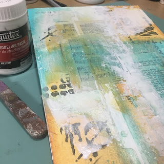
Once I got a good base down, I put a layer of Liquitex Flexible Modeling Paste down.  I wanted this so I could create not only layers, but a texture.  You can see in the following pictures that I take a tool and start making marks in the paste.


Once it was dry enough, I added some vintage paper elements and adhered them down using a Liquitex Gel Medium that has white flakes in it.  I wanted to have some fore visual texture.  Not too sure it really gave me what I was after (yet), but on I progressed! 


Again, while still wet, I used my faithful plastic tool (it is a pick from a floral arrangement) and made some marks.


Really hard to see, bu they are there and visible as I progress.


As it all continues to dry(ish), I start adding more layers - this time with a graphite pencil.  Scribbles, marks, textural imprints that again, can be seen along the way. 


Now it was time for some color.  I think this palette came from an image I saw of Jodi Ohl's on Instagram.  I used what I thought it might be - Quinacridone Nickel Azo Gold, Teal and Titanium White.  


I add a new layer of texture - this time Liquitex Modeling Paste applied using my trusty Palette Knife.

TIP: Depending on your desired outcome and substrate you are using will often determine which palette knife I pull out.  I am sure there is a real educated/technical reason as to which to use - but for me most hard surfaces and not as rough - I tend to go with my metal palette knife and use the Dina Wakley Plastic one for softer (paper) and rougher surfaces.


Time for some more marks - this time I chose to use the Dina Wakley Media Tools as there are four different tips to choose from along with a good ole wooden dowel!  Having said that, if I was doing this on a smaller substrate, I would have used these.


Once it was somewhat dry, I added a few drops of F+W Acyrilc Ink in Sepia and of course some Black Gesso.


Tme for some more visual texture - a Faber Castell Graphite B Pencil  


It always amazes me how just the simple scribble of graphite/charcoal or a basic pencil can add that little something to the piece.

The final touch to this piece was pulling out the Lyra Water Soluble Graphite Stix.  To get this amazing look, I simply dip the stix directly into the water and holding the stix at the top with only my forefinger and thumb - doodle down the piece.  I then go over it for a second time, this time applying more pressure.  Keeping the stix wet is the real key here.  Love this stix and how it came out!


here are a few close ups!


In this final shot, you can really see the marks from the stixs and of course the white flakes from gel that was applied quite early on in the process.  You can also see the texture from the pastes - whether it was from the palette knife or the various tools!  If you look real close, you can still even see the textrure from the canvas base which was the panel! YUM!!


Thanks for stopping by! 

Don't forget to keep an eye on my Instagram and Facebook accounts (and I'd love it if you would follow along) as I tend to post there more often (just not as much detail)!

Most products are linked to my online store W2 Scrapbooking & Mixed Media Art Studio and if I don't carry it, I will often link to where you can find it.

until next time...

Friday, September 15, 2017

Continuing to be inspired...

I have been taking a good amount of time (for me anyway) for me and journal(s),  paints and books.  We all know how little time I take for me - family always comes first, then work, then life then me.

Since my weekend with my friend a few weeks ago - I am trying hard to take the time to play and take time for me. Some days are better than others, but it will be a slow process no doubt.

Here is a sampling of what I have been up to:

I had gotten a bunch of new Stencil Girl Products Stencils (yes, an expensive vice of mine), I order from the states directly from them, I wish I could bring them into the site, but they are keeping the online sales to themselves (fair enough for them, just not for me..ugh). I started the page with a base of mixed torn tissue paper and book pages all adhered using Collage Pauge.  One dried, I did a wash of Titan Buff and Glazing Liquid.  I just wanted to soften and even out the color tones.


Now it was time to get busy!  I apologize for the lack of process pics along the way, as I got excited and was on a roll!  I used about nine or ten of my newest stencils really layering them in and using a variety of Dina Wakley Media Heavy Body Acrylic Paints in blues, greens, black & white.


I think I took it a bit too far, so I decided to put another wash over top to bring it down again. then came up with the idea of simply using straight Titan Buff through some of the stencils again over top to create more levels of visual texture. Simple but kinda cool!  Here are a few close ups.


This in turn gave me another idea...what about a monochromatic(ish) page? So I pulled out all the 'blues' (Sky, Turquoise, Ocean & Lapis - don't ask why I forgot Night) in Dina's line and once again pulled upon my newest Stencil Girl Products stencils


As you go through these photos, you will see that I seldom (if ever) use the entire 'image' of the actual stencil.  I use bits and pieces of each stencil and 'fill' in as I go along.  Usually changing colors with each stencil and/or coming back with the same stencil but using a different color than in the previous application.


The big thing to remember when doing it this way is to work your colors from lightest to darkest.  There is an exception to this rule of mine...WHITE.  I tend to add white near the end of my page.  They often need to be softened or areas need to be made a focus.


In this case, I did add white but it is very hard to see and I used a sponge and dabbed a good amount of the paint off as I wanted only a slight shading/tinting to be seen over top.  I really like the images as is and was quite happy with how this one turned out.  I consider it done!  Here are a few close ups for you...


Like the monochromatic idea, I thought I would try a repeat with 'greens' and using my Dina's again - I dung out all my greens. Hmmm - did you know she only had two (Lime & Evergreen)? I guess I could have used Ocean again but of course didn't think of it until after!

I used Super Heavy Gesso (White) to cover a base I wasn't happy with and went at it with a palette knife as I wanted some good texture.  It almost gives it a plaster look which makes me happy!


Additional colors used were - White, Black, Elephant & Umber 


Once again, I got carried away and did not take as many process pics along the way, but I am sure you can figure it all out easy enough. All these Stencil Girl stencils are from design Seth Apter.  I wanted to use a bunch of 'words' and marks. He has a great selection on their site.


Another tip for you as you are layering multiple stencils this way is to continuously turn, rotate, and flip your stencils.  As you lay them on your page, look for 'empty' spots and apply the colors there.  Offset your layers with another color to create shading or highlights.  


In this case as I had limited colors, I chose to mix some right on my mat with my sponge applicator.  I find Dina's color 'Elephant' a bit too translucent so I tend to make my own grey with white and black (usually gesso, as I find it has better coverage - especially if coverage is what I am after). 


Here are a few close ups so you can see all the layers and the interesting colors I was able to achieve simply with the limited palette I had.  I would say that Lime has always been one of my favorites, but when mixed with Umber...YUM!


I think that is good for today, I've (hopefully) kept you here long enough!  I will work on a few more posts over the next couple of days to share more of what I have been doing.  Don't forget to keep an eye on my Instagram and Facebook accounts (and I'd love it if you would follow along) as I tend to post there more often (just not as much detail)!

Most products are linked to my online store W2 Scrapbooking & Mixed Media Art Studio and if I don't carry it, I will usually link to where you can find it.

until next time...

That Other Neutral Triptych

  That Other Neutral Triptych wrapped canvases 10x10x1.5" (x3) professional grade artist materials I worked on this smaller series at ...