Showing posts with label dyan reaveley. Show all posts

Tuesday, November 14, 2017

Just a Little bit more...

Here are a few images of the final few pages and pieces I did on my creative weekend away:

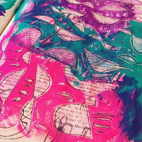
This one is in my Scribblepedia journal, just a light application of Dyan Reaveley's Dylusions paints in both Rose Quartz & Peony Blush.  I then added some more marks using Art Foamies (Shapes Small). I tend to use Ranger's Archival Jet Black ink pad for my stamping, but not you can also use your paints and/or ink (sprays and such) as well.
Tipster:  I like to use the permanent inks as my stamps are usually just a layer, therefore I can put another medium over top of the ink without having to worry about it bleeding.It also never hurts for you to apply a quick blast with your heat tool to 'set' the ink(s).


I have added a thick coat of Heavy Body White Paint (or might have been gesso, hard to tell with me sometimes).  And while it was still wet, I added some marks!  I used the Dina Wakley Media Tools to create these marks.


I also decided to add a bit of scribbles, but this time in form of one of the most popular Art Foamies stamps - Julie Fei-Fen Balzer's Writer's Block.  I know it is hard to see here, but I only wanted partial images of the stamp, nothing too clear.  So I simply used the stamp after I stamped it on some cast off papers before I applying the final stamp onto the page here.


This next is not done, but  just wanted to 'play' with this color series I have been using a lot lately.  Ultramarine Blue, Burnt Sienna, Black & White.  I began it all with some simple finger painting in opposite corners of the the book pages and started layering stencils and colors in my usual format. 


Stencils - StencilGirl Products M108, M103, M109, & M106.


Here is how it looks now - thinking some interesting collage papers might be a nice addition - you do you think? Maybe some scribbles? More paint?


The final one for the weekend was a pretty simple one - thought it was time I pulled out some of my Crafter's Workshop stencils for a change - it has been a while, but once I get going on these I quickly remember why I like them so much for journaling!

Why you ask? Don't get me wrong, I love the StencilGirl ones too (obviously)...but for different reasons.  If I want more of a 'visual' texture, I gravitate to the StencilGirl ones, when I want actual 'feel me' texture, Crafter's Workshop are the best!  They are a thicker Mylar (plastic) and I find are able to hold up to the manipulation of products such as gel mediums, heavier gessos as well as modeling pastes - any weight you want to put through them.  You are able to achieve the noticeable clean 3D effect with these stencils easily due to their thickness and flexibility.  

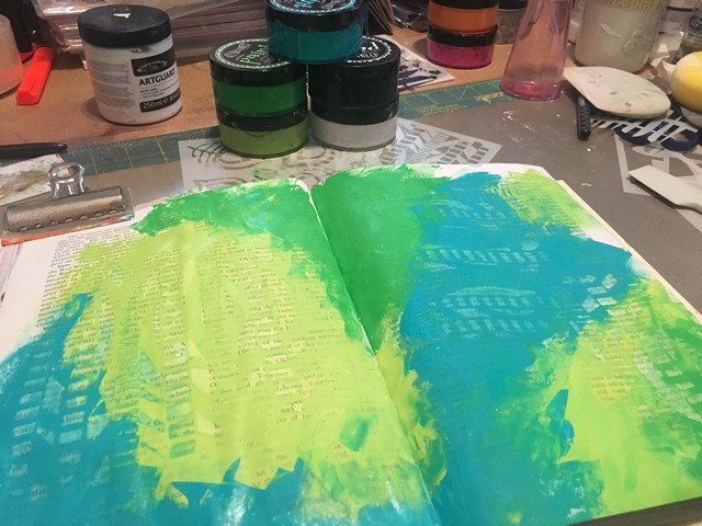
I am back in my upcycled journal again - using Dina Wakley Media Heavy Body Paints in Lemon, Tangerine, Cheddar, Umber and White.  The base paints are all applied using my fingers.  


Crafter's Workshop Stencils used:  TCW593s, TCW447s, TCW547s


Then I did a free hand scribble of the onion skin using my Liquitex Paint Markers in Black & White and then a little extra scribble/sketch using my Sakura Gelly Roll in White.

The lighter ''brown' you see in these last photos are the Umber mixed with White - it really takes on a grey/brown and is starting to be a new fave of mine!  If you do not or have not dabbled in mixing your paints - you really should!  The colors that come through (most often) are fabulous!!


The black sketchy circles you see are done using my Lyra Water Soluble Graphite Sticks.


Thanks for sticking through!  I know it was a tad long!  I have some more to share with you later this week on some pieces I have been working on that I am sure you will enjoy as well!

Don't forget to keep an eye on my Instagram and Facebook accounts (and I'd love it if you would follow along) as I tend to post there more often (just not as much detail)!

Most products are linked to my online store W2 Scrapbooking & Mixed Media Art Studio and if I don't carry it, I will often link to where you can find it.

until next time...

Monday, March 6, 2017

Up Close and Person with #artmarks30daychallenge the final week!

Hope you have been enjoying these posts all about the ins and outs of my take of the month long challenge hosted by Rae Missigman.  My apologies right off the top as there will be a shortage of photos for many of these prompts as it appears I just didn't take that many!  I will do my best to give you a good enough explanation to recreate if you wish.  Here we go for the final 8 prompts...

#23 - Simple

Color palette - Lemon Zest, Fresh Lime & Cut Grass

I started out applying a base of White Linen using my key card, then layering on the colors in the order given above (lightest to darkest). Note - I only used the edge of the key card for the cut grass application - here, I dipped it into the jar and placed it onto the journal page.

To get the marks in the paint, I used a drywall palette knife that has a zigzag edge and simply scraped it across the page.

The black "x's" are made with my Black China Marker. As simple as the page is, it is one of my favorites!


#24 - Primary

Color Palette - London Blue, Lemon Zest & Postbox Red

I pulled out the primary colors from the Dyan Reaveley Dylusions paints (listed above) and if you can believe it - those are the only paints I used to create 'color' - yup, because as you know...

blue + yellow = green 
yellow + red = orange

So when I applied the three base colors I made sure I only applied them on their own and fairly thick.  So when it came time to bring them together. I used my key card and brought the colors towards each other and therefore mixing them and creating the new 'secondary' color.

When they were dried, I took a StencilGirl Classic Leaf stencil by Rae Missigman and applied it to each color with my White Linen paint.  Then when it was all dry - scribbled over them all with my Ranger Fude ball pen in Black.


That's it...that's all!  Slightly bummed my White Linen is now ALL DONE!  So all future white will have to be gesso.


#25 - Hidden

Color Palette - Lemon Zest, Squeezed Orange & Postbox Red

Applied my paints using my Catalyst Mini Blade and once it was dried - I applied DecoArt Media Black Antiquing Cream (you could simply use the Carbon Black if you want too). I like to use the Antiquing Cream as it is never permanent until sealed (which at times can be a curse).  Once the paint was dried, I put on my StencilGirl stencil Tropical Floral by Traci Bautista.


I moved the stencil around quite a bit, turned it, flipped it, moved it to where ever I thought it might fit. Don't be afraid to overlap it too - stencils are best used in a collage form in my opinion! Don't be afraid to create your own patter(s) along the way.

You can also see I used my Liquitex Paint Marker and Gelly Roll pen (both in White) to 'trace' the patterns as well as enhance many of them.


here are some more pictures so you can take it all in...


#26 - Singular

Color Palette - Vibrant Turquoise, London Blue and Crushed Grape

Again, sorry for the lack of progressive photos - but think you should be able to figure this out easy enough.  I as usual, applied the paint using my Catalyst Mini Blade.  My pattern is usually pretty much the same as far as where on the page it is applied (as in pattern), just look at earlier ones and you are able to see it fairly clear.  I often try to get three colors per page.

Once this was dried, took a piece of Vine Charcoal and drew out my pattern.  I have a real love for anything botanical and this seems to be my go to (just look at my sketch books)!

I at first tried to use my blade to apply the gesso, then quickly switched to using my fingers.  I find it much easier to blend and get a better 'uneven' coverage (odd isn't it, not something you would normally want in painting).  I don't really worry about the charcoal smudging with the gesso, just think of it as 'shading' for free (or paint over it)!  I really like how the paint bleeds through the gesso - gives a marble look - love it!

As it dries - I use my Ranger Fude Ball pen to define the image.


Add the Gelly Roll White Pen in where needed as well.


Add a few marks in the corner with the Fude ball as well.  That's it...that's all! Love the simplicity of this page.


#27 - Continuous

Color Palette - Lemon Zest, Squeezed Orange & Melted Chocolate

This is a palette I avoided way too long - but once I got going o it....man I wish I pulled it out earlier! Saying this is rich looking is an understatement!  If you have the Dyan Reaveley DyluisonssMelted Chocolate....pull it out and USE IT!!

After applying the paints with my Catalyst Mini Blade, I pulled out some of my vintage map pages and cut up a sheet in two continuous circles.  To get the four circles, I cut the first one keeping thick lines and then go in again and cut the lines in half and voila - you get two identical (kinda) continuous loops.  I adhered them to the page using Traci Bautista Collage Pauge Matte.  As mentioned in an earlier post - this stuff is awesome.  If dried 'flat' and takes pens, markers and such beautifully.  Since I started using it, I haven't wrecked a pen/marker!  The main reason (aside from the finish), I allow it to DRY!!

The black marks are made by my Ranger Fude Ball pen and the white is the Liqutex Paint Marker.


#28 - Painterly

Color Palette - Cut Grass, Vibrant Turquoise and London Blue

Struggled with this one - just couldn't get to a happy place with my blending. I applied it as usual with the Catalyst Mini Blade, but this time I blended with my brayer.  Happy with the green, but not the rest.  Really liked this color combo - just think now looking back it would have been better on a larger canvas.  

Wanting to keep it simple, and not over think it, I tried to define the breaks with a 'river' of black and white (pens used - Fude Ball, Gelly Roll, Paint Markers)


I used the Fude Ball to write along the line after I was happy enough with the blending of my lines.  Makes me think of a map now.


#29 - Confined

Color Palette - Squeezed Orange, Postbox Red & Melted Chocolate

This color palette is so dreamy!! Again, wishing I pulled out the brown so much earlier!
 Once again, I applied the base colors with my Catalyst Mini Blade and blended with my brayer.  The look is leather like (love it)!


I used a combo of Liquitex Paint Markers and Lyra (or Caran D'Arche)  water soluble crayons trying to stay with the color palette just adding a pop of color here and there (white & yellow) when needed.


Just kept building layers of marks until I thought it was enough.  Not a fave, but do like the colors...just not the pattern as much.


#30 - Shiny

Color Palette - Bubblegum Pink, Postbox Red & Crushed Grape.

Wanting to keep this one on the bright side, I was happy to pull out the more vibrant colors this time around.


For my mark making this time around I pulled out some of my Elmer's Neon Brights Painters along with my Liquitex Paint Markers to keep it bright and vibrant.


For the finer details, I used my Gelly Roll Pen in White.


Love how it turned out and more than happy with the end result. Not to mention that I actually completed a project/challenge from start to finish!! Yay Me!!


Hope you enjoyed all these.  I haven't had time to really do anything since this challenge.  Between the shop, year end, household, family and life in general it has consumed all my time.  I really hope to get the chance to play again real soon - guess I may have to schedule it in....

Have a great day everyone, and thank you for stopping by....

Many of the products shown here are available on the site and can been found following the links or to just browse, head to the shop HERE!

Sunday, March 5, 2017

Up Close and Personal with #artmarks30daychallenge - Week 3

Sorry for the delay in getting these out - to say I have been busy is a serious understatement!  But you don't care about that - you just want to see some inspiration....here you go!

#15 - Loose

My color palette of choice today was Lemon Zest, Postbox Red and Vibrant Turquoise (and of course White Linen & Black Marble).  I used my Catalyst Contour Tool to apply the paints and make my marks.


Used my Liquitex Paint Marker (White) to create the boxes around the openings and wrote out my verse in Gelly Roll Medium Point Pen (white).


This page from start to finish took me 15 minutes - simple but fun and very rewarding to get it done.


#16 - Assorted

Color Palette of Dyan Reaveley Dylusions was Lemon Zest,  Squeezed Orange and Postbox Red. I used my Catalyst Mini Blade Tool to apply the paints.  Really like using this as I get wonderful blending of colors.


The other great part of the any of hte Catalyst tools is that you can use for your making your marks as well.  In this one, I used the Taupe Contour Tool as it is firmer than the others (which are silicone).  Here are some close ups - love how I was able to blend this so seamlessly.


Making my marks this time with a mix of black and white pens (Fudeball, Gelly Roll, Paint Pens)


I also pulled out the We R Memory Keepers Sew Stamper Roller set to see if I could save the page as I was not happy with where it was going.


There was some book papers on my desk so I decided to use them in hopes of starting to like my page!  I simply free cut them and started adhering them onto the page.  I them marked them up with my Fudeball.  I also added some more white - yup, now I like it again!

Here are some close ups... 


#17 - Reverse

Started out a bit literal on this one, wrote straight on the page using my Black Lyra Water Soluble Crayon - backwards  & with my left hand. I also used my Fudeball pen for the the finer marks.


I then pulled out my color palette for the day - Bubblegum Pink, Crushed Grape & Vibrant Turquoise and applied them once again using my Catalyst Mini Blade.  I missed a bunch of photos here, but you can see I used a StencilGirl Stencil by Rae Missigman called Harbor Side.  I just laid it on top of hte page while the paint was still wet and rubbed off the paint with a baby wipe.  This was you could see the book text underneath along with my marks from earlier.


I twisted, flipped and turned the stencil to get all the areas I wanted.


I then went in with my Black Fudebal and White Gelly Roll and sketched around and inside the stencil pattern on the page itself.


This is were I called it done.  I could have easily done a lot more, but that really defeated the purpose of the challenge.  I was trying hard to keep my pages simple and completed in less than 30 min (more often 15)!


#18 - Circular

My core palette today was going to be a bit dark (by choice) and aside from my usual addition of Black & White, my main colors were Vibrant Turquoise, London Blue and Crushed Grape.

I am lacking a lot of progression photos for this days prompt - which usually means I was on a roll (no pun intended)!

I used StencilGirl stencils - Retro Tiles Small, Seeds Doily and Rolls.  I have been applying the paint using a Sofft Art Sponge as I really like how the paint comes off it.  I get little to no seepage. 


#19 - Hashed

Color palette is Squeezed Orange, Postbox Red and Bubblegum Pink.  Applied using my Catalyst Mini Blade of course.  I started out applying some white as a base and then the colors on top.  Once dried enough, I laid out my StencilGirl Boundaries stencil and covered it with Black Marble using the Sofft Art Sponge.  I positioned the stencil across the center and overlapped where needed to get the image I was after.


Added a few scrape marks using the Catalyst Contour Tool in the somewhat wet paints and called it done!


#20 - Suspended

Color Palette was Fresh Lime, Cut Grass and Vibrant Turquoise.  I used my StencilGirl stencils again in Paste Paper to create the first layer by rubbing off some of the paint using a baby wipe.  


Then I started to layer it on again along with the Ornamental Peacock Feathers stencil using either White Linen or Cut Grass paints.  I also added the Kunst Mask 2 stencil with a pop of Black Marble.  Added some marks with my Gelly Roll Medium Point in White.


#21 - Bold

Color Palette was Vibrant Turquoise, London Blue and Crushed Grape.  Applied using my Catalyst Mini Blade.   


Using my StencilGirl stencil Kunst Mask 2, I used Black Marble paint and Sofft Art Sponge with the stencil and flipped it back and forth to create an interesting pattern. Then added some White Linen to  soften it up when and where needed.


Added marks with my Liquitex Paint Markers in  Black & White. and called it done!


#22 - Reflective

Struggled big time with this one and eventually had to just call it done.  Not a lot of photos on this one (hence the struggle).  My main color palette was Squeezed Orange, London Blue, Bubblegum Pink and Crushed Grape.  I used the Crafter's Workshop Tribal Fish stencil with white and black spray and was not happy with either.


After rubbing off as much as I could, I ended up using either a Fudeball/Gelly Roll or Paint Marker to make my marks and just call it done and turn the page.  


No use taking up an entire afternoon or evening with a page that just isn't coming together.  Learn form it and move on!  And that I did... 


Hope you enjoyed this weeks batch - I will try my darnedest to be back tomorrow with the last week of  the challenge! Thanks for sticking with me...


W2 Scrapbooking & Mixed Media Art Studio shop.

That Other Neutral Triptych

  That Other Neutral Triptych wrapped canvases 10x10x1.5" (x3) professional grade artist materials I worked on this smaller series at ...