Arrived Friday afternoon to a beautiful view and the creative juices were going (once all the visiting was done)!
Friday arrival....

Saturday, Good Morning?!?!

Decided to work on my pocket style scrapbook, I do it a bit different than everyone else (surprise surprise), as you know I do various size pages in my 12x12 Ring Album (12x12, 8.5x11, 8x8, 6x6, 11x8.5") so I have carried that over to my 'pocket style' pages (12x12, 8.5x11, 8x8, etc) and mixed them in with my original various sizing....pretty cool outcome!
Here I started out using a Project Life Pocket Design G (10x12") Page, my inserts are from the Kaisercraft Captured Moments Base Coat 3x4 and 4x6" Cards. I also stayed with a bit of a theme this time around which is so unlike me, but hey - always trying to switch things up! So my 'theme' was using Kaisercraft Base Coat (everything)! If you notice, I have used different sized photos inside the pockets as well. This one has an 8x10" cropped down to work in the pockets (so love how it turns out).


Here is another Project Life Page (12x12") Design D
One thing you will note as well is that I never just leave the card 'as is' since I have a hard time letting go of the creative process of scrapbooking. By jazzing up the cards, whether it with stamps, inks, washi tape and or die cuts - it makes me feel like I am doing something with the creative process and it is not simply sliding in a card and sometime journaling on them.


Project Life (12x12) Design B

This next set is from We R Memory Keepers Multi Pack and the page has 3 - 2x4, 3 - 4x6 and 2 - 6x4" pockets. Again, here I used a larger photo and cut and cropped it to fit into the pockets.


Here is the standard Project Life (12x12") Design C. My photos were printed off in 3x5" format so I could put them onto the onto 4x6" patterned sheets of paper and added some die cuts and stamps to make them just a bit better.


Now I am back to a good ol' 8.5x11", American Crafts in this case


Back to Project Life (12x12") Design B

Project Life (6x12") Design H. On the next two layouts I used my Tim Holtz Frameworks Dies either on the photo itself or on the embellished paper.


Back to 8.5x11 again....


Now a 12x12"! Now that is a shocker! So love how these ones turned out! Added some Dusty Attic Fish Net Chipboard (12x12") and messed it up with some Modeling Paste and Old Paper Distress Stain to age it. Then I also added some more Modeling Paste using a Crafter's Workshop 6x6" Stencil (I think it was called Sketch Grid)



Another 12x12", this one was inspired by an Art Journal page I saw in Pinterest. I used paper strips, washi tape, filmstrip ribbon and gaffer tape. Stamp in the background is Kaisercraft Textured Stamps Numbers, and then some added embellishments of Tim Holtz Remnant Rubs Elements, Twine, Maya Road Vintage Findings, 7 Gypsies Reinforcers and Prima Wooden Icons in a Box Borders.

Here are a few close ups...
I layered a 5x7" with a 4x6" of the same photo and used pop dots to give it a 3D look.


Back to Project Life (12x12") Design K


Now I am playing on an 11x8.5" and used Modeling Paste, Time Holtz Frameworks Die, Distress Paint and Lindy's Stamp Gang (Blue & Green)

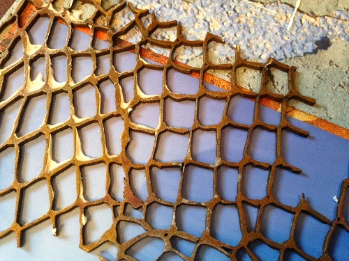
The reverse side is some fun! Dusty Attic Chipboard Chicken Wire and Jillibean Soup Placemats Hexagons inked up with Lindy's Stamp Gang Sprays Turquoise and Distress Inks n various colors.


Having some real fun using Wendy Vecchi Transluscent Embossing Paste on the Base Coat paper with a Kaisercraft 12x12" Stencil Bricks then inked it all up with some Lindy's!


This 8.5x11' layout turnout out great!


The reverse of the above, again using modeling paste and templates; washi tape and such

The last 'layout of the weekend was a Project Life (12x12") Design Design F. Once again I used larger photos and cropped/cut them down to fit into the pockets. One of my favorites is the bottom photo (first photo) where I tweaked a panoramic photo into 3x4" photos making it a 4x12"!


Thanks for stopping by!


