Thursday, March 31, 2016

a little inspiration....on thursday

Was able to do a couple of Donna Downey's Inspiration Wednesday's this past month - finding it harder and harder to make the time for myself lately.  Need to really make it a priority!

If you haven't been following along with the class, or would like to sign up - head over to Donna's here.  No, I do not get paid to send you there, I just thoroughly enjoy Donna Downey and her process!

Here we go....

My take on iw3.2.16

Working in my homemade journal - this spread is actually in the center of the signature so I have a full tag to work around this time (ugh). Out comes the big pail of Gesso - yes, I buy mine by the gallon!  I go through it quickly, a pail will last me about a year.  It is not the best quality of gesso, but for the art journals and the amount of experimenting I do, it is perfect.


This is the idea I had with this weeks inspiration.  Donna did numbers, but you know me, I never follow rules!


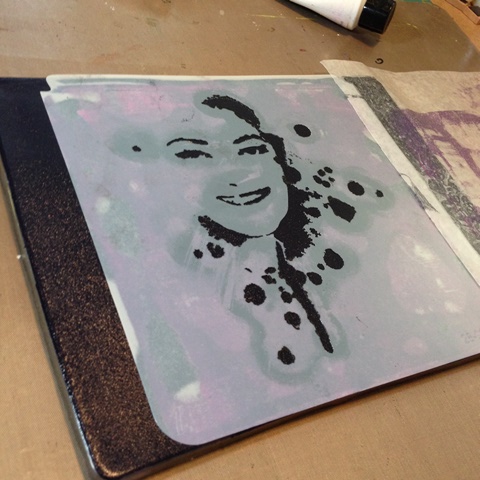
Here is the color palette I will be going with and the medium - Golden Clear Tar Gel, to act as my 'resist' with Donna Downey Stencil (Silhouette Duo)


So firstly, I used the 'mask' part of the stencil (or the guts as some call them) and painted over top of it using Dina Wakley Media  - Lime (one of my fave), one per side.


Once the paint was dry, I offset the stencil on each image and applied a good coat of  Clear Tar Gel over each one. 


This takes a while to dry, so I left mine over night (but not before touching it at one point to see how it was doing and having to do another layer over the one on the right, so DO NOT TOUCH it for many hours...says the girl talking from experience! 


The next day, dry and clear!


Now it was time to see how it would react to the next layer of paint - this time Lemon


I left it for about 2 min, then wiped off what I wanted gone.  It cleared off the tar gel perfectly.  I made sure I left some of the yellow on as I wanted the layers to show. 


Now wanted to try a layer (or four) of Umber, Some times I did it straight up, other times I mixed with the Glazing Medium.


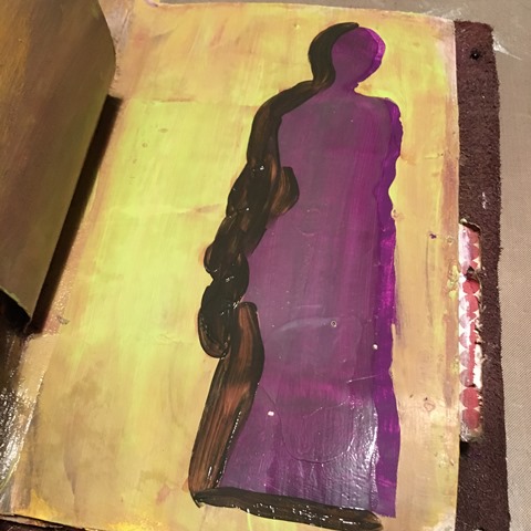
wasn't happy enough with that, so tried using DecoArt Media Fluid Acrylics in Quinacridone Violet 


The interesting thing here was that it tinted the Tar Gel, and I kinda liked it! 


Ya, time for yet another layer! This time Liquitex Super Heavy Gesso (White). And since it takes a while to dry and I was working with an inclusion...I had to get creative in my drying technique! 


Speaking of drying techniques - I missed taking a few pictures, but I'm sure you can figure it out!  I used Golden Artist Paints High Flow Green Gold to get this effect along with a good amount of water; which I applied using a brush so it added a good amount at a time. The journal was tipped up so I could follow the lines and it was able to drip down in the direction I wanted. Then just at the end, I turned it upside down and smacked it on the top edge to get some drips going up.  Love it!  Now it was time to dry, so out came another drying tool rig!


Once it was dry, I went with another layer - glazing medium and quinacridone violet.  As usual, I wiped off too much and after doing it twice (yes, twice), I decided on another technique. 


Again, pulled out the Golden High Flows - this time Quinacridone Magenta.  I followed the lines of the green, having the journal upside down let it flow!


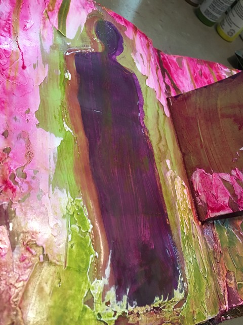
Once it had sat for a minute or two, I wiped away a access. 

Now I decided I wanted it darkened a bit, so applied some glazing medium mixed with burnt umber (DecoArt this time).


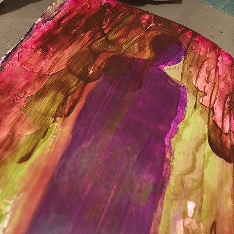
Once it sat for a minute or so, I wiped off the access.  


I search 'fire quotes' on pinterest and came up with one that I adjusted to suit my layout.


Really enjoyed this one.  Because this is such a long post, I will save the next Inspiration Wednesday for another post.  be sure to come back and check it out!

Most products can be purchased at the shop - W2 Scrapbooking.  Thanks for stopping by.


Friday, March 18, 2016

Weekend Junket #06

Here we go...March's set of prompts:

MARCH 

Colors that Inspire...THE WEATHER


What colors do you think of when you think of the weather?  Use that as yet another inspiration for you for your project(s) this time around.

#w2wj06

add character - doodle using an unconventional tool
curveball - use some of your gelli prints
tool - gelli plate*

*don't have one? that's okay, paint onto deli paper, piece of glass or plexi glass, anything with a shiny surface will provide you with a similar result, perhaps just not as crisp or as many reprints.

At times I may find it interesting to put a twist on the prompts is to use the term....
Use something NEW, something OLD something BORROWED and something BOLD!
Now understand that I may not use the above on every challenge, but  I sure am gonna try!  


Here are a couple of my takes on the challenge prompts:

This one started out for ma a bit harder than I thought it would! Not sure if I just wasn't in the groove or simply was have a boat load of brain farts!  Nothing and I mean NOTHING was working for me the first day I started working on this set of prompts.  So I did what any sane person would do - I walked away!  

Here are a couple shot of what I was considering an epic fail!  I believe my issue was I was using Translucent Paints and they were simply too fluid and well, transparent! The base/background was awesome, blended beautifully.  Nothing I did after that came out as I wanted it to.  But all not lost - I did learn something.  As complicated as 'color' and 'paints' are, they truly are simple!


So I cam back the next day with a fresh outlook and went back to what I know - Dina Wakley Heavy Body Paints are the bomb on gel plates! 


Spread out your paint using your brayer (my fave), but wedges, old hotel key cards and such will work too but just may not be a evenly distributed. 


I started out with using one of my Donna Downey Signature Stencils (Leaf Stem Trio).  The second application I had removed the stencil and placed a fresh sheet of manila cardstock to get the ghost and negative print.


Then I picked up the last of the paint off the plate using a sheet of deli paper 


Added more paint to the plate (I did not clean off in between applications), suing the same stencil again, I repeated the above process.  This time I reversed the papers (used the second one first)


Sorry, no pictures of the other  - but you are getting the drift.


Here are a few more samples of  some of my prints...


This was my next attempt at layering the prints  and thinking I could do something that just was not there - once again, tried something that I thought should work.  Yet another lesson learnt.

Applied a coat of clear gesso over my base print.


Selected some colors I thought would enhance the base palette.  I incorporated Ranger Slow Dri  Medium so I would have more time to play and manipulate the paints.


had too much paint, so took excess off using a sheet of deli paper.  This one is sitting off to the side now as I was frustrated it wasn't going where I wanted it to.  It is still a great starting point for the next time I get a chance to play.  This deli print will come into play soon.


Here is a sample of one of the full 8.5x11" sheets I used.  It has several layers of prints on it.  The final layer you see here is a crisp clean one of a Stencil Girl Stencil designed by Carolyn Dube called Arched Aqueduct


I got a bit sidetracked here - but had some fun using the third prompt here.  I doodled using the Fineline Applicators filled with Black and Green paint mixtures. 


Here is my last one - this is where I actually used all three prompts on the pages finally!  I had quite the stash built up so thought I had best start using some!  First I took the deli paper print from above and crumpled it up and adhered it down, tearing off what I didn't want.  Took out my 1.5" circle punch (actually took out my 3" one first only to see it was toast).  I used three different circle punches and punched out from three different prints (1", 1.5" and 2").  I also cut a few strips.  Adhered everything down using Matte Medium.


Was a tad too stark for me - so decided to apply a glaze. I used Umber from Dina Wakley Media line. 


Now it was too grungy - so white wash it was.... 


Now I was liking it a lot, but wanted the circles to pop!  So out came my Faber Castell Stamper's Big Brush Pens to do some shading and high lighting. 


yes, you guessed it too dark yet again! So pulled out the white! 


Now it was finally time to use the final prompt - doodle using an unconventional tool!  I chose to use my calligraphy nib pen and Speedball India Ink.


That was a lot of fun!  I hope you too take advantage of the prompts and 'play' it really is a great outlet.

Don't forget to either link them here or post on my Facebook Page under the  #06  prompt post.

To Link here, simple comment and add a link to your blog post.

Next set of prompts come out April 1.

For a full description on the rules and expectations of the Weekend Junket, please click on the tab about.


That Other Neutral Triptych

  That Other Neutral Triptych wrapped canvases 10x10x1.5" (x3) professional grade artist materials I worked on this smaller series at ...