Wednesday, July 1, 2020

#getyourpainton (part three)

Day 6:

I made a comment in a Facebook group that I belong to and it gave me the idea to do this next color combo.  Green & Brown.  I have said it before, and I will continue to say it, I love the color green, outside...on the ground or in the trees.  I love when I see kitchens done in the old avocado green and then I melt if it has butcher block counters...just not in my house!

So today I pulled out some ready mixed craft paints and got to work.

Strathmore Series 400 Watercolor 12x18"
Gesso - Liquitex Professional (White)
Martha Stewart Crafts Acrylics - Olive Green, Granny Smith, Vanilla Bean & Grey Wolf
Brush - Princeton Catalyst Bright #10 & 8
Stabilo Woody - Lime Green, Brown, White & Silver

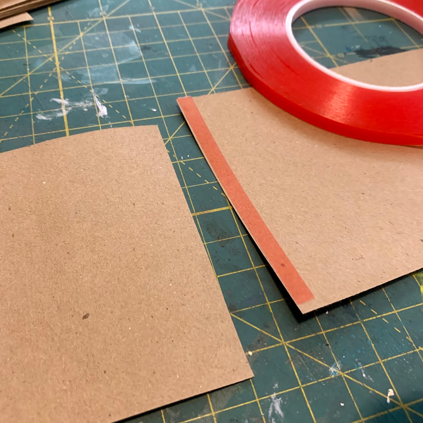
You will see I had yet another idea to change up the taping this time as well.  Wanting to know how a pattern within the taping would effect the outcome as well as how I applied the paint.


Here are a few close ups so you can see I did include some intended shapes with the Woody's.  I is really hard to color outside the lines when it was always instilled you stay within.  I 'color outside the lines' in so many other aspects of my life, but sure not when it is literal!


Some interesting images came out of this taping. Not sure I am liking it enough to do it again though. Thinking once they are cut I may change my mind.


Hmm, what do you think?  As much as I life the colors, I think they are too disconnected.  I wonder if this was to be done in a larger format with out the smaller grid how it would look.  That will be for another day when I am bored.


So, let's look at the elements - line, shape, value and space jump out right away to me. When you zoom in, there is definitely texture in the paint as the stroke goes across the paper and loses its strength.  The principles - I can see them all. Some of them, too many.

Day 7:

This one is way out in left field as I was looking for a book earlier and came across my Tracy Verdugo "Paint Mojo" and it got me to thinking how she using Acrylic Inks...here we go again, down another rabbit hole!


Strathmore Series 400 Watercolor 12x18"
Daler Rowney FW Artist Acrylic Inks - White, Prussian Blue, Flame Orange, Yellow Ochre & Red Earth
Wooden Skewer
Water Spritzer
Mitsubishi Dermatograph Pencils - yellow, green, orange, teal, white & navy.

No gesso this time, no pre-wetting. Simply using the dropper of the inks, got the ink to the paper is the same process I would have applied paint with a brush.  when I got near the end of the process, I would simply squirt out the ink onto the surface and let it fall where it may.  I then spritzed with water to get the inks to spread and or blend.  When it was still good and wet, I used my skewer to 'draw' shapes and marks often dragging the inks into each other.  When I had excess, I use a paper towel edge lightly dipped to the pool of inks to lift it up. Then I hit it will the heat tool to dry it fully before going at it with the pencils.


One thing to note when using inks in this format, you need to make extra sure that your burnish good and hard.  I really focused on where the tape intersected and gave it even more pressure.  I did pretty good with very little seepage.  I believe I had two small areas towards the left center. Doing this, you will also risk the chance of the tape lifting the paper when you peel back.  I again, did limited noticeable damage.


When there is this much water & ink, you have the opportunity for it to go a few different ways - muddy or some pretty amazing results.  I had some of both.


I do really enjoy pulling the inks away from the puddles and making interesting shapes, designs and such.  Mine tend to be botanical for some reason, although hard to tell in the images.


When you dry, the true colors are revealed - some better than others!


Once again, I neglected to take a photo of the pencil stage. It always seems to help in my opinion. I can add the lighter marks to bring out the colors and then use the darker ones to push back the lighter.


The cut. These are interesting, but definitely not one of my faves.  It is fine though as this is a study and needless to say, you are not going to have success with each and every one.  


Looking at these one for elements and principles is for sure a bit strange for me as there is a total different feel to them. When you are used to seeing strokes and now you are seeing a totally different shape as a whole, almost blob like.

A simple evaluation of these - does it have: line, shape, space, form, value, color &/or texture? Did these elements create unity, variety, contrast, emphasis, balance, movement, pattern or rhythm? Once you can look at your art objectively and honestly, you will be able to pick what works and what doesn't easily. You will trust your instinct.

Once you are at this stage, there is a good chance you will have found your 'style' or at least where you are most comfortable. If not, there is nothing wrong with trying new things, it aids you in finding where you (want) to belong in YOUR space.  Just don't compare yourself to anyone else. You are the only you out there, you are truly a one of a kind...like it or not!  You'll find you, I did.


I have a great stash built up now, each one will be used eventually. Whether I use them as business cards, note cards, future studies, framed pieces....your guess is as good as mine.  They have served their purpose as of right now.  No wastage, I used paint, I used my mind, I created something and I learned along the way. Sounds like a good use of my time.

The study end...

Hope you were able to get something out of this. I try to translate many of the technical aspects of art in a simpler form as I tend to over analyze a process simply because I get hung up on a word. With all the research and readings I have done, I have tried to put it in simple words that I won't end up going down yet another preverbal rabbit hole. This self study has allowed me to move on when it comes to composition, if it helps you great, if not...good luck and enjoy your ride!

Tuesday, June 30, 2020

#getyourpainton (part two)

Day 4:

For this days palette, I was inspired by colors of an image on Instagram. I am not by any means a 'blue' kind of person, but I always seem to be attracted to art on Instagram in this palette - weird, I know. My home is decorated in a neutral palette, the thought of putting a color on my wall sends me in a tail spin.

Anyhoo - today's juice...

Strathmore Series 400 Watercolor 12x18"
Gesso - Liquitex Professional (White)
Golden Fluid Acrylics - Paynes Gray, Anthraquinone Blue, Titanium White & Carbon Black.
Brush - Royal SG700 3/4", SG3010 #8
Stabilo Woody - Royal Blue, Black & White.


When I taped this time, I wanted to have more smaller ones as small is where I struggle the most. Looks like I neglected to take a shot of it, but you can see it better in the third photo after the peel.

I applied the paints again in varying strokes, long and short. I tried to add direction in the way of marks/shapes - circles (also half circles) and oddly shaped squares/rectangles. I am trying to get in some interesting marks using the brushes for a change verses the Woody's. I am also using the paints more to mix to get my contrasts and values as I have the limited palette of colors.


When it came time to add the Woody's, I really tried hard not to look at the taped areas and really let my hand run free across the surface. I pressed hard and made sure to have the Woody turn regularly in my hand so it would not look too contrived.


The reveal on this one I will admit was pretty epic.  I turned out so good. I was able to achieve an amazing balance of color, value and space.


I am trying hard not to force any of this, but I know for a fact that I. I am always aware of making sure that I have each of the colors used in each section, often more than once.


I once again really watched the directions and how I thought they would look best with the framing when I cut. I am in awe on how much I like this palette- I may have to break down and try this on a larger surface.

Need a refresh of my Elements and Principles? Here's a quick refresh...

Elements are visual building blocks to influence your design process. Principles are the tools for arrangements that influence the design.  Their end result is to achieve unity in the composition of your art.


Now let's break it down a bit more (but simply)...
Elements:

  • Line - can be literal or implied. It can produce shape.
  • Shape - an area that stands out from space due to a boundary, color or texture.
  • Space - is a feeling, can be 2D, 3D or 4D; negative or positive; proportion, scale; overlapping space.
  • Form - is referring to volume or mass (3D)
  • Texture - visual or literal
  • Value - light verses dark
  • Color - most complex; light, primary, harmony & intensity.

I tend to group them as I have above as this way I feel they work together and can become even more cohesive as a whole.

Principles:

  • Contrast - values, colors, textures, shapes, sizes & even color temperatures
  • Emphasis - focal point
  • Unity/Variety - all the elements fit together in unity, but there needs to be variety. However, too much variety creates a havoc as your eye needs a place to rest.
  • Movement - repetition of an element that creates movement
  • Pattern - a unique repetition of a shape (or element) in different areas which will then create a pattern
  • Rhythm - creating movement that is implied by the repetition of  elements 
  • Balance - visual weight
Your art will be successful with Unity, Variety, Contrast & Emphasis. If it is visually balanced and moves the eye around the painting, you will have good composition.

Are you still with me?  

How about Day 5:

Strathmore Series 400 Watercolor 12x18"
Gesso - Liquitex Professional (White)
Golden Fluid Acrylics - Phthalo Green (Blue Shade), Green Gold, Anthraquinone Blue & Titan Buff 
Brush - Royal SG700 3/4", SG3010 #8
Stabilo Woody - Royal Blue, Dark Green, Lime Green & White.

Today was yet another big challenge for me - green...ugh! Love it as a color, outside, on the ground and in the trees! 

I again made sure when I taped it off, I had several smaller areas to force me to keep my strokes to a minimum. I have to really work at it not to allow myself to go over the strokes that 'ran out of paint' - I want to see how the paint reacts wet on wet and dry on dry. Limit my brush strokes and add more colored pencils marks.


It is always interesting to note that even with all those scribbles (above), they really are not as obvious in the image below.  I have found that in most of the studies so far.


The cuts as usual, are planned out after the tape peel.  I look at all the angles to see what I think is the best composition according the my earlier notes and cut accordingly.

I am adding these to my ever growing stack. What am I going to do with them? You'll see....tomorrow!  Thanks for stopping by!

Monday, June 29, 2020

#getyourpainton (part one)

I have been doing a somewhat of a deep dive on composition in art for well over a year now, but really sat down this past month and went through my notes, looked at past paintings (mine and on the net) to see if I could finally comprehend it all.  Good new...I did and I do!

I have a journal full of notes, a binder full of printed pages for reference. So I planned out a week long self study on seeing how I could get paint to paper using what I hoped would now be more natural habits that I have instilled in myself after all the 'studying' and practice.  

I decided on a practice used by many instructors over the years where you take a sheet of paper and divide it off in sections using masking tape. I chose to use a quality Watercolor Paper as I knew it would handle what I was about to do to it. I also wanted to use different color palettes each day, mix up my brushes and at the end, I even changed up my paints for Inks.

I stayed with Golden Acrylics for the most part, but one day I did use some of my craft paint stash (Martha Stewart Crafts - seriously, I need to use this stuff up) and the final day was Daler Rowney FW Artist Acrylic Inks.

Here we go....

Day 1:

Strathmore Series 400 Watercolor 12x18"
Gesso - Liquitex Professional (White)
Golden Fluid Acrylics - Titanium White, Carbon Black, Transparent Red Iron Oxide, Titan Buff, Iridescent Stainless Steel (Coarse) and Iridescent Bright Gold (Fine).
Brush - Princeton Catalyst Bright #12 & #8
Stabilo Woody - Black

This was a palette I was using on another piece and I had a good amount out so thought why not start here. I decided to start off just making 6 squares (approx 6x6") and simply used limited strokes and tried my best to only stroke one at a time. I either would go in a single swoop or short swipe.  The more I added, the longer and larger my strokes seemed to get.  I also found that I got over zealous and was getting too much paint on the piece. 


Pretty interesting how by simply taping off a sheet a paper, the drastic change it can make.  I find it allows you to see everything in a whole new light.  It is like using a random viewfinder on your piece and then when you cut them into their individual pieces - is when the fun can really start.  If you look at the first image, you can see how I covered almost the entire 6" section, the white spaces really are not really visible until I remove the tape. The strokes are thick and somewhat random, but look at their direction. Color placement is there to give each one a nice focal point, but really noticeable until they are cut and standing on their own.

Here are a couple interesting points I have discovered to help simplify wanting to evaluate and understand my work. These are simply my translations and work for me and my thought process.  You may not think the same way, that's okay.

Elements are visual, look for them in your art. You don't need to have them all, but odd numbers are best. Principles are feelings. It is often how the artist uses the elements to create an effect and then in turn aid with the visualization of their intent. Principles are your tools of arrangement of the various elements. Elements are your building blocks that will influence your process. Their end result is to achieve unity in the composition of your art.

A quick check of the elements - does it have Line, Shape, Space, Form, Color, Value or Texture?  It doesn't need to have them all, but should have at least three.

A quick check on the principles - does is feel Balanced, is there Contrast (in color, value & texture), is there emphasis (focal point), is there Unity/Variety (in the elements), is there Movement (think line), is there pattern (marks, shapes, etc that create a pattern), or Rhythm (implied by repetition of elements)?

A painting does not need to have all the principles, but a successful one will have Unity, Variety, Contrast & Emphasis.  It will also be visually Balanced and will Move(ment) the eye around. This is good composition.

So back to my #getyourpainton study...

Looking at the last photo, you can definitely see line, shape, (visual) texture, value & color. You can also see emphasis on most, contrast, variety and balance. The other principles could be included as well depending on your interpretations of course.

Let's move on to Day 2:

Strathmore Series 400 Watercolor 12x18"
Gesso - Liquitex Professional (White)
Amsterdam Standard Acrylics - Yellow Green, Permanent Violet Light, Primary Cyan & Primary Magenta
Liquitex Basics - Neutral Gray Value 5 and Mars Black
Brush - Princeton Catalyst Bright #12 
Catalyst Wedge No.6
Stabilo Woody - Black, White & Lime Green

I wanted to challenge myself with the colors as these are not ones I use often at all. I will happily use them in my journals, just not in something I would 'paint'.  But since this was a study, why not.  I also decided to change up the taping this time.  I much prefer to paint large, so this is a great way to push my boundaries and push me even more outside my comfort zone. The main application of paint was by use of the Catalyst Wedge.  I love this tool and use it often on my larger pieces.  So using it here really provides some bold movement and impact.


I had a lot of fun with this one.  I found myself being aware of the tape. But I do feel that many of my placements are habits due to my many years of simply playing to see what happens - thus becoming intuitive/instinctive....for me. You will also note that I did my cuts a little different as well.  There were a few that I thought could use the addition of some extra white.  It almost gives them a mock polaroid look, which I am really liking.

Now - let's look for the elements. I see line, shape, space, color & texture for sure. As for the principles - movement for sure, pattern, emphasis, contrast and balance.

Day 3:

Strathmore Series 400 Watercolor 12x18"
Gesso - Liquitex Professional (White)
Golden Fluid Acrylics - Transparent Pyrrole Orange, Titan Buff, Naphthol Red Medium & Anthraquinone Blue
Brush - Royal SG700 3/4" & SG3010 #8
Stabilo Woody - Navy Blue, Orange & Pink

The one thing I haven't mentioned before is that I always gesso after I put the tape on.  I do this as I prefer the raw look of the paper after the tape has been peeled. The one other thing to note is the 'tearing' of paper when the tape is removed. It is dependant on a few things - the tape you use. Buy the good stuff, it is worth it. I prefer the Blue 3M Painters tape. Also, I have found in the past that if you tape on the smoother side of the paper (cold press), I never get tears/lifts.  Also, how hard you burnish makes a difference too.  I tend to simply rub my fingers along the inside edges and of course across the center intersections. I also do not load my brush up too much with paint.

I also neglected to take a photo of the sheet before I did the peel off, but I'm sure it doesn't make that much of difference to you aside from just not being able to see the comparison.


As I have done these for three days now, I am finding myself more and more aware of  the tape placement and look for the color variations within each section - after I have put the initial stroke(s) down. I was oddly excited about this one and did forget to do my woody scribbles before taking the tape off.  So I was more conscious of my marks and their placements as I did not want to go on my white borders. I am once again strategically cutting these to eye pleasing directions.

Let's check for the elements. I see line, shape, space, color & texture.  As for the principles - contrast, variety, emphasis, movement and balance. Always note, not every one will be a master piece, but the purpose it to just get your paint on the paper, practice your brush strokes, color combinations and compositions.


I will end it here today for part one of the series. Come back tomorrow for part two.

Monday, April 13, 2020

I made a roll....


Being inspired by Kellee Wynne Studios on the idea she came up with for herself doing the 100 Day Project this year, I decided that I too wanted to create a roll.

Notice I didn't say I was going to do the 100 Day Project? Ya, not willing to commit to yet another project that I know I just don't have the time for let alone the patience. I did know that if I was to create this and have it on my work table in sight, it would be an easy go to for when I needed a break from painting.  This would be an easy distraction and allow me to just play.

I had originally seen another artist paint on a continuous roll of large paper a year or so ago on Instagram or maybe it was YouTube, I believe it was Jane Davies. I can't be a hundred percent, as I think there have been others as well. 

If you want to see Kellee's take head over here.

Anyhow, here is a quick rundown on how I made mine...

I have a sizeable stash of this paper from when I had my store as it was by far my favorite.  It comes in (approx) 12x12" sheets and I use it a lot in my journal making due to its lightweight and of course yummy kraft color.  It is very similar to grocery bags (thicker than a classic lunch bag). The actual paper weight is #50, so if you compare it to a basic cardstock which is #65 it gives you an idea.

I have this hard core from an old roll of packing tape that I kept for a 'just in case' scenario (see, it happens), so measured it out and it was 4 1/4" and knowing that the paper was 12x12" ish, I simply cut the paper into 4 x 12" strips.

I cut 12, 12x12" sheets into 4x12" strips for my roll. 


Next I took a piece of a quality thick packing tape to adhere the first strip to the core.


You can see that my paper isn't a perfect fit, but that doesn't bother me as I was not willing to waste paper, nor was it simply a big deal. I just trimmed off the access.


Next I dug deep into my totes looking for some redline tape.  Anyone who has ever made paper crafts knows that this stuff is gold! I knew I had a 1/8" somewhere, but came across this 1/4" first, so that's what I used! Applied the doubled sided tape to one end, stuck the next strip to it...repeat!


I created somewhat of an assembly line to make it go faster (as of course I was getting bored)...


Line up the roll side to the taped paper...


peel off the red, and stick it down...


give it a quick rub with your finger to secure...


Once I added the 36 sheets to the core, I decided to take a twist off Kellee's white roll and actually perforate it, so every 4" I ran the perforating blade up....


see where I went with this? 😂


Each square is 4x4"

Pretty simple and cost me nothing that I already didn't have.


You can make your own too - if you don't have this paper, consider using:
  • packing paper from any of your recent orders
  • copy paper
  • found papers 
  • envelopes
  • old scrapbook papers
you get the drift, simply use your imagination and create away.  Only thing to keep in mind is what you are going to do to the paper so that should determine the thickness of papers you should use.

I knew what I was going to do with mine and I also knew what this paper could take so it was an easy decision for me.  I wanted to do simple scratching of paint on the base and then add vintage paper bits in a collage format.  I had created a piece earlier (a post on that another time, but you can see it on instagram here) doing something similar, but wanted this to simply be simple.

I keep a small bin/tote on or around my work table and toss opened vintage paper/packs I have purchased online along with other bit and pieces of often found/recycled papers that I have been using recently - because let's face it, putting it away is simply futile. So I added my roll to it and will grab it when the urge hits. Again, know for a fact it will not be daily.


Here are individual images of the first 7 I have done...


All tied up nicely with some jute.


Loads of fun!  Thanks for popping in, hope you too are able to get on a roll with your art!

That Other Neutral Triptych

  That Other Neutral Triptych wrapped canvases 10x10x1.5" (x3) professional grade artist materials I worked on this smaller series at ...