When I get an idea, it is not always complete, just something that needs to work its way out of my brain. I do however jump right in and work my way through it - however long it takes or until I know it is just not possible. More often than not, it works, but just takes a while and the process can be daunting.
This one was no different. I wanted to work large, on a small surface. What? It can be done, in my mind anyways. I took six 5x7" Fredrix Artist Canvas Panels and taped them together using a good quality tape. The large panel was now a 15x14".
I started the process using two Lyra Color Giants pencils in Black and Grey to doodle a rough sketch I thought might work. Note I was trying to keep the connection of the panels by overlapping the circles to join the canvases.
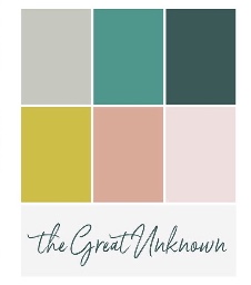
Next was time to start added colors. I belong to a color based art program called Experience True Colors (ETC) and this months theme was called The Great Unknown (kind of fitting wasn't it) and the palette was one I was really enjoying to work with.
Like anything I do, especially in regards to art, I don't follow rules well - I use them as inspiration. Now don't get me wrong, ETC doesn't have rules when it comes to your interpretation on the monthly palettes, which is perfect for me and I of course take full advantage of it.
I added a few drops of FW Acrylic Artist Inks in Process Magenta and Flesh Tint. Let them sit for about a minute then sprayed them liberally with water and again allowed them to sit for about 2 minutes. Then I took a rag and started to blot them.
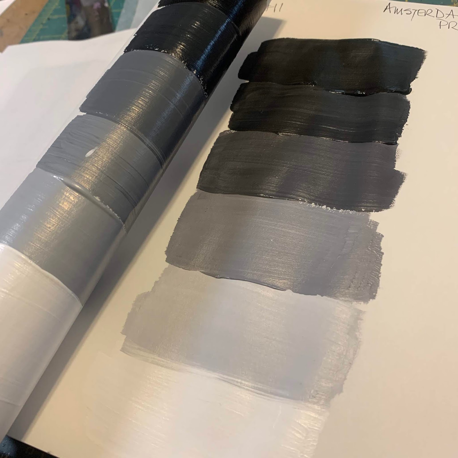
I then allowed them to fully dry at this point. I pulled out my large range of Grey acrylic paints and began added them to the now dry surface. I mixed the greys as I applied them. I got on a roll at this point and needless to say, taking photos were not even on my radar.
Hence why we are now at this point. I used six or seven different grey hues from five different companies - Golden (fluid and high flow), Liquitex, DecoArt Media, Grumbacher and Martha Stewart. Knowing it needed a color now, I brought out my Shiva Artist's Paintstik (Oil). I used White, Azo Orange and Yellow Ochre.
Blending the colors with my finger, the idea was there, but the color was not and I knew that this was not the result I wanted. Time to walk away for a bit.
Came back a few hours later with fresh eyes to fix the colors. I once again pulled my Paintstiks and this time used the White, Napthol Red and Yellow Ochre.
It was getting there, but still not happy. Had a bit of a meltdown, and started applying Light Modeling Paste and Sand Paste for texture I guess, as like I said, I was having a hissy fit. So needless to say, it was yet again time for a break (seeing a pattern here, right).
I came back with fresh eyes the next day, dry surface to work on. Still suck on the greys, I began adding it is various hues/values thickly over the textured surface.
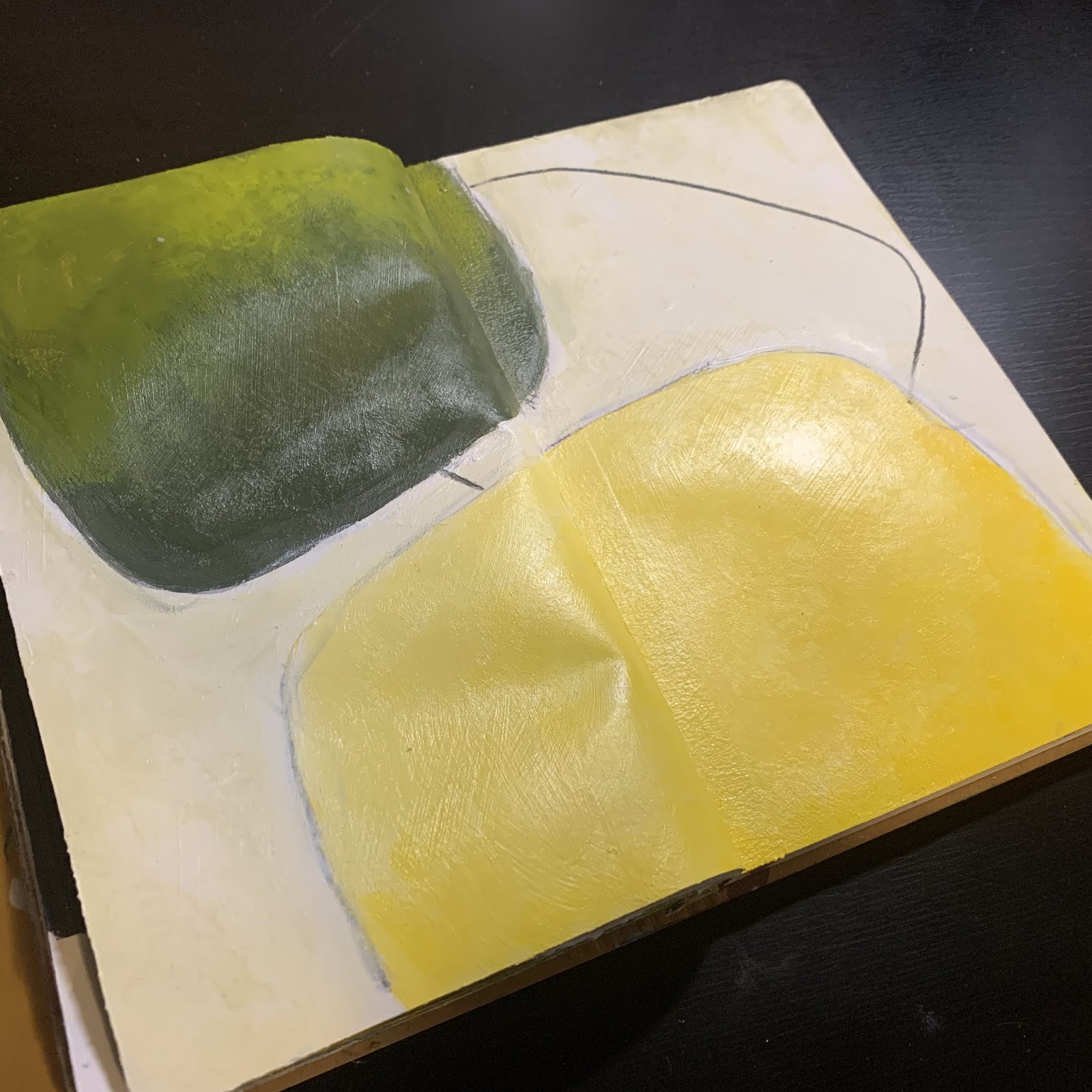
Now it was time to add some color - I thought I'd try some green....
Ya, no. No mater what I did at this point, it just wasn't what I wanted. I didn't know that yet, but I knew it was time to walk away again or it would end up in the garbage. Tomorrow is another day!
Tomorrow it is...
I came in with an idea to bring it all together...
Or so I thought. This is the piece just before I had yet another hissy fit. Underneath all this, I had added so many layers trying new colors. I think I was really hung up on staying with the ETC color palette and it just wasn't working for me at this point. I pulled out Turquios (Phthalo) and Titanium White with a mission to fix this hot mess. I really liked the left side, but still now happy with the right. I did a wash over the base to push back the colors in hope that would help. Nope.
My next attempt was pulling out a stencil and trying to push the background back even further.
If you follow along on Instagram, you will have seen a few of these images along the way. The one thing that I found so interesting was the feedback I got along the way. Everyone was loving the images and couldn't understand why I wasn't liking it. It took me that night to figure it out. It was too much like an art journal page and not a painting. I know I am by no means an accredited artist, but I am an educated one. Yes, self taught and continuing to educate my self on a daily basis. I know what I like and what I don't. I knew I didn't like this. So day four was going to be my break through....
I started out day four with adding some torn pieces of Tim Holtz Tissue Paper (Postale) again overlapping the pieces so that there would be some on all of the six panels. Think I would be happy now? Nope.
I took some Titanium White and Acrylic Glazing Liquid as I wanted the collage elements to be pushed back again (when will I learn)?!
I once again, wiped back the white so it was not so bright and got the grunge I thought I wanted.
I of course new with wasn't going to be the end, it needed more. I pulled out some deli paper and did a few rough paint doodles on them and just put them on the painting to dry to see if it was what I wanted, and of course walked away yet again.
Day five was now upon me and I was not going to lose to this panel. I had an idea and thought it through and boy, it may have took a while, but I love the results.
I started the day off with mixing up some Bone Black and Turquois (Phthalo) and some abstract shapes to create a focal point. I knew I wanted that Turquois to peak through. I also added some sgraffito through a couple areas.
I wanted to see how the deli paper circles would work so I cut a couple out to see.
Sorry for the glare, but at this point I was just trying to see what would work here. I knew pretty quick it was only going to be the one.
I also added some line drawings in grey to keep the panels joint once they were separated.
It was finally coming together. Now was the time to cut them apart to see if it worked.
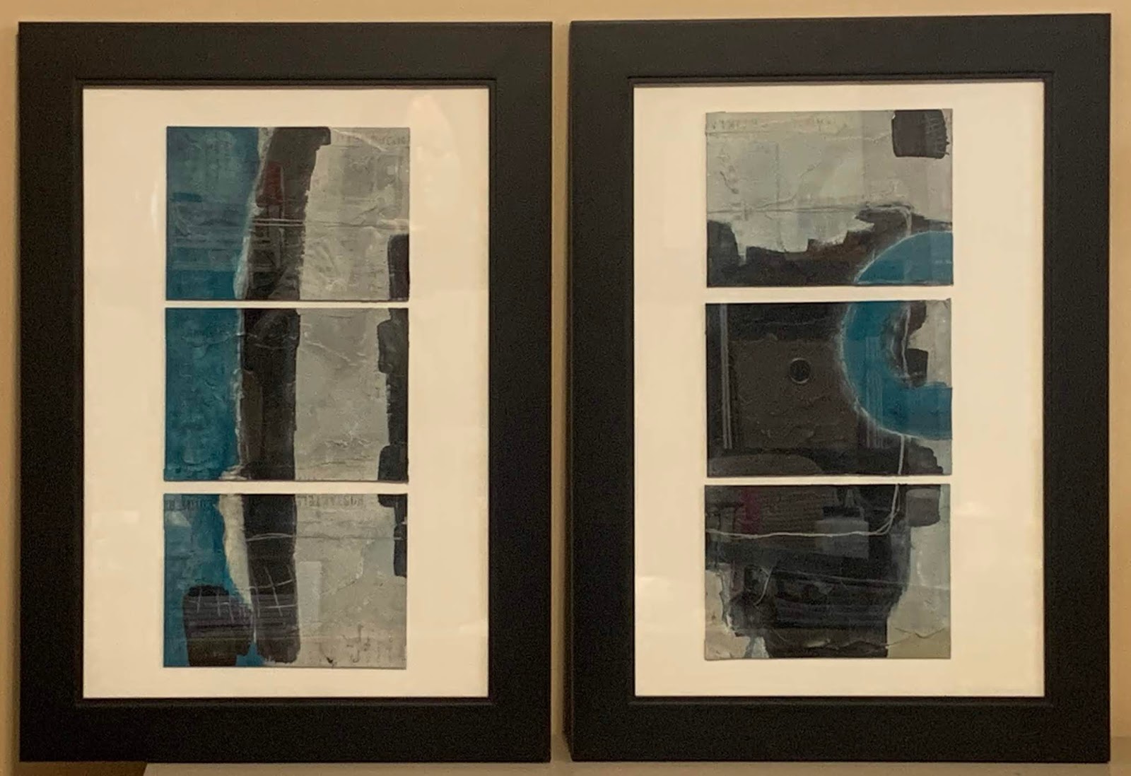
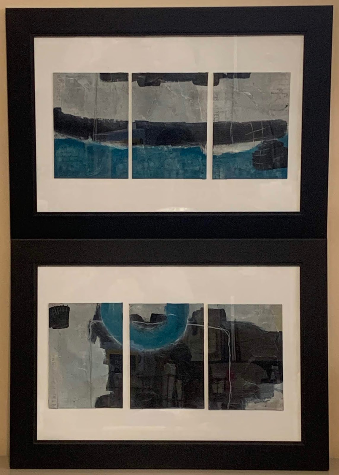
Now comes the fun part. My idea on working large on small. It can be done....see!? What if...once part, you frame separately or together and arrange how you want, when you want. If I was to frame individually, I could change the layout whenever I wanted. I knew I wanted it in two frames. How I wanted to to be presented was to be determined.
Here is just a sampling of the ways these could be hung. Whether you choose vertically like above or horizontally...


The possibilities are endless. I have them currently mounted in two 12x18" frames. Not sure yet if this is how they will end....time will tell.
Thanks for sticking it out with this long post. I will see you again soon...in the mean time, be sure to check me out over on Instagram and Facebook by searching @w2studioarts. Have a great day!