For this play time inspiration, I had just gotten in my new Traci Bautista stencil release (Soulful Scribbles) from StencilGirl Products along with a new pack of Liquitex Vibrant Colors Heavy Body Paints...so needless to say....it was time to play!
As you know, I always start with the lightest color in my palette of choice. This time around it was Yellow Light Hansa rolled over the gesso'd paper with my brayer.

Next I laid down the stencil Soulful Scribbles and pulled the next color Vivid Lime Green and rolled it over the stencil using my brayer.


I really love these two colors together, make me happy!

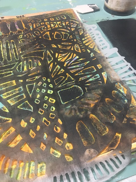
Next I pulled out my Dorland's Wax and rubbed some onto the dried surface using my palette knife. I turned and the stencil in different directions and placements on the piece so I would be able to save some of the under piece.


In these tow pictures (above & below) you can see the clear images I created with the wax.

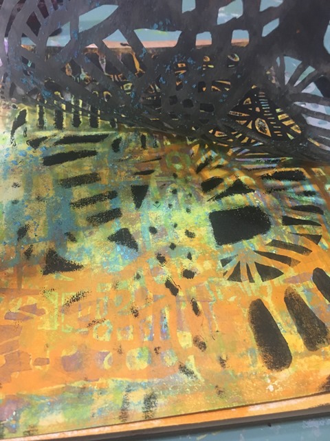
I now took my next color Light Blue Permanent and brushed it on with my 1" flat paint brush. With this step, you need to be a bit careful as I was using Heavy Body paints (vs the usual fluid) and it can move the wax. I did apply the wax fairly thin, but it still would move it if I applied too much pressure. Heat set the paint. One thing you will see is how the wax begins to melt with the heat which you will use to your advantage. Taking a baby wipe, start wiping away the melted wax areas - it will show the green from below and the dried blue will remain in the areas where there was no wax.


Time for another stencil and another color! This time I used Soulful Scribbles Let Go along with Brilliant Purple. I applied the paint this time with a make up sponge being sure to use as little paint as possible. To do this, I dip and dab (check out my palette sheet on the right in the photo)!

Time at add yet another layer of color and visual texture - Cadmium Orange Hue and the Soulful Scribbles Unfold stencil.

I applied it using my brayer over the the stencil.


Once I pulled it off, I knew right away it wasn't what I was after - too muddled and ugh (for me)!
So what next? How do you fix it?

In this case...BLACK! Prima's Heavy Black Gesso through the stencil with a brayer of course.

As you can see from the photo above I was not able to get the coverage I was hoping for so I pulled out a make up sponge and started applying the black with it through the stencil
Much better!

Now it was time to bring in the white (I know, predicable aren't I)! Using the Soulful Scribbles Flourishes stencil and Liquitex Heavy Body Titanium White paint and a Sofft sponge, I started picking areas of the stencil and a page to apply the white. Always making sure to pick areas of the stencil and page that need a break from the darkness all a while keeping in mind the balance on the page.


As usual, I feel it needs a pop now - so out comes the Medium Magenta and using the same stencil again, start using new areas and continue to flip, turn and maneuver it around the page


Having fun now, so add in the Brilliant Purple again along with Soulful Scribbles Dots Dash stencil

Sadly, I went too far. The page is way too busy! So what now? Yup....BLACK!

Using Spring Bloom Collage Mask 3 I lay it down on the hot mess of a page and apply Black Gesso over the entire page using a sponge for good coverage!

Well that took a long time to get here didn't it?! But as usual with this masking technique - the busier the under piece the better the impact! The colors really sing her and I am more than happy with the results!


Inspiration - Dina Wakley meets Robert Burridge
Using the idea of a limited paint palette via Robert Burridge's color wheel, I pulled out my Dina Wakley paints to see what I could create.
My main color would be Blackberry Violet, accent Lime and accent colors Ocean & Tangerine. I would also allow Black & White for additional tints and shades with the colors.

First off you will see some color under the application of the purple (ya, I didn't like how it all started), so with a heavy application of the Blackberry Violet and then mixed with white, I got to a place I liked again.

Using my large angled paint brush, while still wet, I began to blend


Begin added additional colors back into the piece, again using the large angled brush to blend in


It really did nothing for me, so I pulled out my mini catalyst tool #1. I started once again introducing the colors onto the page with a fairly heavy application


While still wet, I started brushing across the page with the large angle brush, now I was getting somewhere!


This is where I got an idea (oh oh)!
Pulling out my DecoArt Media Fluid Acrylic Translucent White, I applied it to the page through the stencil Soulful Scribbles by Traci Bautista.

Then layered Soulful Scribbles Unfold over top and continued to apply the paint.


Now it was time to add my idea! Interference paint! The first application was using Violet gong between the Soulful Scribbles stencil then layering as before with yet another stencil Soulful Scribbles Let Go.


Time to introduce yet another Interference color - Green!


I continue to play around with a variety of the stencils and Interference paints - mixing it up with the stencils (flipping, flopping, turning and continually moving them around the page).


Here is a short video showing the Interference in it's best light!

Thanks for sticking around for this long photo filled post! Hope you find some inspiration to create something on your own. Will do my best to get back on here sooner than later.
In the meantime, you can usually find me more often over on Instagram or one of my Facebook Pages W2 Scrapbooking Mixed Media & Art Studio (only until end of 2018 then it will be removed) or the newer W2 Studio Arts
Don't forget to check out the online store - there are loads of great deals to be had with this being the last year - stock is moving fast! Be sure to use the coupon codes, they can be found on the home page.
until next time...


