Thursday, May 31, 2018

Color Trio Inspirations

I signed up for a class by Rae Missigman over on the Jeanne Oliver network called A Guided Word a while back and just didn't have the time to go through it.  I will say, I probably should have read more about the class before I bought it, but I will say, I still took something away from it....Color Trios!  Now this really is not something new, but honestly, something many do not follow or take into account when working on a piece.

As many of you know, I am a huge fan of understanding the product and the process.  I take many classes and read a lot (and I do mean a lot) of materials on everything about art. Many are intrigued by how and what I take on a class, book, article, video, etc.

If you have taken the course or want to - please be sure to look into it.  I took something totally different from it that I am sure was expected.  In all honestly though, that is the pure joy of art - it is all about perspective...your own. Your perspective, YOur perception, YOURr view, YOUR understanding, your take, simply....your way!

Rae worked her way through the course offering three different color trios to work with, I however; took it to a whole different direction.  I used the 'colors' in a way that was inspiring to me - more abstract - more in the way of Jodi Ohl inspired.

Follow along if you wish and see how I used the the color trios....my way.

Abstract Grunge

My first color trio was Teal, Green Gold & Luminous Rose (and of course Black & White for tinting, shading and accent). This would be known as a Split Complementary on a Color Wheel. I painted on a 12x16" Canson Canva ArtBoard.


I applied all the paints using either a brayer, Catalyst Tool or Wedge. The further I got into it, I pulled out some brushes (Brights in varying sizes) to allow me to get better definition along the center of the piece.


Made marks using my flower pick or edge of rubber brayer. Created the black lines using a very old American Crafts DIY Patterned Brayer (Stripes). 


Splattered the three main colors that were mixed heavily with water using my 1" Bright brush.


I scribbled using a water soluble Graphite pencil  as well as a Charcoal pencil when I did not want the seepage.


This was a very fast and simple piece that was done in less than an hour. Really love how it cam out. Using the textured brayer was a great blast from the past - do you have a favorite tool from year ago that you still love to use?


Abstract Color Blocking

The next color trio I used was Deep Violet Purple, Luminous Rose & Granny Smith
I once again used a Canva ArtBoard to create this piece.


Creating an 'under' image is something used by many artist to simply get something down on the canvas when they often fear the white of a canvas.  I do not have this issue, this base was an older piece I just didn't like so covered with heavy black gesso.  Once it was dried, I wrote out some lyrics from a song I like using a Liquitex Paint Pen in White.  Once it was dry, I used a water soluble crayon to sketch out the basis for my blocking.


I filled in my spaces with a mix of the paints - some pure, some mixed with others, some mixed with white (heavy body or translucent)


Using a brayer, a sheet of deli paper or a baby wipe - I adjusted the amount(s) of paint on each area to get it to a depth I was happy with.


I scraped, scratched, spritzed and splattered along the way.


I would often use the baby wipe and pull away a good amount of the paints in order to show the words beneath.


As you can see by the number of photos along the way, there was a lot of adding and subtracting along the way.


This is how is sits now.  Really liking the vibrancy it has - so unlike me with the brightness, yet so me with the grungeness.


More Abstract Gunge


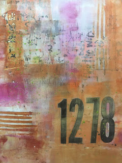
The next color trio was a tough one to work with.  They are all transparent! Quinacridone Nickel Azo Gold, Quinacridone Magenta & Transparent Pyrrole Orange.

I once again did the writing on the canva board, however this time I used the white base and wrote with a black paint marker.


I missed taking several photos along the way - could have to do with me now liking how it was coming along.  I painted over the entire piece a couple of time using Liquitex Soft Body Titanium White Acrylic Paint. Always using my brayer to apply and my flower pick to scribble.


I used some of my vinyl number stash to attach a meaningful number combination. Then continued to apply more paints as well as take away when needed.


You can see I once again used the American Crafts DIY Brayer to add some much need visual linear texture.


I continue to apply layers using one of my smaller brayers, adding little color patches along the way.  I will sit back look at it and decide where it needs a pop of color or a push/pull back of color.


Blending with a brayer is one of my favorite ways to work a piece.  If you use the brayer too much on a wet surface you will often get a strong pull right from the bottom - hence a pulling/tearing of the substrate.  Sometimes it is okay, others it can ruin your piece...so be cautious.


Needing some definition, I pulled out a graphite pencil and started making my own definition - as seen here with the 'cross' which aided in dividing the colors and therefore creating a new focal point.


Here are a few close ups to see the amazing texture I was able to get along the way.


Will say not one of my favorite combos, nor final outcome, but will say I learned a good thing or two along the way....which always make me happy.


* * *

You can usually find me more often over on Instagram or one of my Facebook Pages W2 Scrapbooking Mixed Media & Art Studio (only until end of 2018 then it will be removed) or the newer W2 Studio Arts (be sure to like & follow).

Don't forget to check out the online store - there are loads of great deals to be had with this being the last year - stock is moving fast! Be sure to use the coupon codes, they can be found on the home page.

until next time...
* * *

REMINDER: The shop will be on 'vacay' for the first two weeks of June.  Even though you will still be able to submit orders, I will not be filling, shipping nor replying to emails.


Tuesday, May 29, 2018

Shattered

I have been on a painting whirl this last few weeks - inspiration is just got me going.  How individuals get inspired is different for each.  I am often simply inspired by a shape, a color, a doodle....what? a doodle? Yuppers!

I have been seeing many doodle images similar to the one I have used in this piece. I thought for a few minutes if I really wanted to actually 'doodle' all the shattered look...then I thought nope! I'm, going to stencil it!

Here is a look at my process...

Using an 18x24" gallery wrapped canvas - I got to work.  Even though most artist grade canvases come pre-gesso'd, I still prefer to put a good coat or two on - not sure why...one day perhaps I will try doing one without and see if there is a difference.

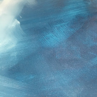
I used DecoArt Media Prussian Blue Hue and Titan Buff along with Golden Acrylic Glazing Liquid.  I find using the glazing liquid offers me not only more open time, but also amazing blending opportunities.

I used a large painters angle brush to apply and then (the same but) separate one to blend. As I started with my layers, I added more Titan Buff to one side, making sure to use short yet fluent strokes.


I introduced a smaller firm brush (1"), my current fave is a bright brush - shorter bristles, yet still firm.  Really like the visual texture they provide. 


 Now it was time for the stencil to be introduced.  I have this in my shop - but alas I was not aware! I did a google search for 'shattered stencil' hoping I would find something - yes!! Once I discovered there was one, I searched my shop and luckily there were some still in stock. It is called Shattered Triangles by Crafter's Workshop (Designed by Julie Fei-Fan Balzer #TCW562).

I laid it out over the canvas where the two colors intersected. I used Liquitex Heavy Body Titanium White Acrylic paint and applied using a Sofft sponge applicator.


I simply flip, flopped, turned, rotated and moved the stencil across the divide to get the effect I was after.  


Now came the time I was continually rotating the canvas to see where I wanted to go next.  There is something to be said about doing this, along with taking photos!  I would rotate it, take a photo, rotate, take a photo, rotate....you get the idea!  I would walk away, come back and look with fresh eyes, hoping it would speak to me as to which way I would continue on...

I finally decided it was going to be a vertical piece, but was now trying to decide if I wanted the light or dark side to be the focal.  Oh the struggles... 


Then came an idea!  I pulled out my Donna Downey Studios stencil that I picked up when I took one of her classes a year and a half ago. This jumbo stencil is fabulous.  I actually have two of them.  One is cut and the other is intact. This stencil is called Silhouette Duo and measures 21x28" and is fabulous!

I taped it onto the canvas so I could decide where I wanted it placed.  For a day it sat like this and I struggled, so kept walking away.  I was about to start putting it down and had moved the stencil to the left and voila! it came to me...I offset it and it all came together.


I taped the stencil down off to the left, and then laid the Shattered Triangles stencil over top of the silhouette image.  I once again used the Liquitex Heavy Body paint and started fitting it into the space.


I really liked how it was coming along.  What was othering me was the 'gaps' in the silhouette and the filled in triangles (solid white), so once again I had to take photos and sit back and look.


I pulled out a fineline bottle filled with Titanium White High Flow paint and 'filled' in the gaps.


There was still something really bothering me about this image - do you see it? The blob of white on the right hand side of the silhouette. This space would be the space between the arm and the waist - it was wrong.

I took a baby wipe and cleaned it off and then re applied the stenciled image over the silhouette stencil again using the heavy body white.

Much better... 


I have since added another string of the shattered triangles, however; I am struggling on whether it belongs or not.  I have stepped away for now. As I sit here and look at it I am thinking of taking it away and continuing the shattered towards the top right corner...hmm.


Anyhoo...for now it it will sit.  I have started work on another for my son - one he asked for back in January (mentioned in an earlier post here). I finally have the base done enough that I am happy with it, want a peak?

It seriously looks looks suede!  It is a mix of Titanium White, Black, Titan Buff and Grey along with glazing liquid of course.  The canvas is a Gallery Wrapped 16x40".

To get this effect, I use many sheets of deli paper (often crumpled then opened up again) as paint pick ups. Yes, simply lay them onto to wet surface, burnish with your hand (or brayer, depending on how much paint you want to pull up) and pull back.  I do this several times using the same sheet so the paint sticks to paint...it provides an amazing visual texture.  Next on the agenda is the image transfer of lyrics to many of his favorite songs.  Wish me luck...


You can usually find me more often over on Instagram or one of my Facebook Pages W2 Scrapbooking Mixed Media & Art Studio (only until end of 2018 then it will be removed) or the newer W2 Studio Arts (be sure to like & follow).

Don't forget to check out the online store - there are loads of great deals to be had with this being the last year - stock is moving fast! Be sure to use the coupon codes, they can be found on the home page.

until next time...
* * *

REMINDER: The shop will be on 'vacay' for the first two weeks of June.  Even though you will still be able to submit orders, I will not be filling, shipping nor replying to emails.

That Other Neutral Triptych

  That Other Neutral Triptych wrapped canvases 10x10x1.5" (x3) professional grade artist materials I worked on this smaller series at ...